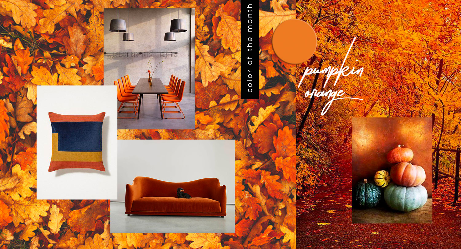
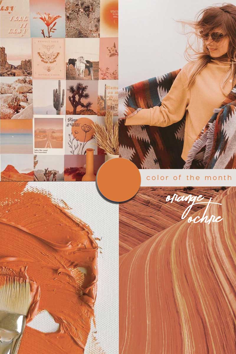
It’s October and Orange is our new colour of the month – the shade has a seasonal twist!
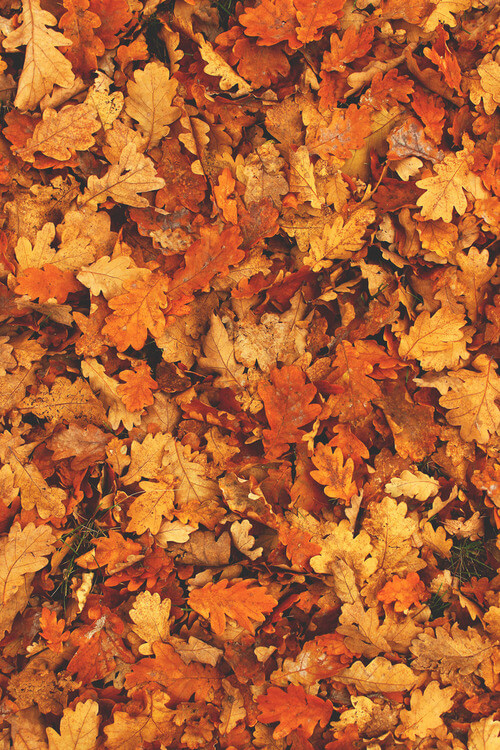
Autumn is in the air and we are spicing things up with the around warmth of the orange color trend – a colour synonymous with autumn – from brightly coloured squashes and pumpkins to autumnal leaves.


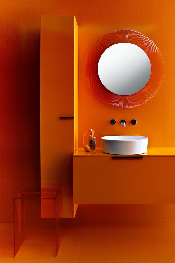

Via The Kartell by Laufen bathroom collection designed by Ludovica & Roberto Palomba / Martin Dulanto installs vibrant orange staircase inside Peruvian house Casa Blanca Dezeen / via

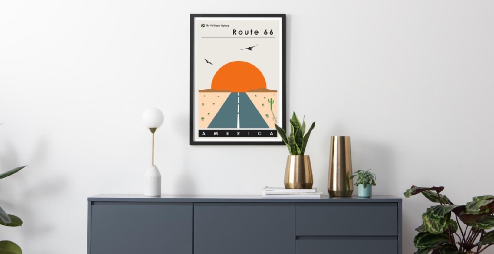
IB American road trip inspiration MADE Route 66 poster
.
ORANGE COLOR TREND 2020


The colour orange is fresh, youthful and creative – it embodies the warmth of red and the optimism of yellow. Orange is a secondary colour; the result of mixing red with yellow in equal portions.
However, there are many variations of orange depending on the proportions of the two primary colours. Stimulating, vibrant and flamboyant ‘orange’ blends red associated with ‘energy’ with the ‘happiness’ of yellow. Combining red and yellow, the colour orange carries less aggression/ fierceness of red due to the calming addition of yellow.
|| Be inspired : Cantaloupe orange color trend
In English, the colour orange is named after the appearance of the ripe orange fruit – interestingly the colour is said to stimulate the appetite. Orange is a popular colour in restaurants perhaps due to the fact it encourages the feeling of hunger and contentment. A warm and welcoming colour orange is both physically and mentally stimulating. Orange relates to social communication; encouraging two-way conversations. Apparently if you have people around at the kitchen table, the colour orange makes your guests talk and eat for a longer duration.
Also do you know that different shades, hues and also even tints of orange can have different meanings?
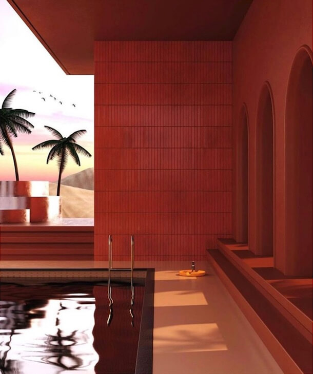
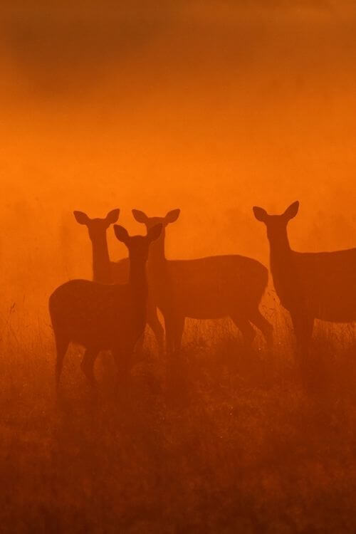
A light orange or peachy shade can be more soothing and friendly, a more golden orange is associated with prestige, wisdom and illumination. A red-orange stirs up emotions of passion, desire and even aggression. Dark orange can represent deceit and distrust. Whilst burnt orange may also tap into negative emotions – this shade of orange can also be suggestive of autumn, evoking a feeling of warmth and comfort. Think cuddling up to cosy fires.
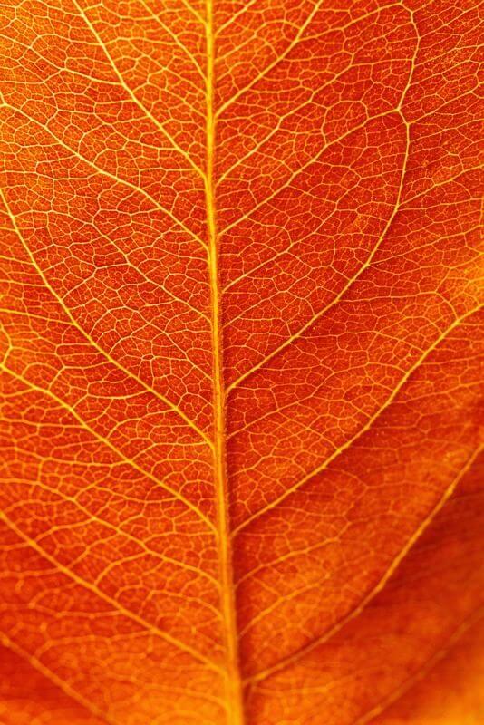
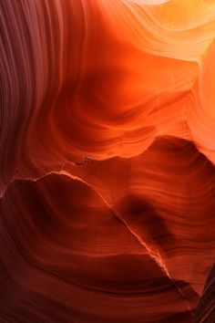
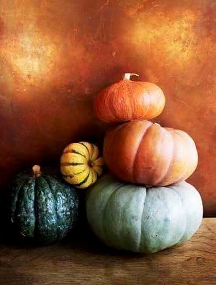
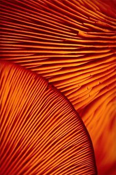
Orange is considered a very hot colour – just like flames of a fire, it conjures up the sensation of heat. The colour can be associated with the hot sun in summer but also reminiscent of autumn time and harvest – think of the changing colour of leaves and typically orange pumpkins. It is a type of photosynthetic pigment ‘carotene’ that gives carrots, oranges, sweet potatoes and pumpkins the orange colour.


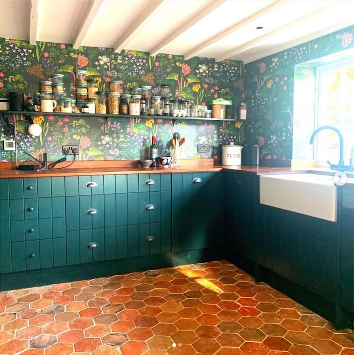
Terracotta orange colours via / Orange Trend GLAMOUR image @caradaur / Kitchen @sophierobinsoninteriors
Terracotta taps into those earthy tones and translates from Latin as “baked earth” a type of earthenware and as a colour evokes warmth.
Terracotta orange colours can be “soft” and “comfortable” or “bright” and “energetic.” These colours can make modern interior design feel sunny and happy, cosy, warm and inviting. Falling into the terracotta orange palette are a variety of shades including reddish brown, red, pinkish red and yellowish orange hues. Earthy, natural, muted colours through to rich orange, deep yellow, pumpkin and brick tones.
Bare ‘exposed’ brick walls are often embraced to add character and warmth into our interiors. Just like the trend towards green, terracotta can help to connect our indoor spaces with outside.


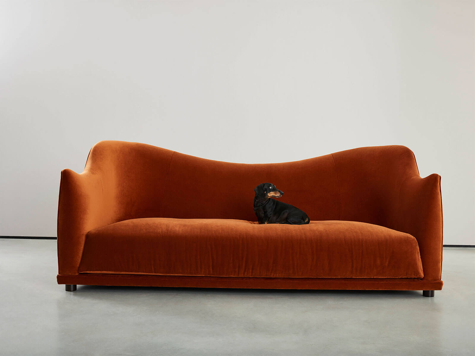
Fired up, textured buildings with terracotta screens: Terracotta by Creaton via / Vogue Terracotta tones in the Frtiz Hansen New Luna sofa by Jaime Hayon
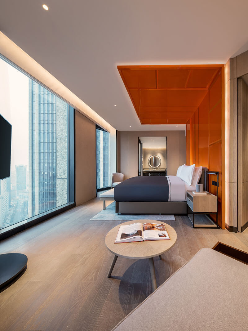
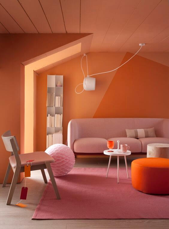
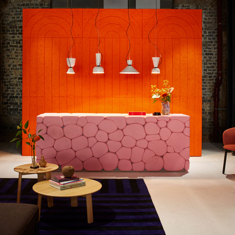
ORANGE COLOR TREND 2020 IN DESIGN & INTERIORS
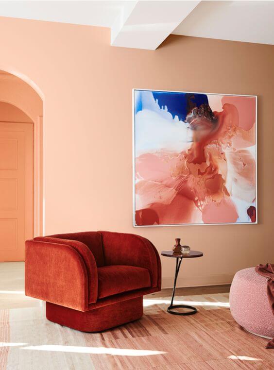
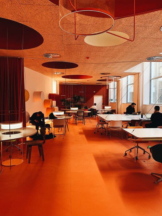
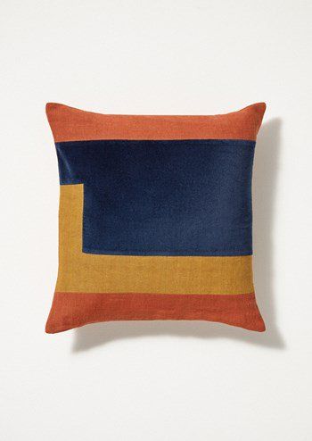
Orange can be used as an accent to bring a burst of colour into interiors. As a colour it can be fun and playful – here, again, the reference trend is the “Playful Living” we have seen here – so feel free to embrace it!
No need to go overboard on orange, just a bit of bright orange can do the trick, by adding a boost of colour. A vibrant pop of colour can create a cheerful mood and happy home. Orange is a great colour to use where there will be large congregations of people. This is because it decreases the irritability and hostility, improving social behaviour.
For a less saturated orange head for a deeper, richer orange colour. From bright, bold and saturated through to deeper; you can pick a shade to suit you! Use alongside an array of beautiful autumn tones that come in abundance this time of year. Or reminisce those hot long days of summer- radiant orange and blue.

Contemporist CCD/Cheng Chung Design


Via / ROOMS, a special exhibition curated by Elle Decor Italia, photography Stefano G. Pavesi & Studiopepe / via

Via Designed by Studio BV, photography by Corey Gaffer


Via / via Design: Doepel Strijkers & LEX Architects


@_volume_creative @L_D_F_Official photo: @editphoto⠀⠀


Via Architect Estudio Cano Laso, Photography: Jason Bailey & Lucy Savage / @chrisbarneau via @dellostudio / via


2lgstudio / Blain Harasymi Photography / Via / First light by Simon Roy / @katewhitaker01 / via /
.
Liked this post? Pin it!

.
Be inspired by the latest color trends:


