6 Inspiring Color Palettes for interiors and decor for the next year
We are exactly in the middle of the year and it’s the perfect time to stop and explore more about the color trends for the next year!
Lately, I have been working on many different trend consultations, by exploring the most relevant macro trends, lifestyle changes, and how they will impact interiors and design. It is always fascinating to see how colors have such an interesting link with all these changes, and how color trends are reflecting new styles and visions.
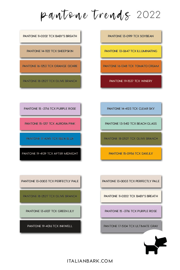
In this article, I am sharing some new Pantone color trends 2022 in 6 palettes perfect for interiors and design, in collaboration with imm cologne fair.
In this article you will find 3 of the 6 boards, while you can discover the next 3 moodboards and the Pantone codes in the magazine by imm cologne here !


Interior Color Trends for 2022
starting from Pantone
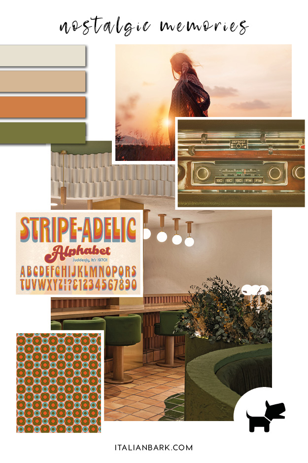
Moodboard#1 : Nostalgic memories
/ Pantone color trends 2022
The first color palette takes inspiration straight from the 60s and 70s decades, in a nostalgic and playful mood.
In a world that combines pandemic, racial and social injustice and climate change, the past is a safe place where to escape, and many of the top trends for design and interiors are actually inspired from the past. In particular, the late 60s and 70s aesthetics are having a big comeback for their rebellious, playful and optimistic mood, perfect as a way to escape from present times.
Youthful, energetic and warm, the moodboard is made of burnt oranges, beiges, natural greens and soft neutrals, combined in fluid shapes, bold geometric designs – all elements that convey strong 70s vibes.
Designers have already declared warm earth tones to be the hottest colour trend of 2021, that is going to last next year as well. “There seems to be a subtle shift toward the humbler earth tones. We believe richer hues will redefine how the whole home feels—comforting, safe, and inviting.” Alongside warm earth tone colours, designers determined that 1970s aesthetics and nature-inspired patterns will be big in design this year. Designers expect the 70s – an era of bright colours and earth tones – to make a major comeback.
Among the many different hues of orange, Pantone Orange Ochre is perfect because of its terracotta undertone, yet its reference to the earthy colors. In the moodboard, I combined Orange Ochre with a must-green for the next season, Pantone Olive Branch, and two warm neutrals – Pantone Baby’s Breath and Pantone Sheepskin.
–
Collage ©ITALIANBARK | Sources :
mood 1 | Shutterstock
mood 2 | Shutterstock
pattern | via
graphic | Shutterstock
interior | Masquespacio via Dezeen
–
Be inspired: Color of the Month | Ochre Orange
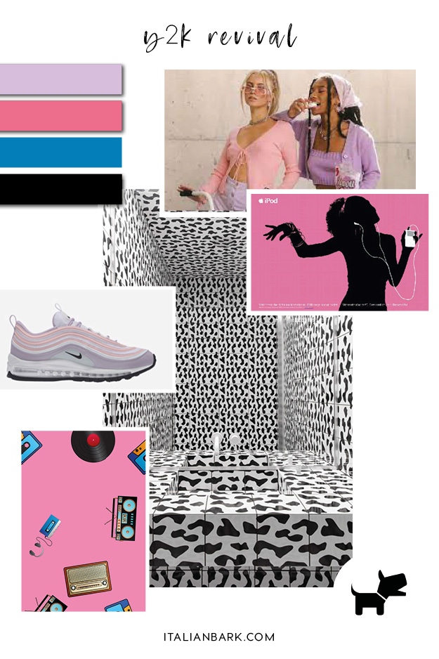
Moodboard#2 : Y2k revival
/ Pantone color trends 2022
Lately, another source of inspiration that is becoming popular is the 2000s decade.
Called the Y2K aesthetic, this style is inspired by the mid-’90s and early 2000s when the internet became more popular, during the dot-com boom.
The decade also evokes a sense of nostalgia in the Millennial and X generations, reminding of their childless and teen ages, but is becoming especially popular in the youngest generations, especially on TikTok.
This distinctive style is a blend of pop culture and tech advancements from the millennium, like for example the first iPod that totally changed an era. Bubblegum pink is one of the distinctive colors of this aesthetic – remember that Pantone’s 2001 Color of the Year was fuchsia rose? Lilac is another distinctive color of this style, that in the moodboard is combined with black and a strong cyan blue.
Pantone Aurora Pink is the perfect bubblegum pink, strong yet feminine, together with the lilac Pantone Purple Rose and the beautiful and bright Pantone Ibiza Blue. For the accents, Pantone After Midnight is the perfect black to be used.
–
Collage ©ITALIANBARK | Sources :
mood 1 | the trendspotter
product | nike
pattern | shutterstock
graphic | inspiredology
interior | katy pititskaya interiors via Dezeen
–
Moodboard#3 : Zen silence
/ Pantone color trends 2022
The third moodboard is not inspired to past atmospheres, but to the Far Eastern design.
Referring to the new minimalist aesthetic, this mood embraces simple and geometrical shapes together with raw and natural materials such as crude clay, adobe, and rooted wood.
In fact, while the minimalism from the 1990s was about the idealized absence of things, the New Minimalism is about using the absence of things to enhance the meaning of what we choose to retain. It is about enabling our favorite pieces to express what really matters to us, and at the same time respecting the environment by making sustainable choices also in design.
The mood celebrate raw textures, finding beauty in imperfection as for the Japanese wabi-sabi concept – think for example about kintsugi pottery technique, handcrafted methods, and everything which highlights the natural aspect of objects and their surfaces.
The colors are natural and neutrals, with browns and greens. In the moodboard, I choose a soft green called Pantone Green Lily, together with Pantone Olive Green, and a warm antique white – Pantone Perfectly Pale. Do not forget in this palette a touch of black, to underline details and geometries – Pantone Inkwell.

–
Collage ©ITALIANBARK | Sources :
mood 1 | pexels
mood 2 | shutterstock
pattern | shutterstock
graphic | pexels
interior | studio Keiji Ashizawa Design via Dezeen
–
Explore the other Color Trends 2022:
Moodboard #4 / Southwestern Desert
Moodboard #5 / Mediterranean Vacation
Moodboard #6 / Cocooning Detox
.
.
Liked this post? Pin it!
……
.
/ Be inspired \
8 Future Color trends for 2022 starting from Pantone 2021
From 2020:
Cool Color Trends for 2021 starting from Pantone 2020
From 2019:
Cool Color Trends for 2020 starting from Pantone 2019 Living Coral

.
Be inspired by the latest color trends:
Follow ITALIANBARK on Instagram here
