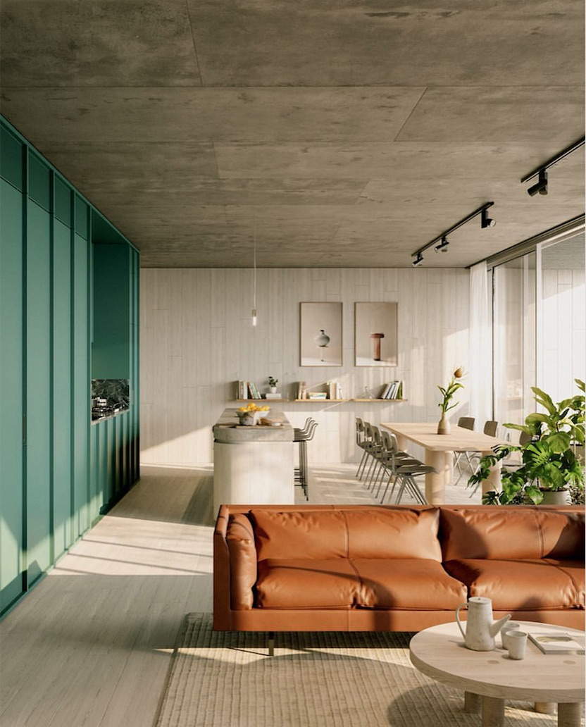
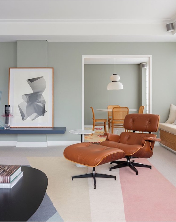
Browns color trends 2020 in interiors and design:
be inspired today by caramel brown
This month let’s indulge our sweet tooth with caramel… even the word sounds delicious! It may be enough to get you dreaming of the sweet confectionery in all its luscious forms… a drizzle of delight, sumptuous swirls of caramel or soft chewy candy. However, caramel can also be used to describe the milky, light brown colour itself.
But when it comes to the colour, caramel is it to your taste?
BROWN COLOR TREND IN INTERIORS AND DESIGN / Caramel
In French, caramel means “burnt sugar,” which comes from the Latin cannamellis, a combination of canna, “cane” and mel, “honey.”
Honey hues and a hint of spice just happen to inspire Dulux colour of the year 2019 ‘Spiced Honey.’ Described as “a versatile shade filled with warm and inviting tones of amber and rich caramel.” This particular shade of ‘Spiced Honey’ has a “raw, natural quality that works like a warm neutral – making it adaptable to pairing with different materials and styles of decoration” says Marianne Shillingford, creative director of Dulux UK.
|| Read more about Color of the Year 2019 Spiced Honey
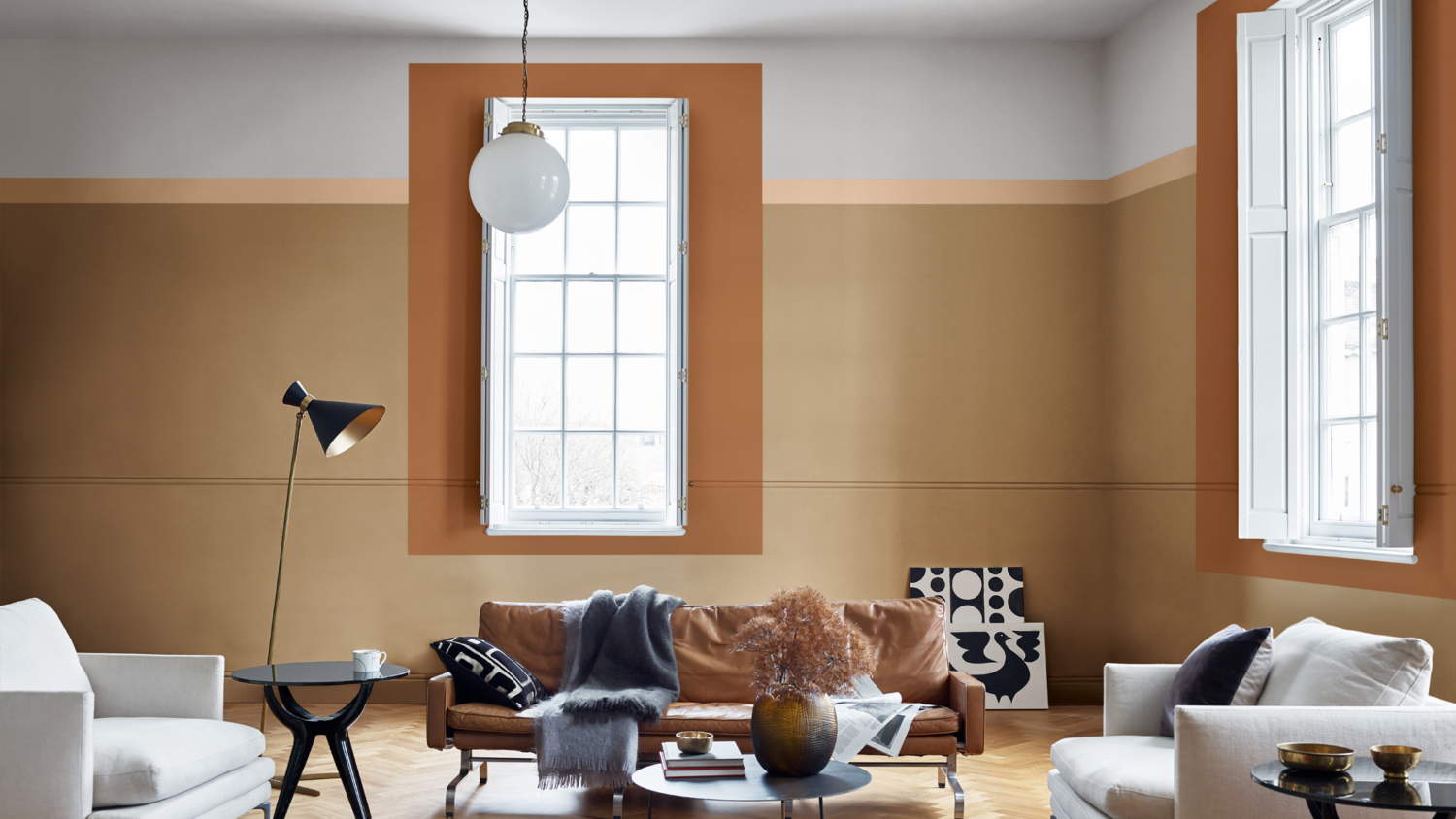
Dulux Colour of the Year 2019 – Spiced Honey
.
Pantone has selected ‘Cravings’ as a colour palette for 2019. As the name suggests, this palette is based around ‘senses stimulated by food.’ Cravings “carries the sense of longing or desire and incorporates colours that conjure up the temptation that is aroused on seeing a mouth-watering dish, a tasty dessert.”
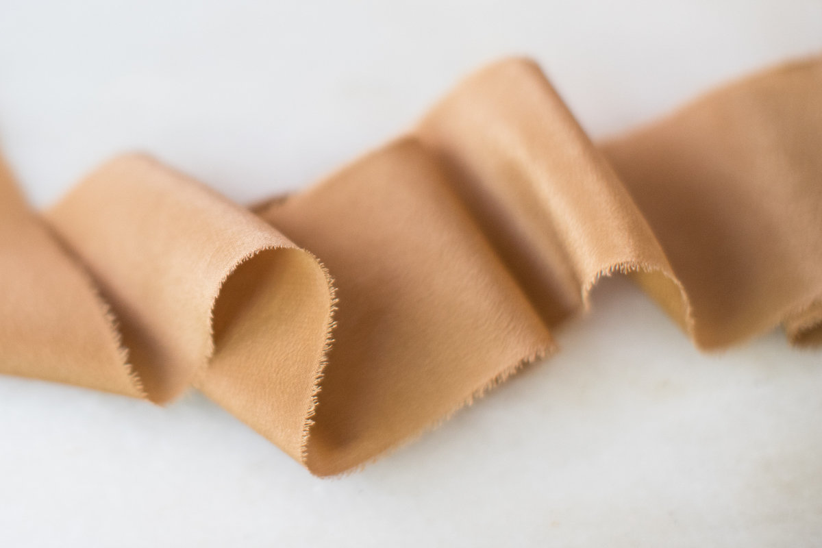
Among the colours included in ‘Cravings’– Pantone Colour Palette 2019 we find caramel toned ‘Butterum.’
Pantone-Butterum- ‘Cravings’ Colour Palette 2019 | Ribbon- Caramel-Etsy
||| s h o p t h e p o s t |||
[show_shopthepost_widget id=”3505411″].
BROWN COLOR TREND IN INTERIORS AND DESIGN / Caramel in interiors
There is something cosy and indulgent about caramel; a warm colour that stimulates the appetite. Caramel may conjure a certain sense or element of guilty pleasure (which comes from the sweet treat itself) however it carries sweet intentions.
As a colour it is far from frivolous, in fact caramel is considered a – stable and grounded neutral with a warming presence. ‘Practical, sure-footed and down-to-earth’ the colour ‘encourages us to ground our earthly ambitions.’
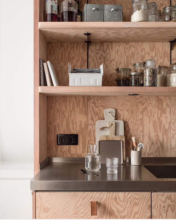
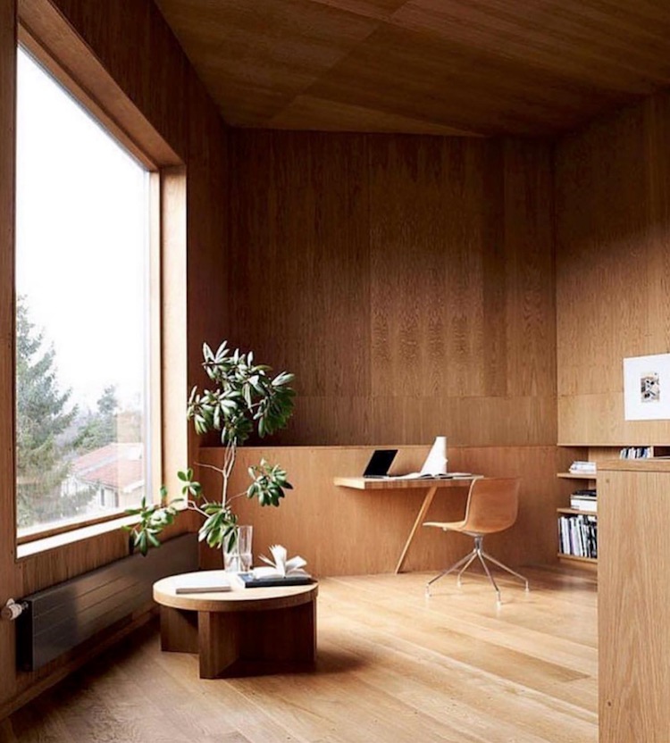
Used as an accent colour, it can add warmth to interiors. Caramel – think of the colour of warm wood, the tan tone of leather.
Consider keeping the palette simple, such as Caramel and Cream (off-white shades).
A warm neutral try with other neutral/ natural tones or consider pairing with muted colours such as clay pink and caramel. Whatever palette suits your taste!
.
Be inspired by our caramel finds!
1. @themodernproper 2.@bymolle styling by @design.studio.nu via 3. source 4. Instagram @anna.cor 5. Instagram @lelarose 6. source 7. source 8. elfcosmetics.com
1.Instagram @community_journal by @byrnearchitects Interior Design by @lisabuxtoninteriors Styling @tess.newman.morris via Photo by @lisacohenphoto 2. instagram @carlhansenandson 3. source 4. source 5. instagram: @hesterdewolff 6. HAY Eclectic Cushion Caramel
1.archdaily.com 2. architectureau.com 3. essentialhome
2. @decortribal 3. @catarina__moreno 4. @dezeen /5. @maeengelgeer 6. Ph @linethitklein Styling @mariegraunboel for @ELLEdecorationdk via
1. @thelocalproject by @milieuproperty& designed by@editionoffice, visualisation @raw.render 2. @metteduedahl 3. @juxt.designstudio 4. via 5. @staceyreesartist 6. @arentpykestudio Ph @tfadtomferguson
Bottom image: @kitagar

||| p i n t h e p o s t |||
The latest interior color trends 2020 : caramel


