Interior trends for a/w that are here to last in as home decor trends in 2017
Let’s start again talking about interiors, today on the blog. A new season means new trends, or old trends here to last next months: let’s see together what’s hot on home decor for this Autumn/Winter 2016?
An easy way have an idea what’s most appreciated in home decor, what’s more trendy (am I the only one who hate this word?), with a wide range in term of public and geography, it’s to check on Pinterest.
I use to look on regular basis at my Pinterest account analytics (you need a business verify account to add this service) where you can easily see what’s been most repinned, loved etc, and I think it’s a great evaluator to see what’s on common taste. Or, better to say, in the interior&design insiders, as Pinterest itself is more used by people working in the field.
Together with some articles from favourite blogs, a closer look to instagram feed, a look back to the design fairs I visited this year….ta daaa here it’s my top 6 of the hottest home trends for this fall/winter 2016:
(together with a few comments, let’s assume something it’s trendy but we have to think with our brains right?)
::
Ritorniamo oggi a parlare di interni, via. Nuova stagione in arrivo, che vedrà le riviste, i blog, Pinterest, e poi magari le case riempirsi di…?
Un metodo semplice ed efficace per avere un’idea di quello che è più attuale nell’ambito decor, più di moda (sono l’unica ad odiare questo termine? Eppure non trovo sinonimi adatti), prendendo in considerazione un ampio spettro di pubblico e Paesi, è proprio Pinterest.
Io non guardo spesso i dati analytics del mio account Pinterest, ma lo faccio ogni tanto proprio per vedere cos’è stato più repinnato e apprezzato: secondo me è un modo semplice per valutare la direzione che sta prendendo il gusto comune senza avere limiti geografici e partendo da una buona selezione di chi lavora nel settore. Più che di gusto comune parlerei di preferenze tra chi è addetto al settore, infatti a differenza di altri social network Pinterest è utilizzato soprattutto da che nel settore interior&design, quindi già in partenza è un buon filtro per fare questo tipo di valutazioni.
A questo aggiungeteci un po’ di siti preferiti, uno sguardo in più al feed, quanto visto la scorsa stagione alle fiere di settore…….e ta daan eccovi la mia top 6 dei trend per la casa per questo autunno/inverno 2016.
Con tanto di commenti, perché diciamolo: va bene di moda ma non siamo pecore che dobbiamo seguirla a tutti i costi 😉
[symple_divider style=”double” margin_top=”20″ margin_bottom=”20″]
home decor trends 2017
[symple_divider style=”double” margin_top=”20″ margin_bottom=”20″]
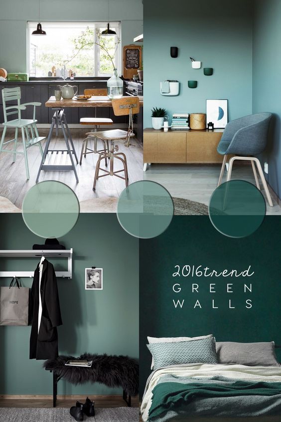
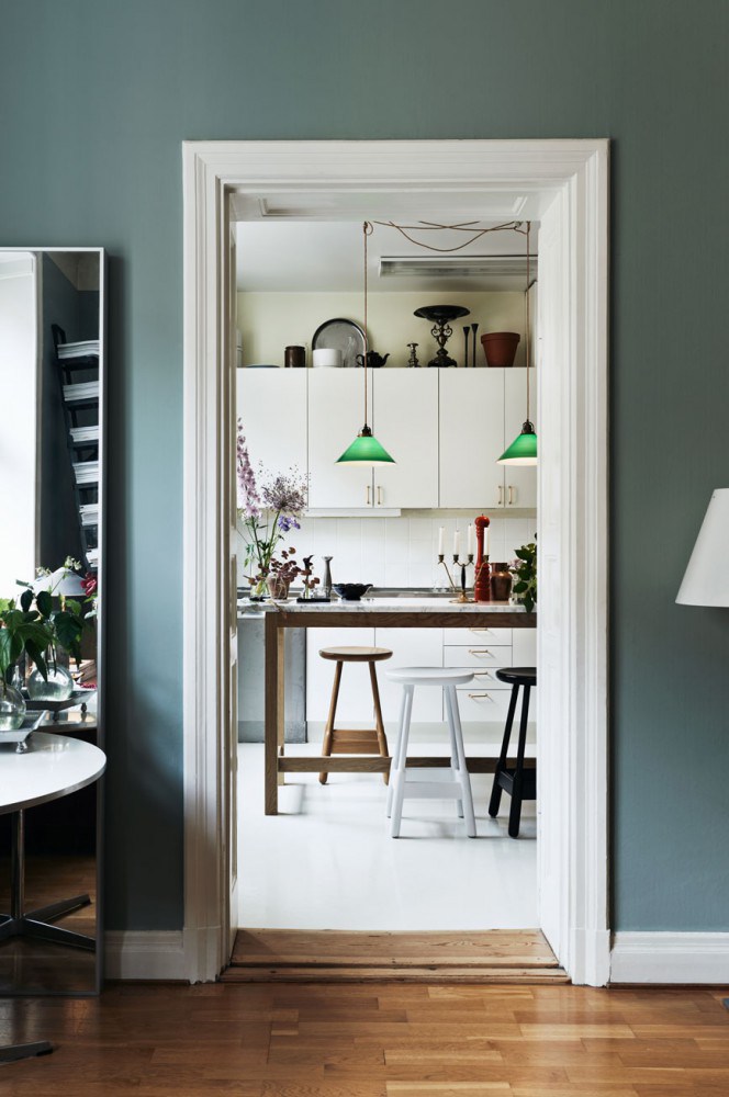
1 | green walls
[symple_spacing size=”20″]
[symple_spacing size=”20″]
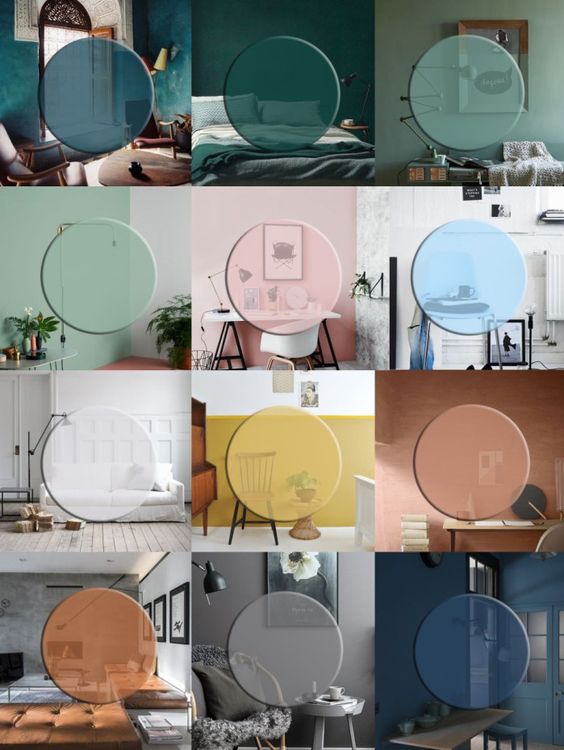
This is the most repinned photo of Pinterest feed (7.9k times?). It is linked to a post about green walls trend from January and is still the most popular one. And continues to be, despite references to an article in the January I mentioned the trend of green walls.
Green in interiors was rediscovered not just as natural green, that is, indoor plants (don’t speak about this here today, all know it’s a trend and hopefully it it’s going to last as it is a good trend!), but also as a color option for walls. Let’s think: a few times ago, who would ever think about green for wall paint? But let’s say this, it is a beautiful color, of course with the eye to choose the right shade.
I love it in its desaturated mix with gray, which makes green something similar to neutral shades; it’s very trendy also in dark tones that recall forest colours. Recently, thanks to French by Design blog I rediscovered a wonderful green called watched, it’s a mix of mint and azure: I don’t think it’s in a good fit with the next season, but I would bet for next spring/summer ♥
You can find my selection of hues and inspirations in green paint here, while here something more about coloured walls and how to choose the right hue
::
Questa è la foto più repinnata in assoluto del mio feed (7.9k volte?) e continua ad esserlo, nonostante rimandi ad un articolo di gennaio in cui vi parlavo del trend delle pareti verdi.
Il verde negli interni è stato riscoperto non solo in forma di verde naturale, cioè di piante in casa (di cui non vi parlo oggi qui, tanto è ovvio come trend), ma anche come opzione di colore per la casa. Ditemi la verità: fino a poco tempo fa chi ci pensava a dipingersi la casa di verde? E invece è proprio un bel colore, anche se come sempre occhio a scegliere la tonalità giusta.
Nelle sue versioni desaturate e mixate con il grigio, che si abbinano bene a tutto quasi come un colore neutro, o più scure che rimandano alle tonalità della foresta. Di recente grazie al blog French by Design qui ho anche riscoperto un verde stupendo, il watched, ovvero il mix tra menta e azzurro: anche se lo trovo molto estivo come colore, quindi non ci scommetterei sulla stagione in arrivo…ma su quella dopo, secondo me si ♥
Qui trovate la mia selezione di tonalità e ispirazioni in verde, mentre qui vi avevo parlato di pareti colorate in casa e di come scegliere il colore adatto
[symple_spacing size=”20″]


sources: 1. Dulux via the Design Chaser 2. Ingerstedt via italianbark 3. Bolig Magasinet 4. Bar Botanique, Amsterdam
[symple_divider style=”double” margin_top=”20″ margin_bottom=”20″]
2 | Patternmania
[symple_spacing size=”20″]

[symple_spacing size=”20″]
Less words and quotes (although I still like it so much all prints with quotes and so on!), more and more different pattern mixed and matched. Less graphic pattern, except in small scale or in ethnic theme, more and more natural and floral motifs. The mood goes from the exotic, the opulent, to the wild. On this theme, my Bible is the Pinterest feed Patternbank.
Already talk here about floral pattern, remember? Instead, even if jungle theme is still very popular, maybe it’s on its final times, after the Rio Olympics exploit, shall we say this? (You can find some tropical and jungle some inspirations here, it’s a post of two years ago) Together let’s put out all those cactus, flamingos, figus leafs, they are nice but maybe we are tired of them and so on. But this requires another post;)
Something more on the topic next on the blog, remember also this moodboard?
::
Sempre meno scritte (anche se a me i poster con frasi continuano a piacere cosi tanto!), sempre più giochi di pattern diversi nello stesso ambiente. Sempre meno pattern grafici, se non a piccola scala o a tema tribale (adoro!), sempre più motivi naturali e floreali. Atmosfere che passano dall’esotico, all’opulento, al wild. Su questo tema, la mia bibbia di riferimento è il feed Pinterest di Patternbank.
Di pattern floreali ve ne avevo già parlato qui, ricordate? Mentre il tema jungle è ancora molto popolare ma forse ha un po’ stancato, dopo l’exploit in concomitanza con le Olimpiadi di Rio, che dite? (alcune ispirazioni jungle qui, ve ne parlavo già due anni fa!) Insieme ci metterei tutti i vari cactus, fenicotteri, foglie di fico, e via dicendo. Ma per questo serve un altro post 😉
Di pattern vi riparlerò di sicuro, intanto ricordate questa moodboard?!
[symple_spacing size=”20″]
sources. 1. via 2. tinekhome via decor8 3. My Domaine 4. via
[symple_divider style=”double” margin_top=”20″ margin_bottom=”20″]
3 | tone-on-tone palettes
[symple_spacing size=”20″]
[symple_spacing size=”20″]
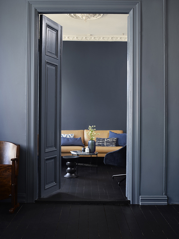
This is another of the most popular images in my feed, refers this January post about the colors of this in 2016 in my opinion.
Colours are greens, blues, grays, and earthy colors ( more inspiration on this here), in a colour match that I love and seems will be among the most popular for next this season, tone-on tone palettes.
The tone on tone is the opposite of contrast colour match: it’s about choosing one main hue and then another in its graded tone, playing on different shades of the same hue.
Look at these beautiful images collected by Eclectic Trends here!
::
Questa è un’altra delle immagini più popolari del mio feed, rimanda anche questa a un post di Gennaio che riportava quali fossero secondo me i colori di questo 2016.
Le tonalità sono quelle del già citato verde, dei blu, del grigio, e dei colori della terra (di cui abbiamo già parlato qui). Ma la grafica richiama un’estetica decorativa che pare sarà tra le più popolari di questa stagione, e a me piace moltissimo.
Il tono su tono, ovvero l’antitesi rispetto all’abbinamento per contrasto: si tratta di scegliere tonalità molto simili di colore e di giocare sulle differenzi sfumature dello stesso.
Guardate che belle queste immagini raccolte da Eclectic Trends qui sul tema!
[symple_spacing size=”20″]

sources: 1. 2. Eclectic Trends 3. VtWonen via Planete deco