img via
cover photo Photo: Jared Smith via MyDomaine
::
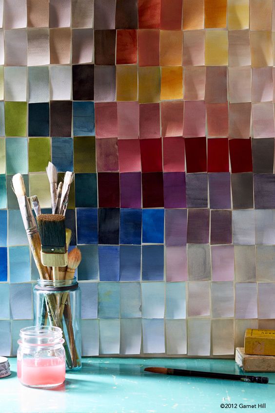
Feeling inspired in this summer day to talk about colour, colour at home and the colors of the year according to Pantone.
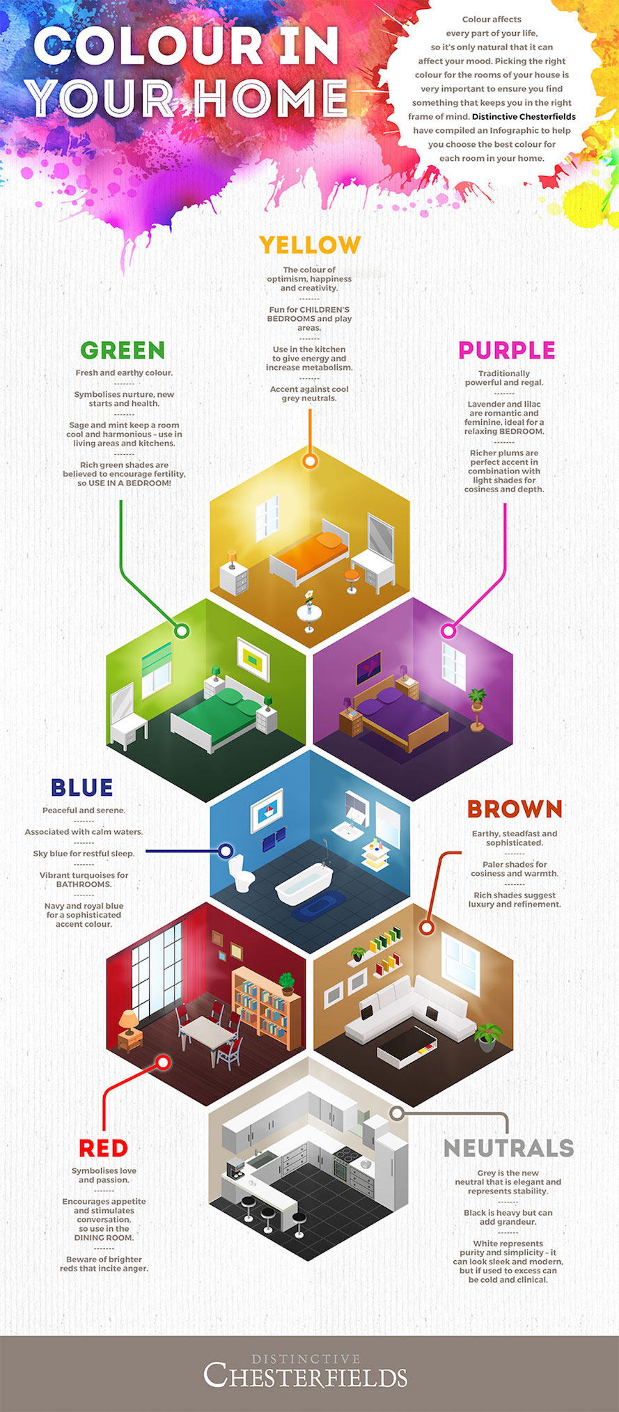
A few time ago in this post I talked about painting walls in bold or dark colours, about what I have done in my house more than about rules on this. In this infographic created by Di Distinctive Chesterfields , there are indeed some simple rules to keep in mind in choosing the color for a room, based on how this can affect our mood.
Yellow, red, blue, green … but in which hue? Let’s see what are the main colours for the season according to Pantone then!
::
Oggi in questa giornata estiva vi parlo ancora di colore, del colore in casa e dei colori di quest’anno secondo Pantone.
Poco tempo fa in questo post vi parlavo della tentazione di dipingere le pareti di casa in colori accesi oscuro, di quello che ho fatto in casa mia più che di regole in materia di colore. In questa infografica creata da Distinctive Chesterfields ci sono invece alcune semplici regole da tenere a mente nella scelta del colore per una stanza, sulla base di come questo può condizionare l’umore delle persone.
Giallo, rosso, blu, verde…ma in che tonalità? Vediamo che dice Pantone?
::
::
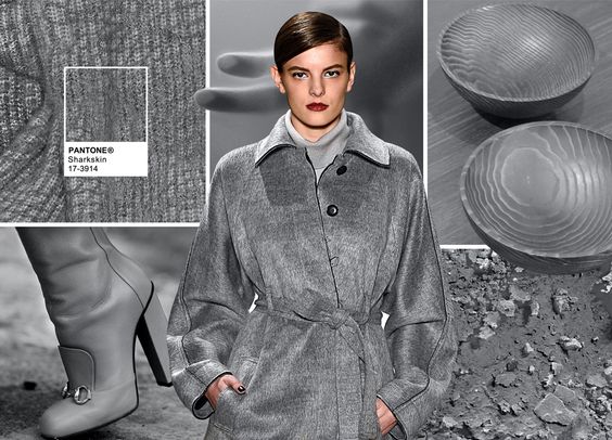
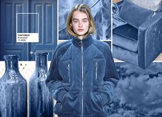
Pantone aw 2016 colour forecast
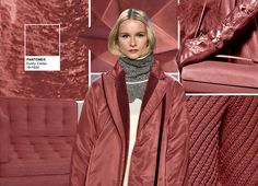
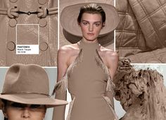
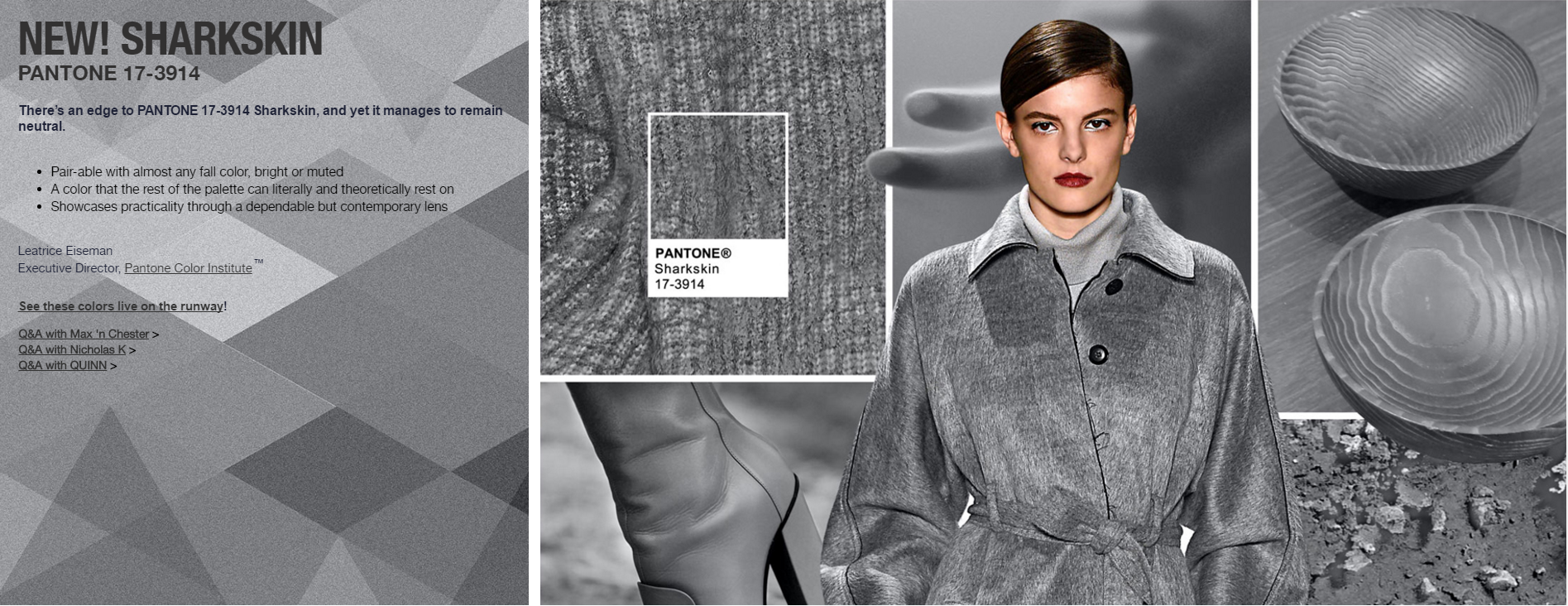
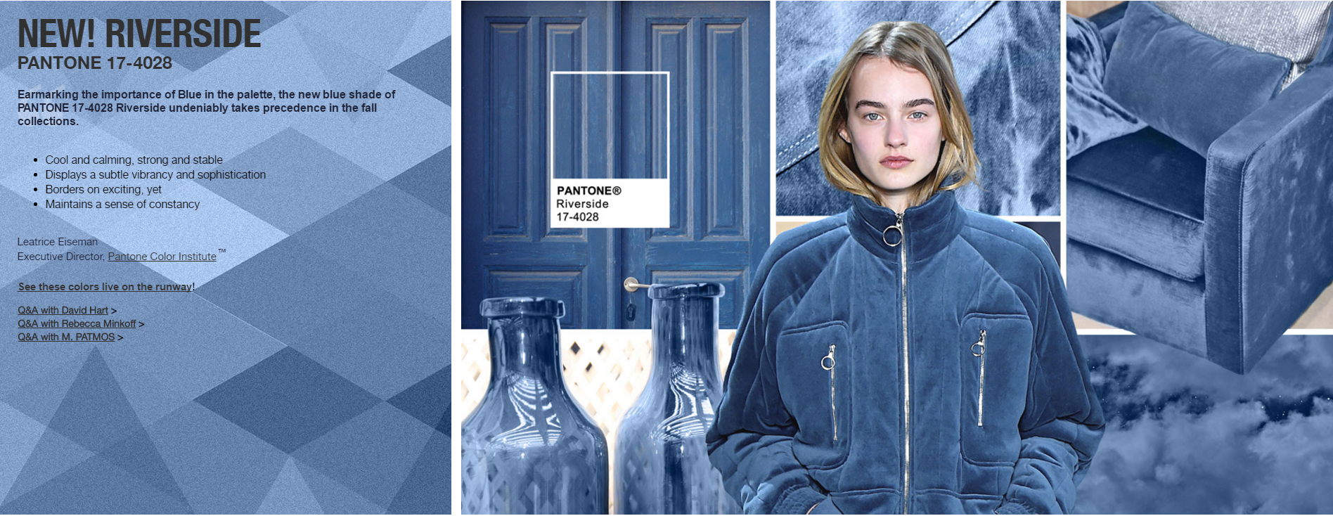
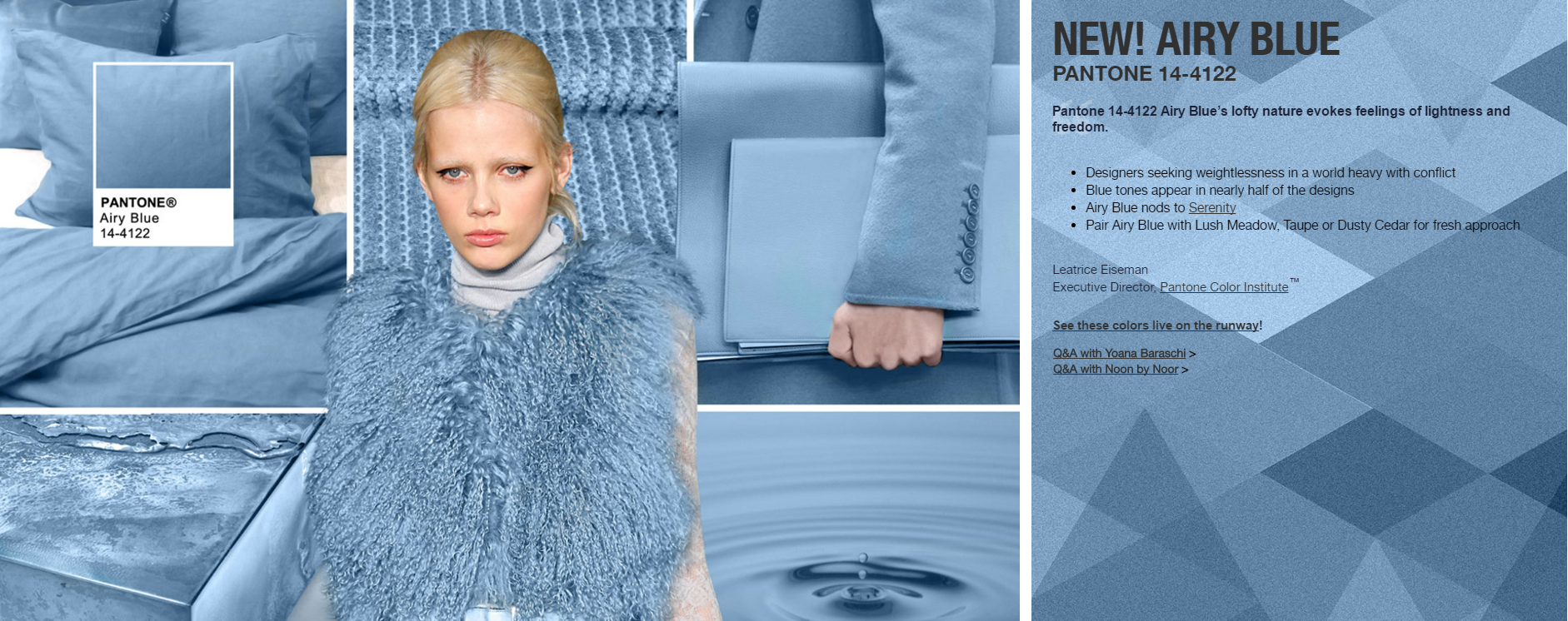
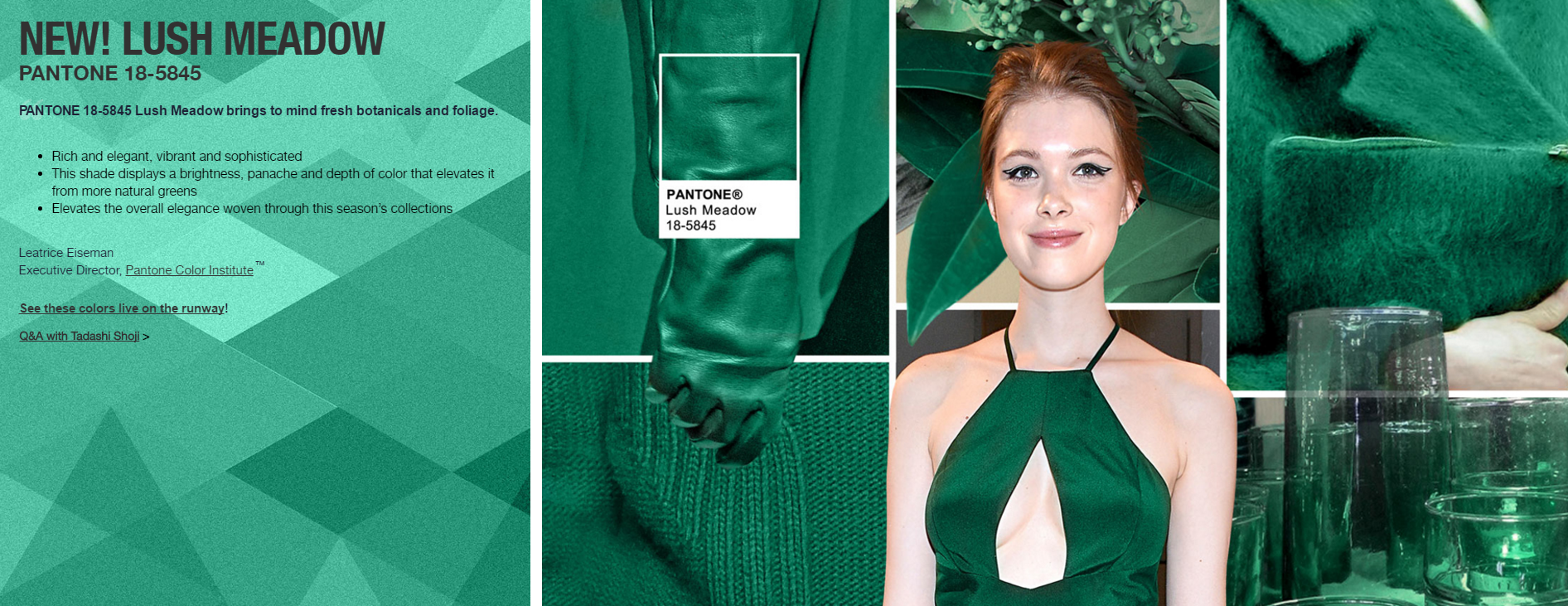
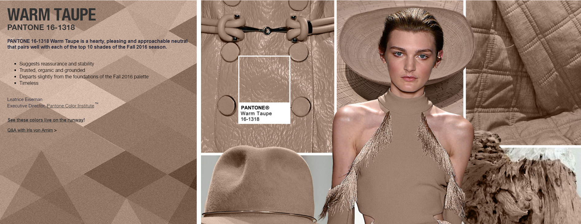
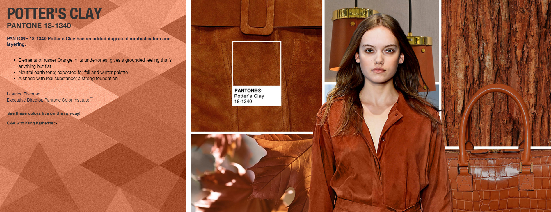
Pantone predicted for next season Autumn- Winter 2016 in its fashion colour report a match of earthy and vivid tones.
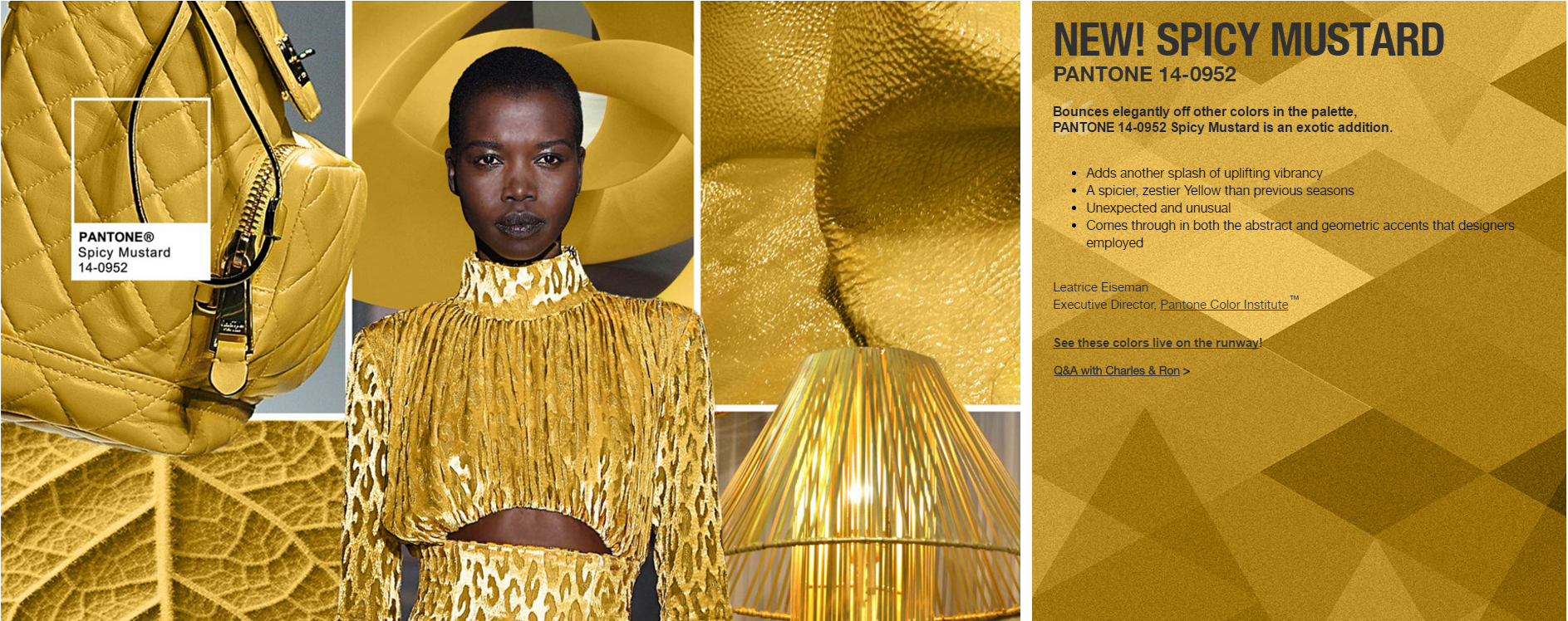
Grey, blue into two different shades ( I love this Riverside (17-4028), which is a darker hue of the Serenity chosen as colour of the year 2016 with Rose Quartz, while airy blue (14-4122) is more similar to it), together with a forest green reminding of foliage and botanicals (check here for more inspiration on green). These are matched with earthy hues such as taupe and clay, and with red that seems to be back in two different shades: one vivid (aurora red 18-1550) and a softer one, Dusty Cedar 18-1630 that gives a nod to the PANTONE Color of the Year 2016, Rose Quartz . Finally, this yellow spicy mustard 14-0952 reminds me a lot about the ochre gold, do you agree?
What do you think of the colour combination for next season?
::
Pantone per la stagione aw 2016 propone una combinazione di colori che rimandano alle tonalità della terra, del blu e del verde, con accenti in giallo, rosso e lilla.
Che ne dite? Io ho già un mio preferito, ed è quel Riverside che mi ricorda tanto i colori del tessuto jeans. Stiamo a vedere!
.


::
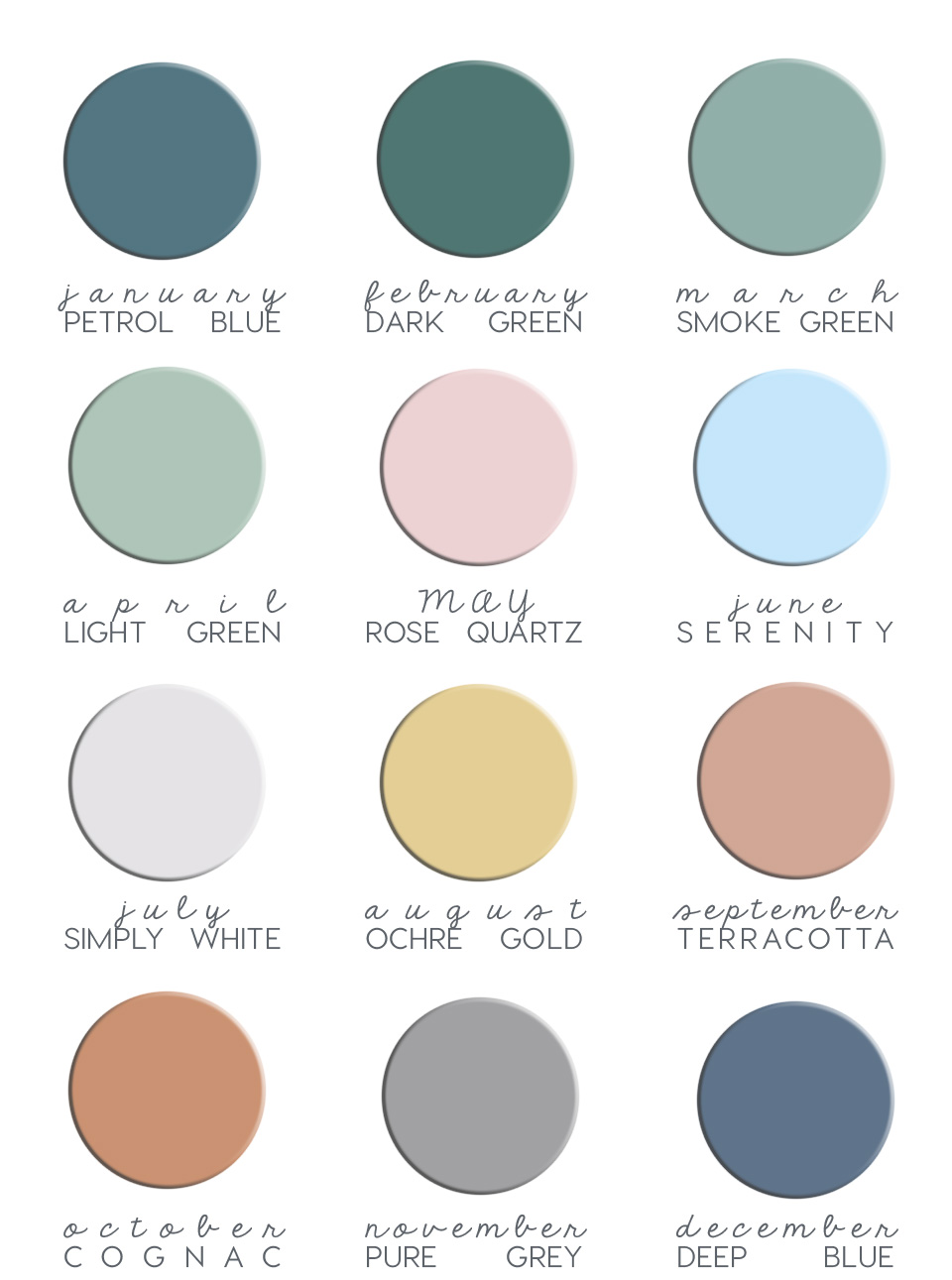
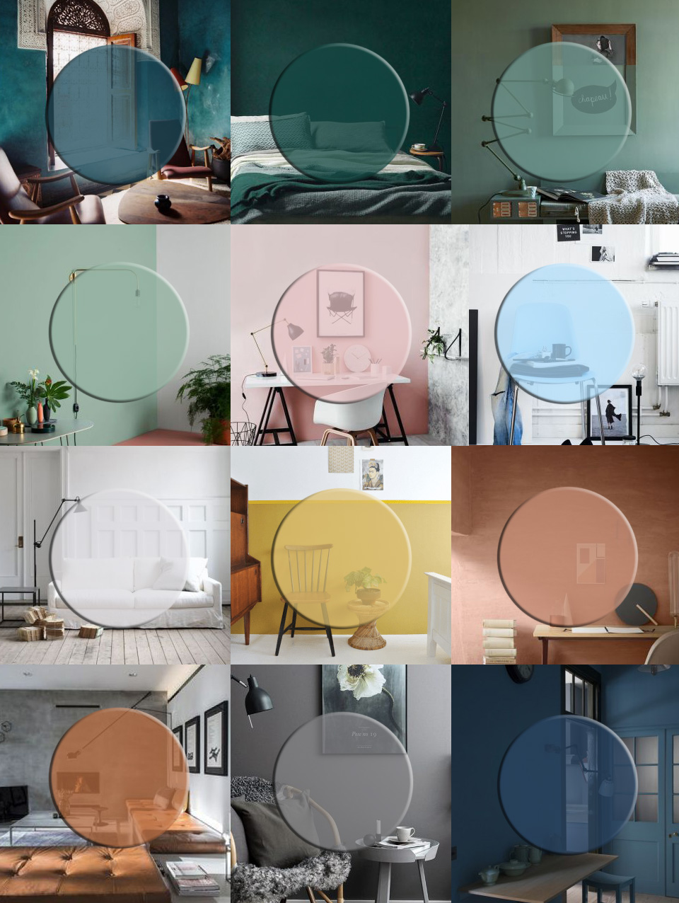
This is the colour calendar for this 2016 I’ve shared on January, no reds but feeling the same about greys, blues, greens and earthy tones.
Just click below for many other colour inspirations!