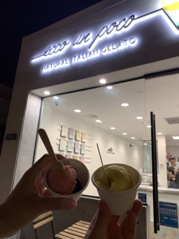
Ecco Un Poco is a new ice cream shop in Los Angeles which offers fresh and handmade Italian ice-cream. The shop is founded by a young Italo-Mexican couple.
The branding and interior design, that I developed through online interior design, reflects the young and fresh vocation of the shop, plus the different origins of the owners, who are linked together by the colours and mood of California.
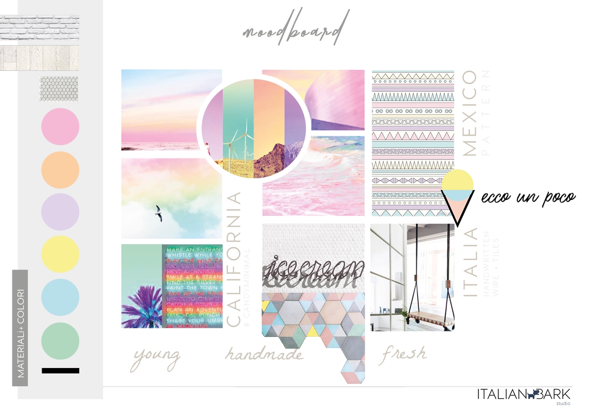
Ecco un Poco / Logo Design
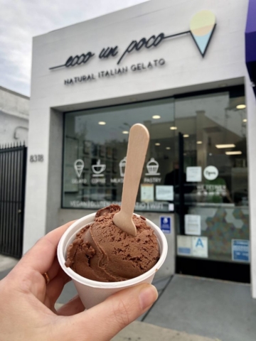
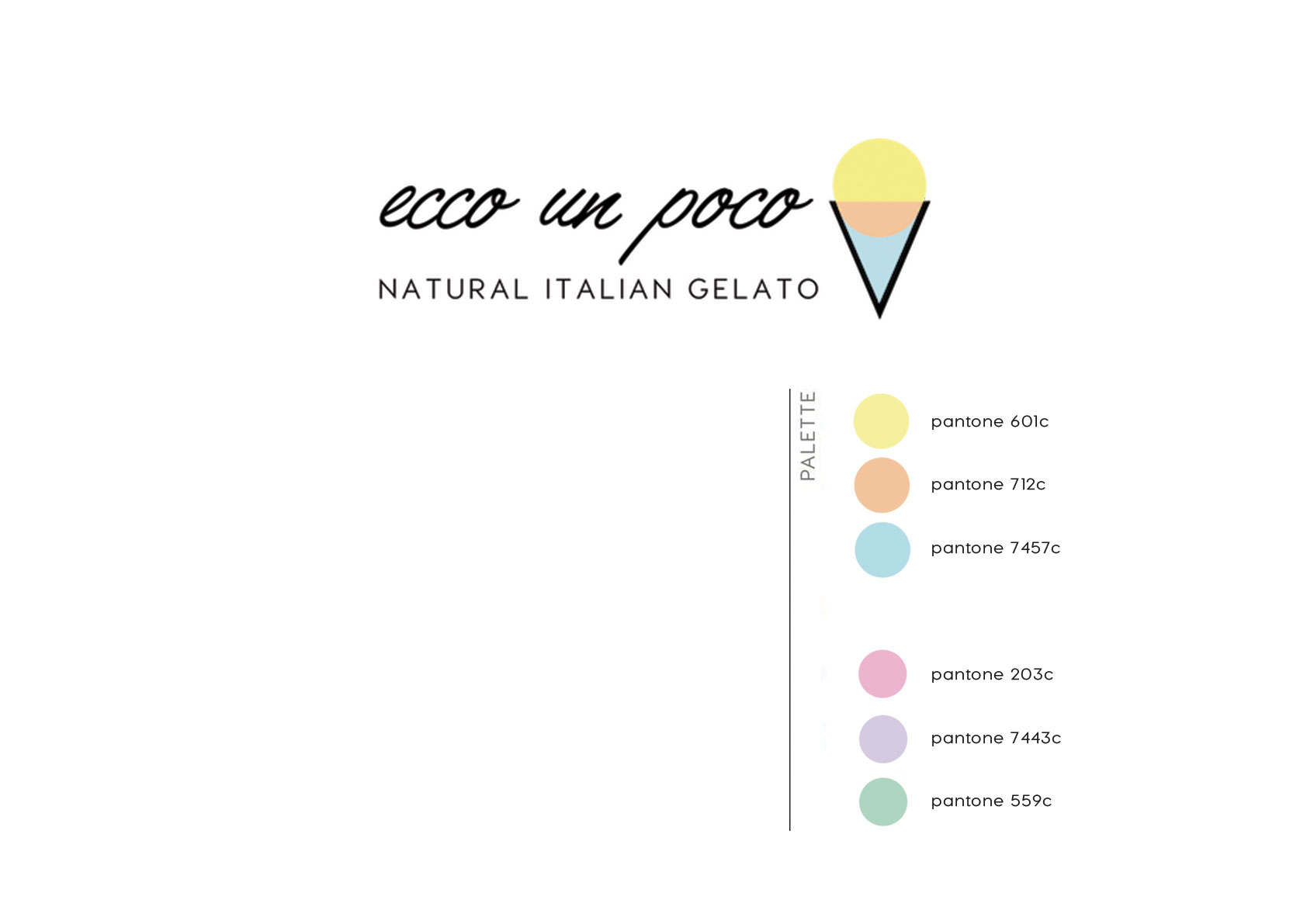
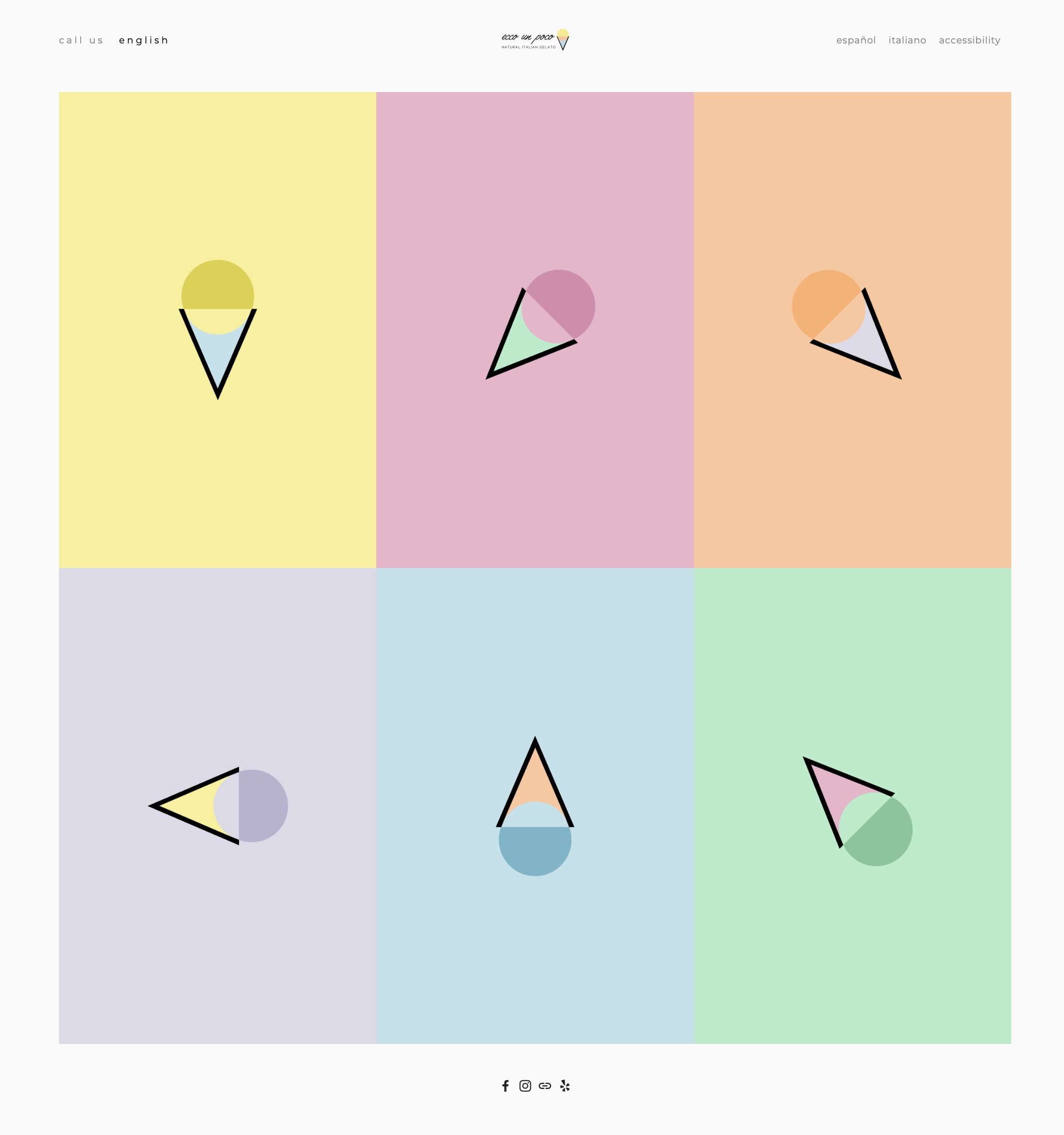
The logo design is a stylization of the ice-cream shape, with a color combination ( sky blue, peach orange. lemon yellow ) which recalls California sunsets. A palette of pastel colors have been chosen to give alternatives to the logo, and be used to define the interior and the different gelato flavors. The handmade quality of the shop is also expressed by the handwritten styled font.
Ecco un Poco / Interior Design
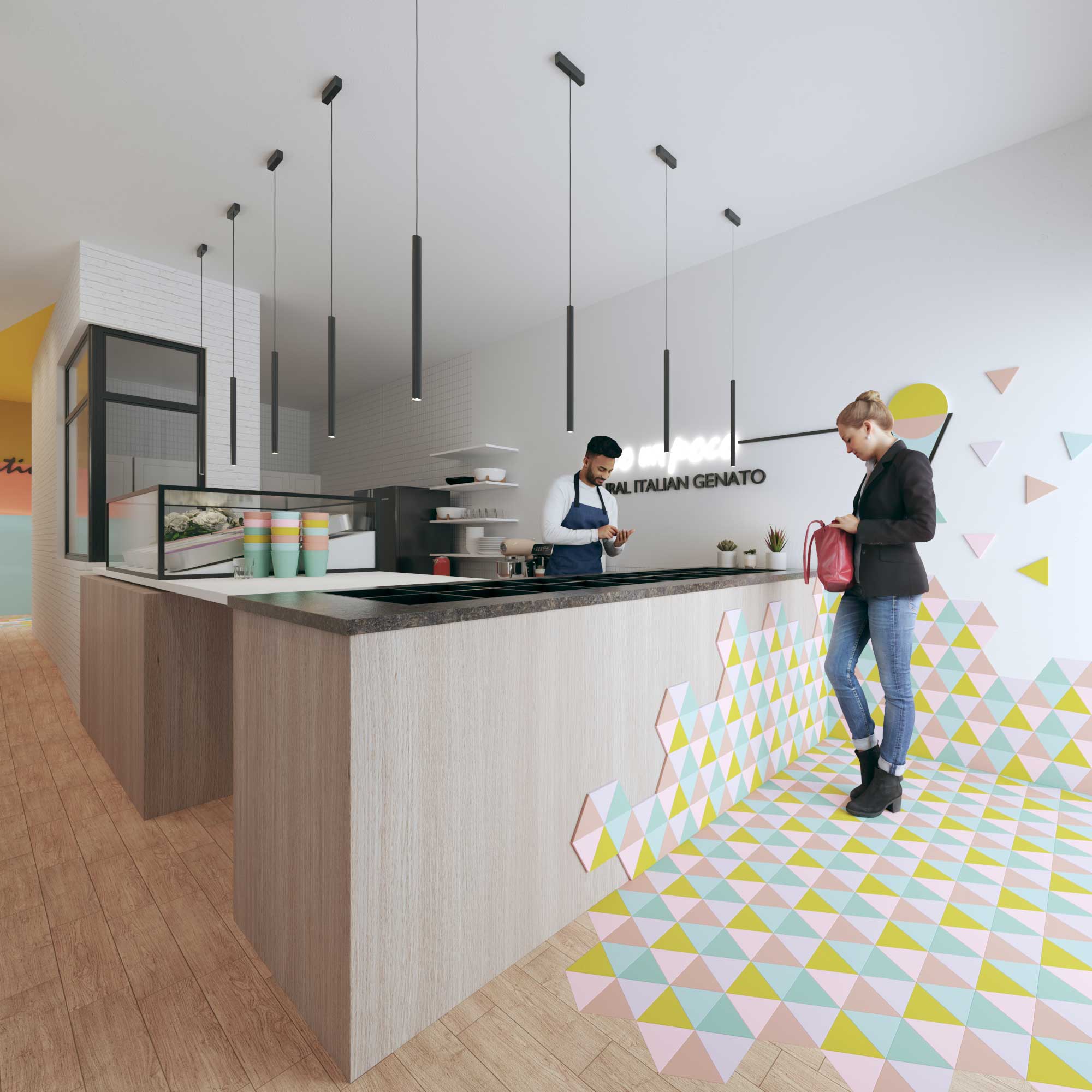
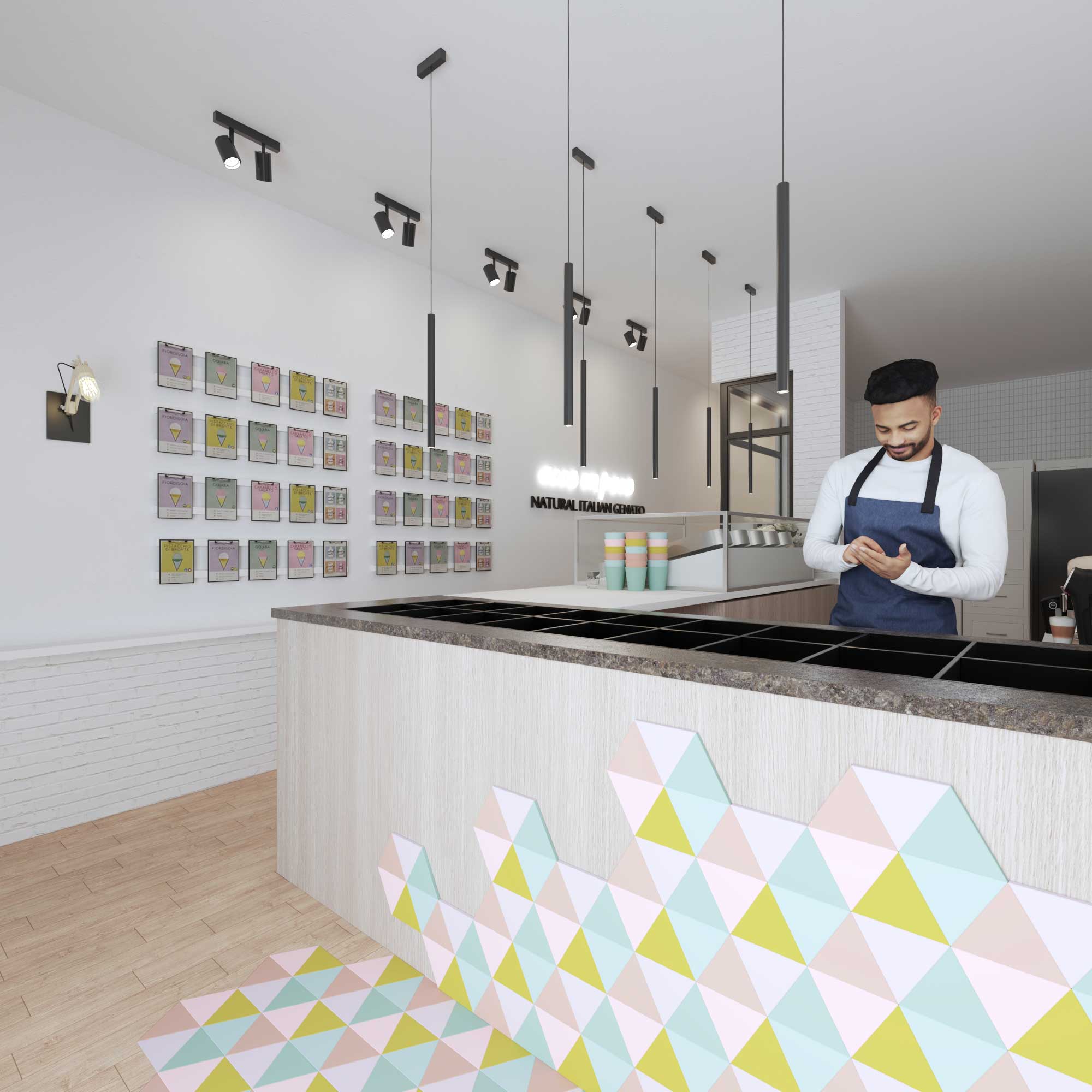
The interior design is playful and colorful, with a predominance of white to underline the freshness of products.
In fact, walls are mainly in white, with white exposed bricks behind the counter and some colourful neon signs to add a modern vibe. Cardboard and handmade details will remember the artisanal vocation of Ecco Un Poco.
The colour palette of the logo is repeated on the counter plus flooring tiled decor, which goes up to the wall becoming the shop logo sign. The same palette defines the back and the toilet, in horizontal color block decor.
The laboratory is divided by a white glazed partitions and covered with vertical white tiles, plus a vynil flooring to be easily washed.

