What will be Pantone’s 2019 color of the year?
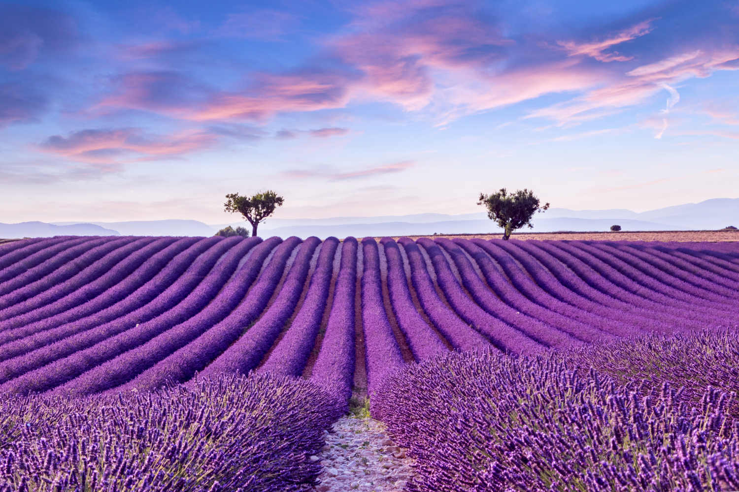
According to Pantone, the global leading Color Institute, 2018 was the year of Ultraviolet : which was quite a weird color trend for interiors, as it’s very hard to use and was often incorporated in much softer hues such as lilac and lavender. But in my opinion, it is quite a cool color for graphic design.
You may or may not agree with Pantone’s color of the year predictions but it is certain that they are influencing our tastes and perceptions about colors a lot, even if it’s in an unconscious way. A few days ago, I got a really interesting study in my mailbox regarding color trends and the most popular colors to people: maybe the Pantone 2019 color of the year is among them?
[ ITALIAN ]
Quale sarà il Pantone dell’anno 2019?
Secondo Pantone, l’istituto che regola l’omonima norma internazionale per il colore nella grafica, questo 2018 è stato l’anno di Ultraviolet : una tonalità piuttosto particolare, nonché un trend colore molto difficile da applicare negli interni e spesso declinata in colori più soft come il lilla e il lavanda. Ma, almeno a parere mio, un colore davvero cool per la grafica e il design.
In ogni caso, che tu sia o meno in sintonia con le scelte Pantone, sappi che in qualche modo comunque influenzano le nostre percezioni, spesso anche inconsciamente. Un paio di giorni fa ho ricevuto un comunicato stampa davvero interessante proprio sul tema tendenze colore: in particolare, con una ricerca delle tonalità preferite dalle persone, molto allineata con le ultime tonalità Pantone dell’anno. La condivido oggi nel blog: che tra questi ci sia anche il Pantone 2019 ?

Colors in bowl by jkjainu
–
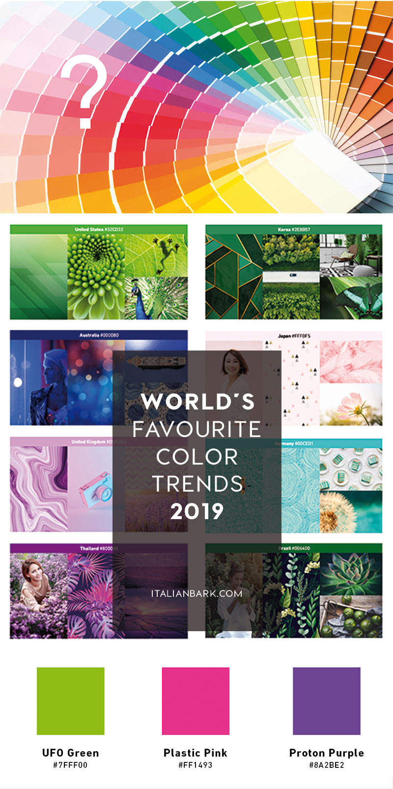
A rstudy on 2019 Color Trends according to people’s most beloved colors
Led by Shutterstock, the study I am sharing today gives three of the most popular global colours on the rise… and yes one is identical to Pantone’s 2018 Color of the Year. Plus – and this is the most interesting part – they have included one favourite colour according to different Countries.
Shutterstock being one of the largest online image banks, they were able to do a really wide analysis regarding color preferences, starting from the image downloads by using color pixel data and by mapping the pixel RGB level at a global and a country specific level.
–
Una ricerca sulle tendenze del colore 2019 in base ai colori più amati
Condotta da Shutterstock, l’indagine che condivido oggi riporta i tre colori globalmente più popolari oggi e uno è proprio il Pantone 2018. Inoltre, la ricerca elenca una serie di colori preferiti e più popolari in base alle diverse nazioni.
Shutterstock è una delle più grandi piattaforme di immagini online ed è stata perciò in grado di fare un’analisi molto ampia, partendo dai download di immagini effettuati, sulle preferenze in termini di colore da parte degli utenti. Usando i dati dei pixel colorati e mappando il livello RGB, in scala globale e specifica per nazione, ha trovato infatti una serie di risultati molto interessanti.
Color palette samples by Bokeh Art Photo
[symple_divider style=”dashed” margin_top=”20″ margin_bottom=”20″]
Most Popular Colors for 2019 are…
The top colors surging in popularity year-over-year in 2018 are three bright and neon hues: Proton Purple, Plastic Pink and UFO Green.
It’s very interesting to research the colors we love because they reflect more than just simple trends, but also our cultural moment and the period in which we live in. Think for example of the subdued, pastel shades of the ‘50s like clean robin’s egg blue or pale, pat-of-butter yellow that gave people a sense of peace after a decade of war. The natural greens and browns of the ‘70s aligned with the first Earth Day and cultural movements of that period. Surely, 2019’s Color Trends refer to a digital dimension.
Let’s see more about these 3 top colors.
–
I Colori più popolari per il 2019 sono…
Dalla ricerca sono emersi 3 colori in aumento di popolarità anno su anno nel 2018. Si tratta di tre tonalità luminose e al neon: Proton Purple, Plastic Pink e UFO Green.
È molto interessante fare delle ricerche sui colori che amiamo perché essi riflettono più delle semplici tendenze, ma rappresentano il nostro momento culturale e il periodo in cui viviamo. Pensiamo ad esempio alle tonalità tenui e pastello degli anni ’50, che davano alle persone un senso di pace dopo un decennio di guerra. I verdi e i marroni naturali degli anni ’70 sono allineati con i movimenti culturali di quel periodo. Di sicuro, le tendenze del colore del 2019 parlano di una dimensione digitale.
Vediamo insieme quali sono questi 3 colori.
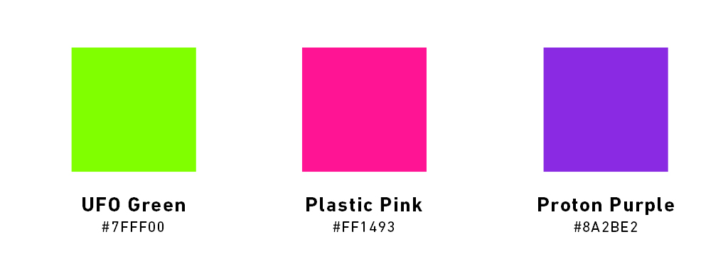
1#
Proton Purple / Color Trends 2019
Proton Purple is a vivid purple representing the palpable positive charge of our daily lives. It is very similar to Pantone 2018 Ultraviolet. Color code: #8a2be2
Proton Purple è un viola acceso che rappresenta positività. E’ anche molto simile al Pantone 2018 Ultraviolet. Codice colore: #8a2be2

.
2#
UFO Green / Color Trends 2019
UFO Green is a bright green that evokes lush country sides alongside whirling rows of binary code. Remembers of Pantone 2017 Grenery
UFO Green un verde brillante che evoca paesaggi lussureggianti in codice binariodigitale. Ricorda il Pantone 2017 Greenery. Codice colore: #7fff00


.
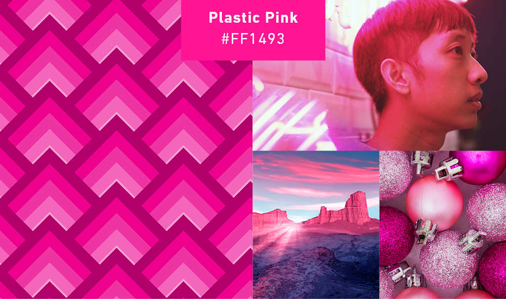
3#
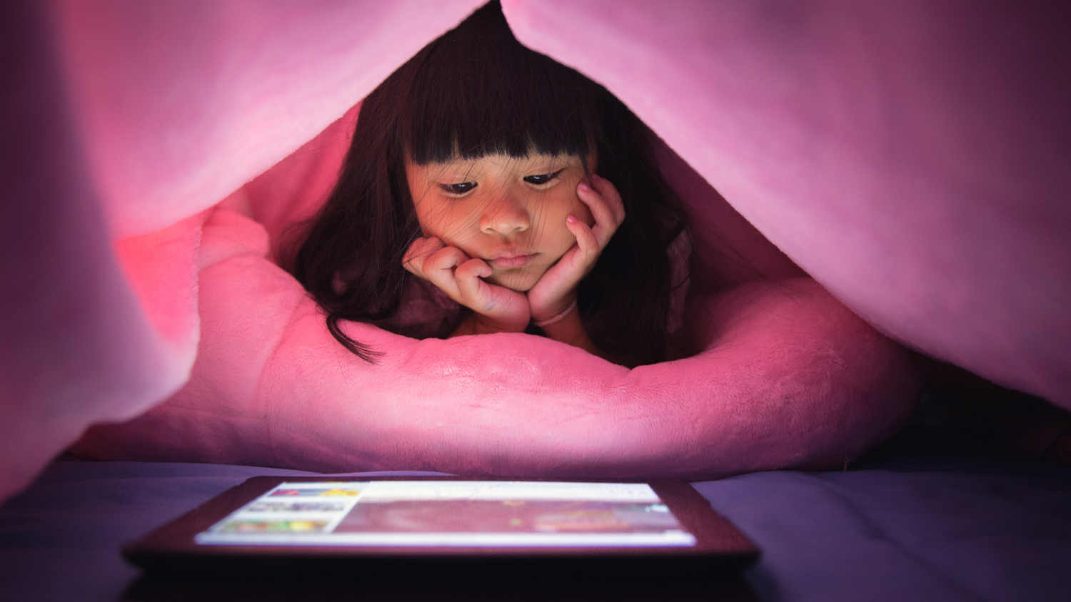
Plastic Pink / Color Trends 2019
Plastic Pink is a sizzling pink with lots of depth, that captures the electric glow of cities at night. Color code: #ff1493
Plastic Pink è un rosa con molta profondità, che cattura la luce elettrica delle città di notte. Codice colore: #ff1493
[symple_divider style=”dashed” margin_top=”20″ margin_bottom=”20″]
Color Trends 2019 in Different Countries
In addition to the top three fastest-growing colors in global popularity, the report also highlights the top trending color for 20 different countries around the world. I think this is the most interesting part of the study because color preferences changes according to the times, but also according to the place and culture in which you live.
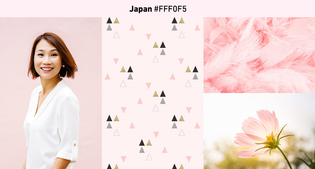
From lavender blush in Japan (recalling sakura) to plum in the U.K., these hues show us which are the local color favorites in different places around the globe. I am not surprised that for Italy it is a warm hue of pink.
PS: Maybe the Pantone 2019 color of the year may be found among these hues?
–
Le tendenze colore 2019 in base ai differenti Paesi
Oltre ai tre colori con la più rapida crescita in popolarità a livello mondiale, la ricerca riporta anche il colore più di tendenza in 20 paesi diversi in tutto il mondo. Penso che questa sia la parte più interessante della ricerca poiché le preferenze cromatiche cambiano sia in base all’epoca in cui viviamo, sia in base al luogo in cui ci troviamo e alla cultura in cui cresciamo.
Dal color lavanda in Giappone (che ricorda senza dubbio il sakura) al prugna del Regno Unito, queste tinte ci mostrano quali sono i colori locali preferiti in diversi luoghi del mondo. Non mi sorprende che per l’Italia ci sia una tonalità calda di rosa.
PS: Forse il colore Pantone 2019 dell’anno si trova proprio tra queste tonalità?

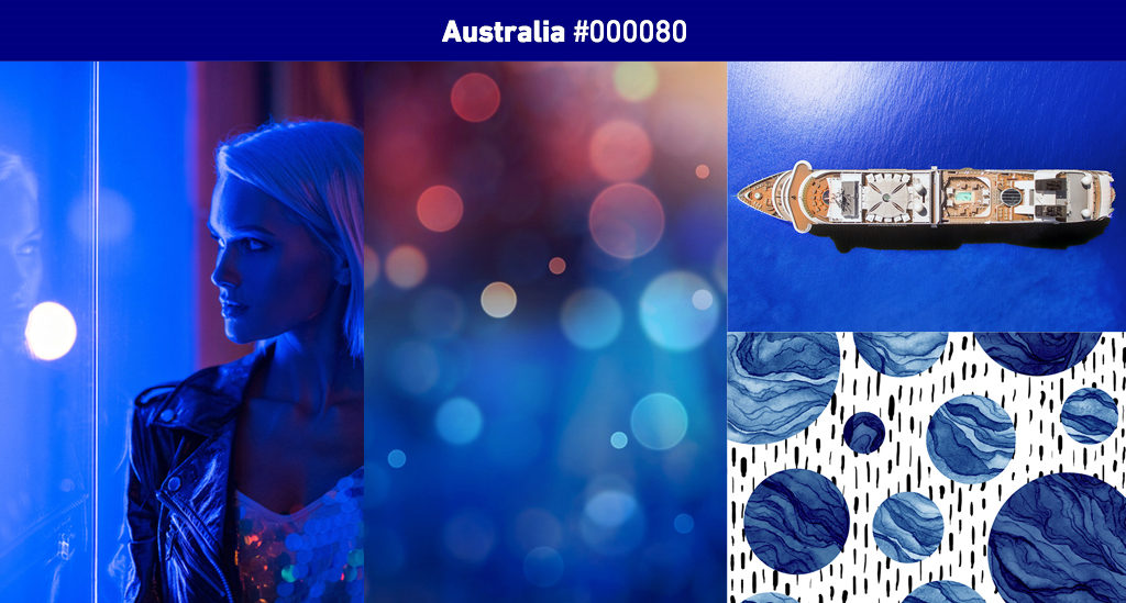

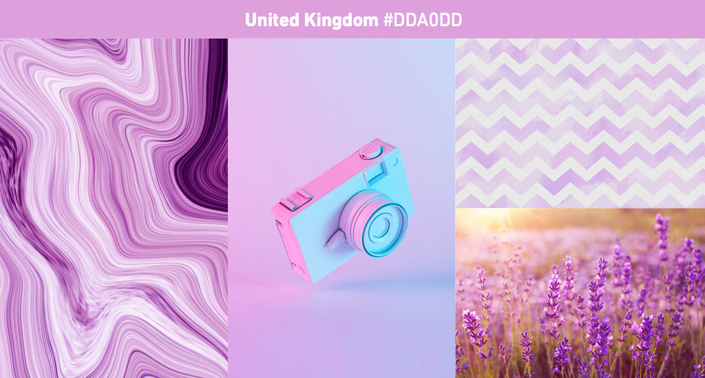
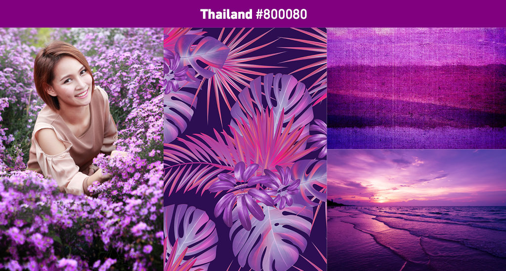
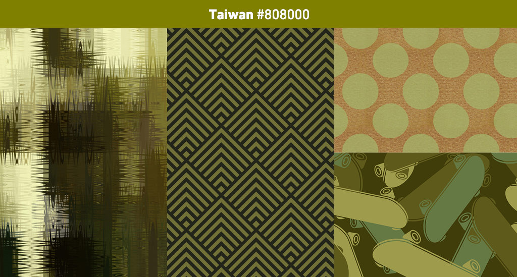


Explore some Countries here:
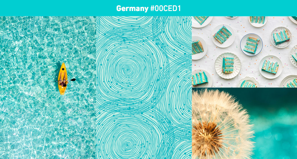
Thailand Taiwan Australia US UK Korea Japan Germany Brazil
Images via Shutterstock. Read the complete research here
[symple_divider style=”dashed” margin_top=”20″ margin_bottom=”20″]
More about Interior Color Trends:
- The Colors from milan Design Week 2018 that will last in 2019
- The color everybody is loving now for Interiors
- Pastels are the new Neutrals
- What’s the world’s favourite color? it is called Marrs Green
[symple_divider style=”dashed” margin_top=”20″ margin_bottom=”20″]
Liked this post? Pin it!