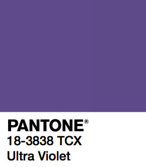
Pantone of the Year 2018 is a strong and vivid hue of violet, the Pantone Ultra Violet 18-3838
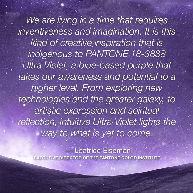
“The Pantone Color of the Year has come to mean so much more than ‘what’s trending’ in the world of design; it’s truly a reflection of what’s needed in our world today.” – Laurie Pressman, Vice President of the Pantone Color Institute.
Ultra Violet Pantone looked really like a weird choice to most of people. I expected Pantone 2018 to be a bold color and violet was actually among my predictions – together with red, that’s a great match with ultra violet.
I remember last summer I added violet in my 2018 Interior Trends Guide (that you can still download for free here) and it was also in my Report with the Color Trends for 2018 from Milan Design Week 2017. In Milan it was actually the first time I noticed the use of dark purple and violet in several projects and new products, it drew my attention because it was something new . Violet is closer to blue, usually less saturated than purple, which has some hint of red instead.
This doesn’t mean I do like violet, I realized I have almost nothing in ultra violet at home. But I love to see how color trends change, how they evolve, and I think there is much more behind than just telling “I like this” or “I dislike this”. And it’s also much more than just about interiors actually.
Ultra Violet Pantone communicates originality, ingenuity, experimentation and non-conformity. It is also the color of mindfulness practices and spirituality.
Enjoy today a round up of inspiration and moods in Pantone Ultra Violet. I’m expecting a lot of this next year: if you are unsure about how to incorporate Ultra Violet in interiors, I’m coming soon with some inspiration also on this.
[ ITALIAN VERSION BELOW ]
Pantone 2018 Ultra Violet Mood #1 | Iridescent


Sources: 1 | Softness by Pablo Alfieri – 2 | American Spirit – 3 | Aaron Kaufman via – 4 | Oh My Pastel by Machineast
Find more on Iridescent Design here
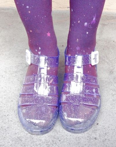
Pantone 2018 Ultra Violet Mood #2 | Cosmic


sources: 1 | via Purple Aesthetic – 2 | – 3 | via – 4 | Stailuan – 5 | via
Discover more about Pantone Swatches Instagram project here
Pantone 2018 Ultra Violet Mood #3 | CyberPunk


Sources: 1 | Blade Runner 2049 – 2 | Ultraviolet Break of Day, by photographer Marcus Wendt via Creative Boom – 3 | via – 4 | via
Pantone 2018 Ultra Violet Mood #4 | Modern Romance
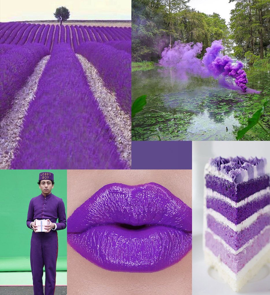


Sources: 1 | via – 2 | Filippo Minelli via – 3 | Grand Budapest Hotel via – 4 |Lipstick Junkie Forever – 5 | Cake Merchant
Pantone 2018 Ultra Violet Mood #5 | Indian Chakra
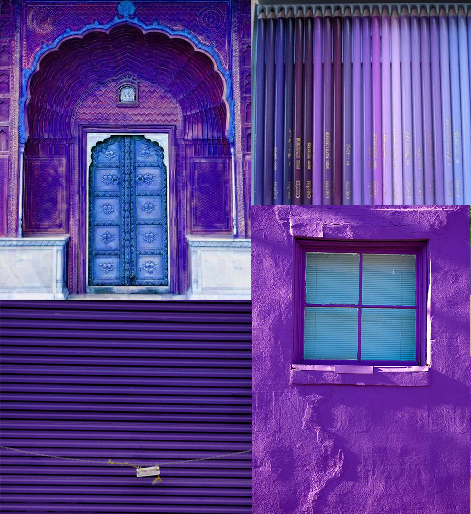


Sources: 1 | via – 2 | via – 3 | via – 4 | Tiger Tears Blog
–
More inspiration on Pantone Color of the Year from the past:
Pantone 2017 Color of the Year Greenery
Pantone 2016 Color of the Year Rose Quartz + Serenity
Pantone 2015 Color of the Year Marsala
–
[ ITALIAN ]Il Pantone del 2018 è una tonalità forte e decisa di viola, il Pantone Ultra Violet 18-3838
“The Pantone Color of the Year has come to mean so much more than ‘what’s trending’ in the world of design; it’s truly a reflection of what’s needed in our world today.” – Laurie Pressman, Vice President of the Pantone Color Institute.
L’Ultra Violet è parsa alla maggior parte delle persone una scelta davvero strana e poco condivisa. Io in realtà mi aspettavo una tonalità molto forte per quest’anno e il viola era tra le mie ipotesi – assieme al rosso, che comunque in coppia con il viola è perfetto.
La scorsa estate avevo aggiunto il viola nella Guida alle Tendenze di Interior per il 2018 (che potete ancora scaricare gratuitamente qui) , il viola era anche nel mio report delle Tendenze Colore per il 2018 dalla Milano Design Week 2017. A Milano avevo notato per la prima volta un diffuso utilizzo del viola negli allestimenti e nei prodotti, che mi aveva colpito perché qualcosa di nuovo rispetto ai soliti colori di tendenza.
Ciò non significa che amo il viola, in realtà non ho praticamente nulla di viola in casa. Ma mi piace notare come cambiano le tendenze, come cambia la nostra percezione dei colori, e penso che questo vada necessariamente un po’ oltre del singolo “mi piace” o “non mi piace” un colore. E oltre al semplice settore degli interni.
Con Ultra Violet Pantone intende comunicare originalità, ingenuità, sperimentazioen ed anticonformismo. E’ anche il colore della spiritualità, che male di sicuro non fa.


