January: New month, New year and – can you believe – a new decade!
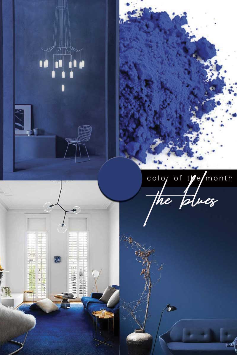
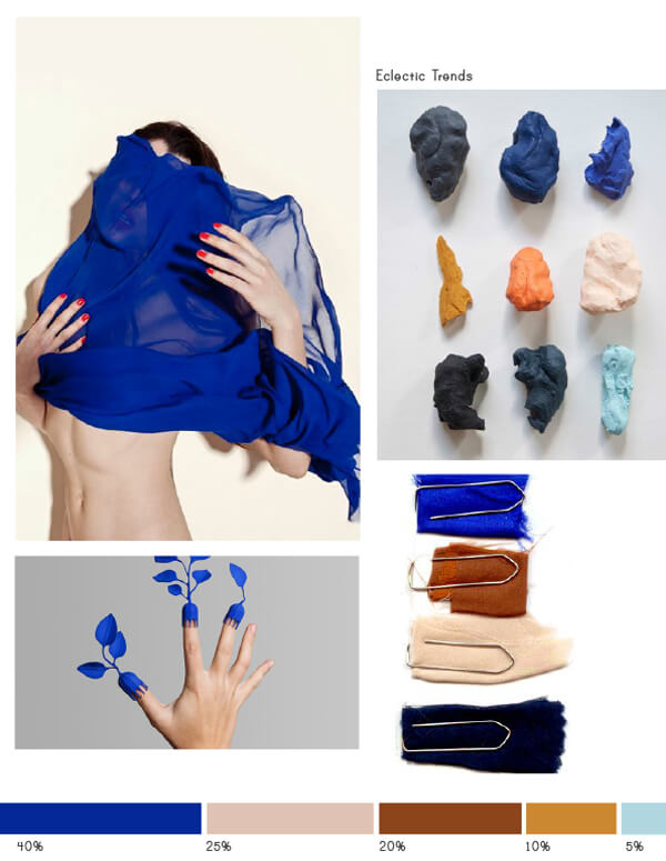
This January we are bringing it back to blue. From the calm and serene (Baby blue) to the dynamic, dramatic and exhilarating Electric blue – through to the Classic. Not only is blue the most popular choice globally – Pantone have selected Blue as their Colour of the Year 2020 – when it comes to the particular shade, they have decided to keep it Classic.
|| Be inspired: Blue Interior Trend
Via @pantone, @livelokai / via / via
–
BLUE COLOUR TREND
INTERNATIONAL KLEIN BLUE to CLASSIC BLUE
Blue represents both the sky and the sea and is associated with open spaces, freedom, intuition, imagination, expansiveness, and sensitivity.
Psychologists suggest that the popularity of the hue may take root in our evolutionary development. In the hunting-and-gathering days, those drawn to positive things for instance clear skies and clean water – were more likely to survive – over time this preference for the colour may have become hard-wired. Yet, scientifically speaking – the sky and the oceans are not really blue – well not in the same way that leaves are green and soil is brown. For the most of art history this posed a big problem. Unlike certain browns, reds and yellows – you can’t capture the blue of the sky, grind it up and then throw it on a canvas. Blue pigment is not quite as easily made (source Artsy- a brief history of blue).
via @bellemagazineau
International Klein Blue (IKB)
Known as Klein Blue, it is a deep blue hue invented and made famous by the French artist Yves Klein. For him, colour – particularly this most vivid shade of blue – “represented a kind of freedom”.
Yves Klein’s ‘love affair’ with the colour blue began when he was seduced by the deep cerulean skies of the French Mediterranean. He considered that this colour had
‘a quality close to pure space and associated it with immaterial values beyond what can be seen or touched’ (tate.org).
It was paint supplier Édouard Adam who truly ignited Klein’s passion for blue – showing him two powdered pigments – Prussian blue and Ultramarine blue. Klein became preoccupied with colour and out of all the colours Klein used – ultramarine blue became the most important. The artist began painting entire canvases, everyday objects, and casts of ancient sculptures with French Ultramarine – which had been invented about a century before. Ultramarine – a deep blue colour pigment literally meaning “beyond the sea”.
‘Yves Klein had been refining his use of colour, striving to capture a shade of blue that would encompass his entire experience – eradicating the horizon and combining the earth and the sky, laying bare the range of his own emotions, unlocking an experience of the endless void of space’ (International Klein Blue facweb).
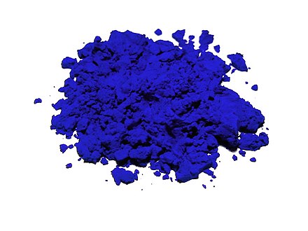
Synthetic ultramarine, similar to that used in IKB pigment via 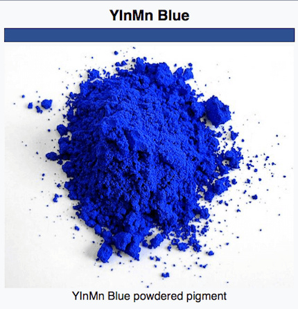
The right blue was hard to find. When Klein found a pigment, he was happy with; the process of mixing it with any agent, changed the shade and ultimately destroyed the effect. The artist ‘experimented with a binder to preserve the luminescence and powdery texture of raw yet unstable ultramarine pigment’ . Working with a chemist – he created his very own colour – a strikingly saturated matte version of ultramarine – patented under the name International Klein Blue, in 1960.
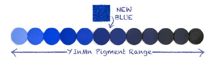
The visual impact of IKB comes from its heavy use of Ultramarine, as well as Klein’s often thick and textured application of paint to canvas. The Frenchman YVES Klein – created a hue that had never existed before. Another more recent accidental discovery is a new, but inorganic YlnMn Blue and has a fond familiarly with IKB.
Classic Blue
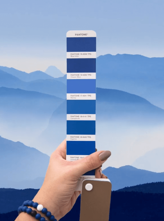
Since global influencers Pantone announced earlier in December – Classic Blue as their new colour for 2020 – expect a surge in blue, anything from mid tone to bright, deeper inky and indigo.
The Colour of the Year process has been running since 2000 as a way to forecast trends in the colour industry and wider industry. Look back to the first colour picked Cerulean Blue – two decades later blue is back on the colour cards and this time they have chosen ‘Classic.’
In contrast to the selection of more striking colours in recent years, which have grabbed attention and a reaction, the colour surprises by being a safe ‘Classic Blue’ – “a solid and dependable blue hue we can rely on.” The reassuring qualities of Classic Blue are said ‘to offer the promise of protection; highlighting our desire for a dependable and stable foundation from which to build.’ A reaction to the fast-moving society and also the company’s first “multi-sensory colour of the year, pantone call Classic Blue a “timeless and enduring hue elegant in its simplicity.”
As part of the multisensory experience at the announcement of the Colour of the Year Firmenich perfumers crafted a unique fragrance symbolising the meeting of the sky and sea. Perfumer Ashley Balavoine created a scented candle that evokes Classic Blue with notes of “water and sea salt lifted by airy sky.”

The colour for 2020 represents not only a new year but reflects the start of a new decade. Whereas Paint company Dulux have selected an early morning inspired tranquil dawn – pantone have opted for a colour suggestive of the sky at dusk.
“A boundless blue evocative of the vast and infinite evening sky, Pantone 19-4052 Classic Blue encourages us to look beyond the obvious to expand our thinking; challenging us to think more deeply, increase our perspective and open the flow of communication,” said Leatrice Eiseman, executive director of Pantone Color Institute.

|| Be inspired: Color Trends for 2021 starting from Pantone 2020 Color of the Year
When it comes to a colour for a new decade, green is a popular choice (previously written about in The Future is Green). That is not to say that any other colour – comes out of the blue as to speak. Although typically green conveys the environment and ultimately the planet which is of huge discussion of recent times and most definitely on the agenda for the future. The documentary series Blue Planet narrated by the great David Attenborough in 2001 took us ocean deep and brought to the surface / opened our eyes to the impact of plastic in our oceans. Subsequently the colour subconsciously connected or maybe re-connected with our planet. Earth – often compared to a majestic blue marble, especially by the fact that our world is mostly covered in water.

–
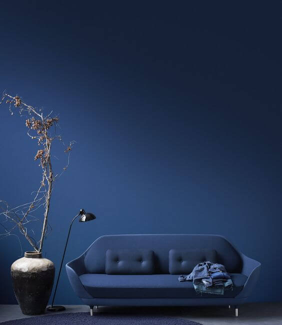
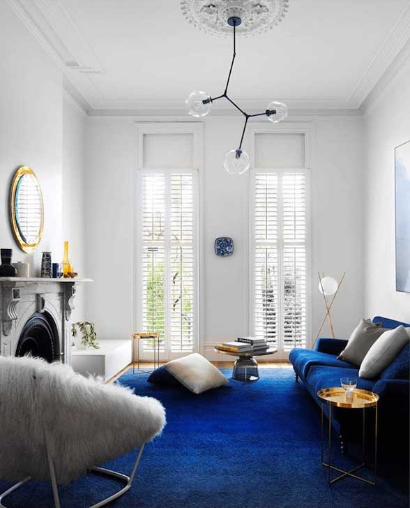
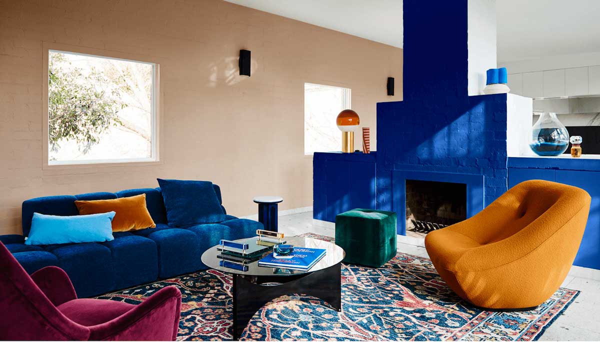
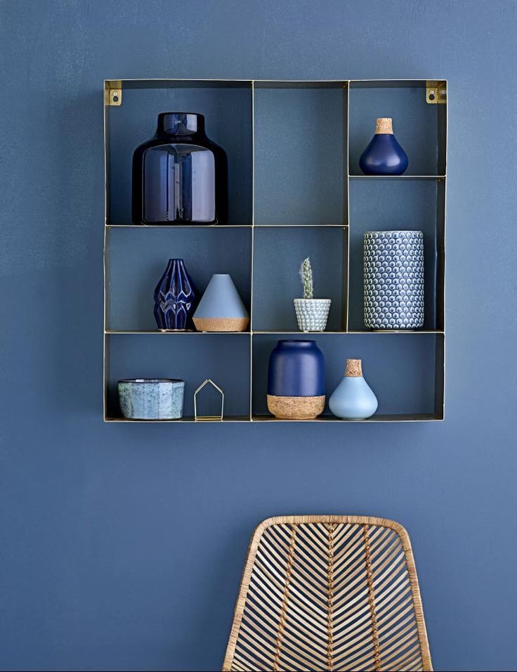
BRINGING the BLUE COLOUR TREND into INTERIORS
Companies that have also backed blue as their colour of 2020 include PPG paints with Chinese Porcelain – a blend of cobalt and moody, ink blue offers escapism. “The need for simplicity and escapism from technology is in part, the reason that consumers are craving blues like Chinese Porcelain that bring us closer to natural elements such as the sea and sky” says Dee Schlotter, senior colour manager at PPG Paint.
Whereas paint brand Sherwin-Williams have named Naval as their colour of the year – a rich navy with hints of sapphire, which embodies the dualities of glamour and serenity.
Dulux au have created comeback a palette which blends eclectic style with vintage charm which includes Dulux Master Blue. Borrowing from the past, it turns our focus to the design classics of the 1920s-1950s, such as the Bauhaus, and Arts and Crafts movements. The result – a blend of personality, heritage and sense of home.
Dulux
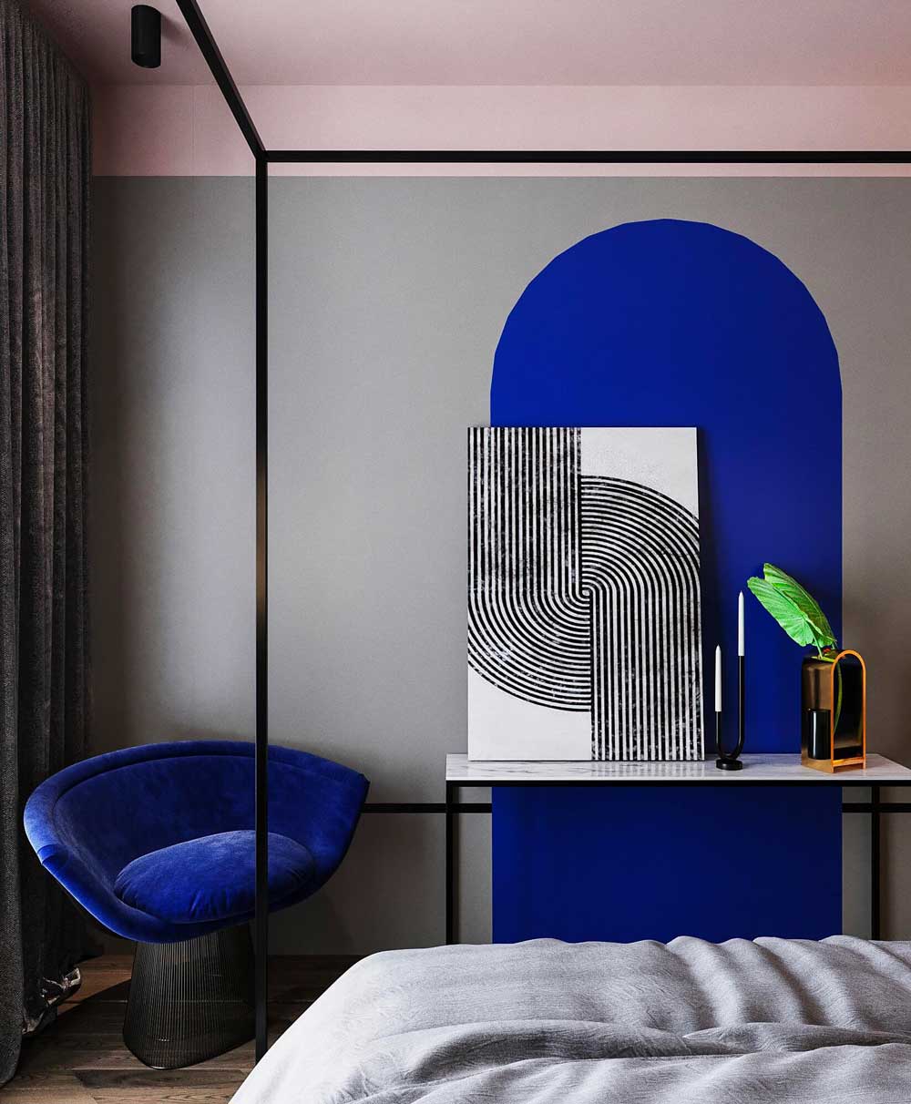
The love for blue is nothing new – in recent years we have seen a comeback in IKB and we see the colour popping up more and more in design/ interiors and especially now pantone have chosen blue. Although pantone selected a particular shade of Classic Blue (Cobalt blue hue) we are already seeing variations in blue – some heading towards the Cobalt and the deeper moody side of blue.
For it was artist Yves Klein that left an iconic impression for this colour – his shade now recognised as International Klein Blue. Homage to the artist Yves Klein -French paint manufacturer Ressource has just expanded its bespoke offerings to include a blue inspired by Klein’s passion. Aptly- named “Teint Yves Klein.”
Intense blues are emerging everywhere and under various name guises too; including Electric blue, Hyper blue, Cobalt blue even under the bracket of inky blues.
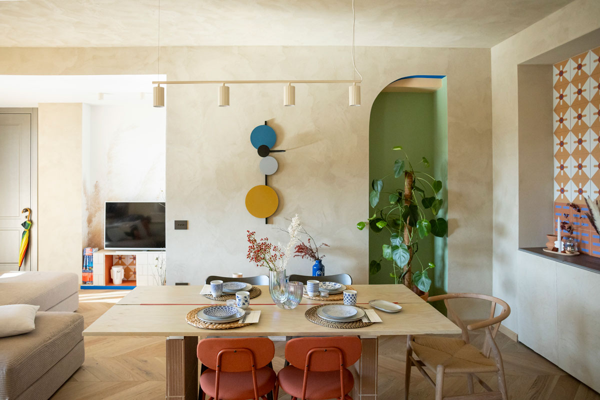
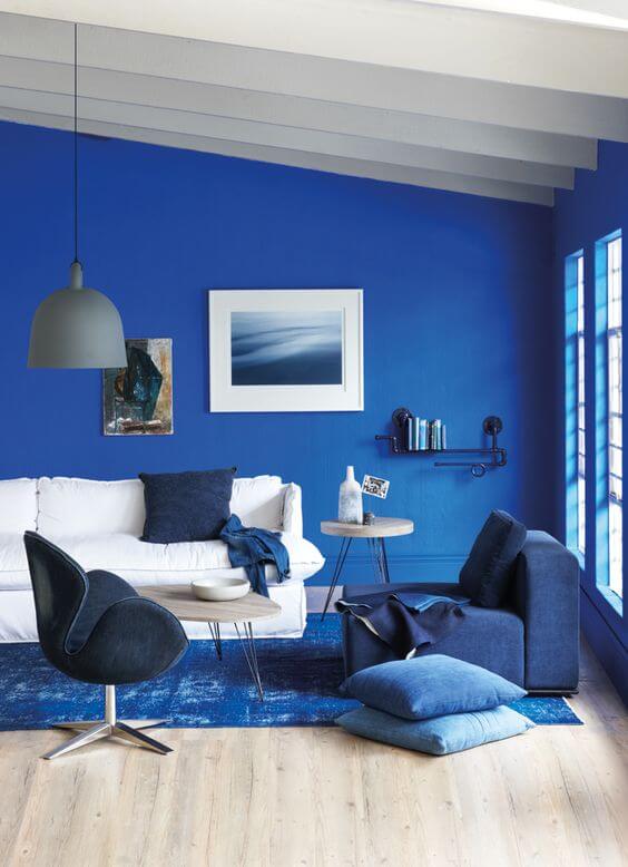
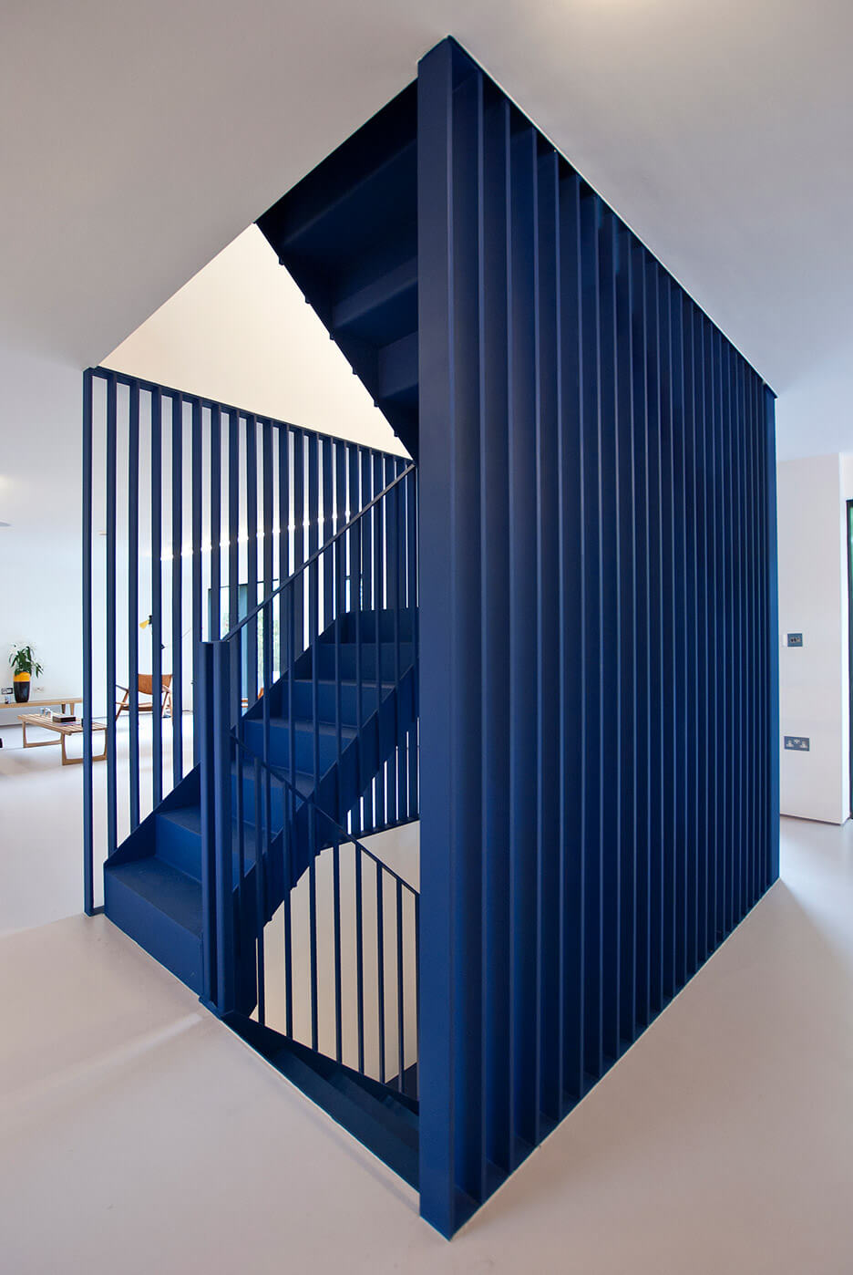
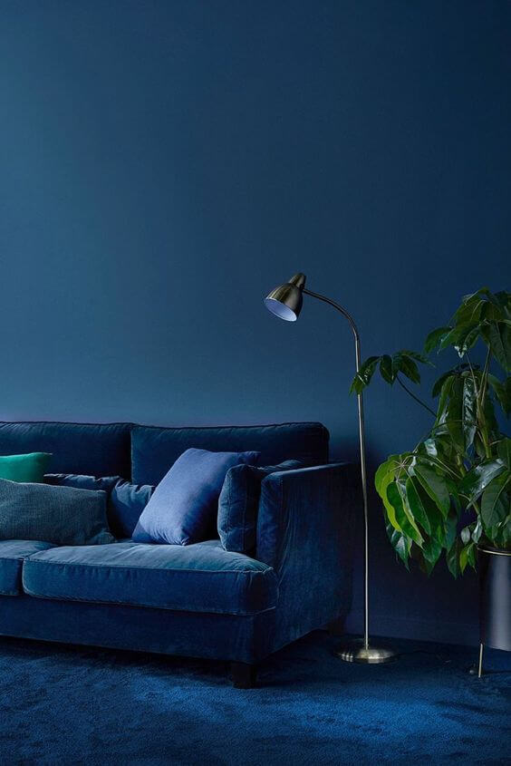
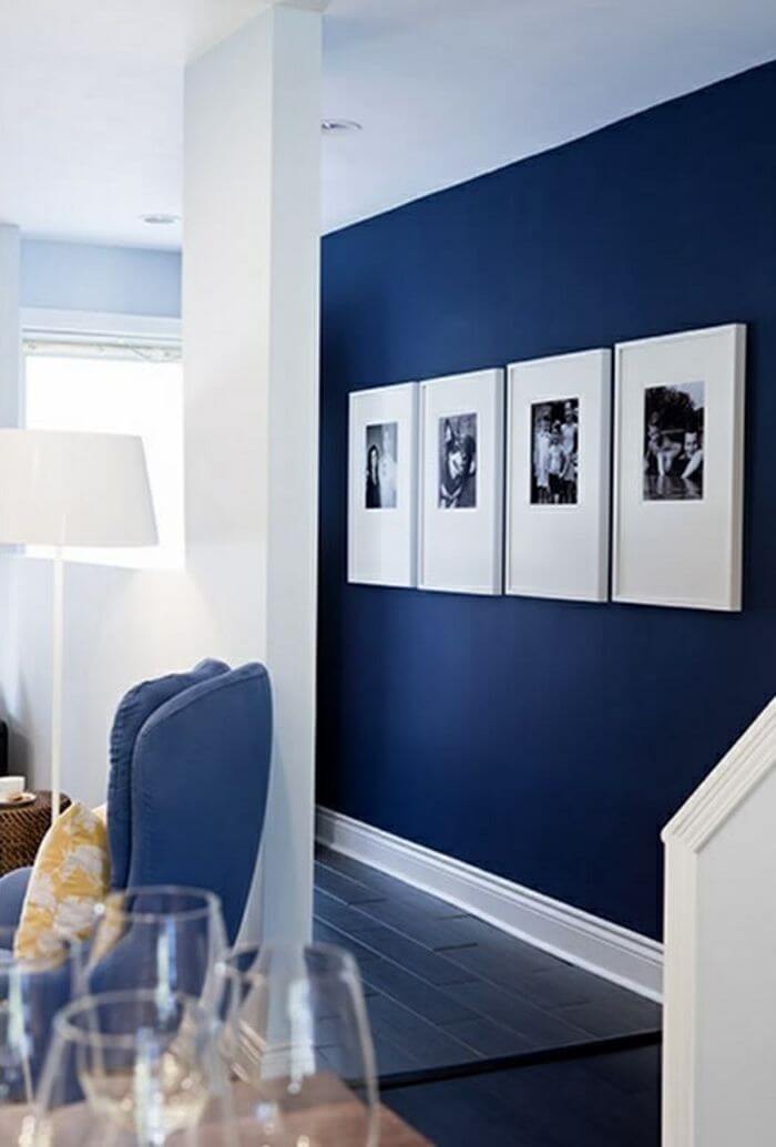
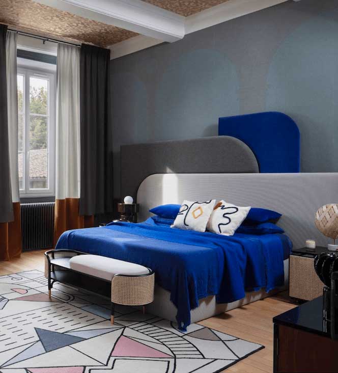
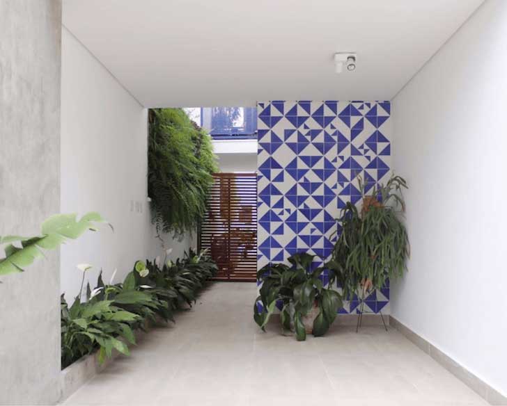
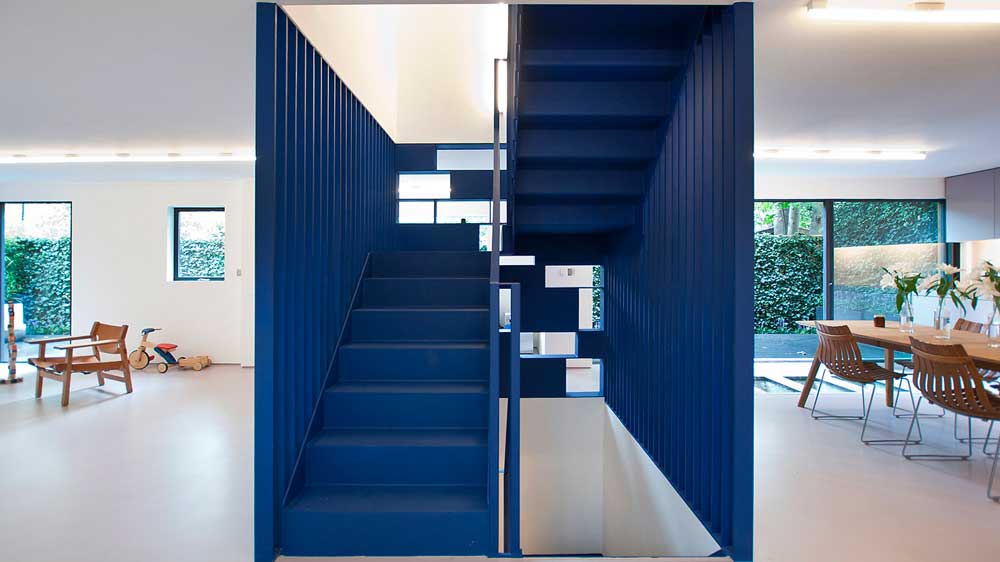
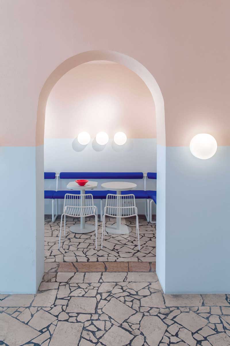
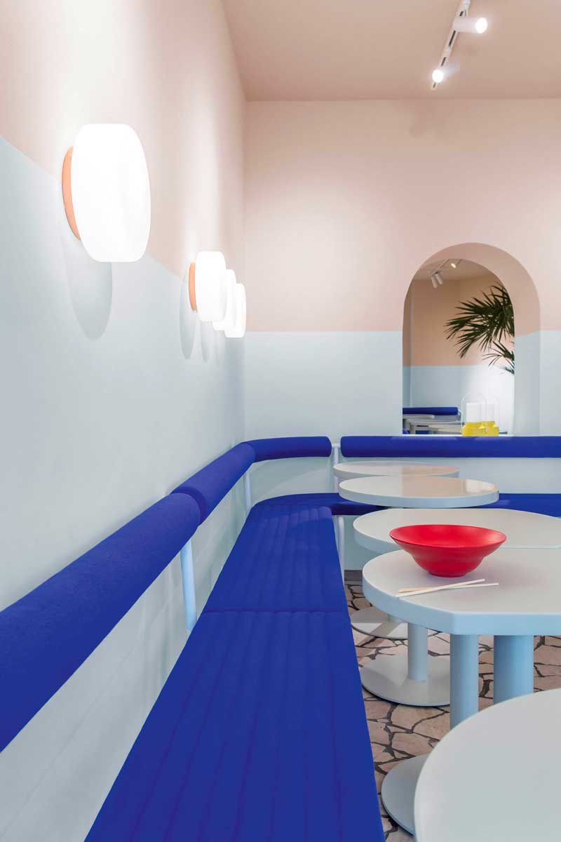
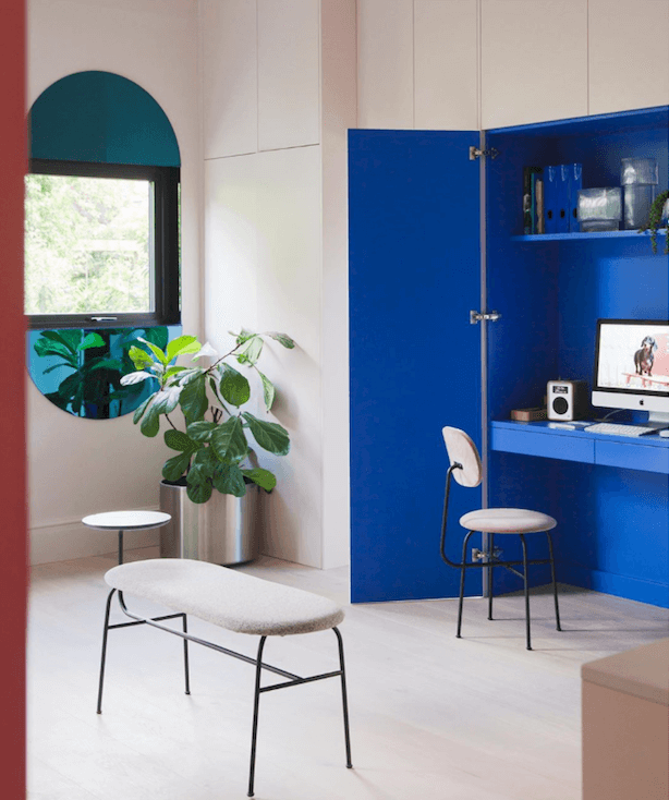
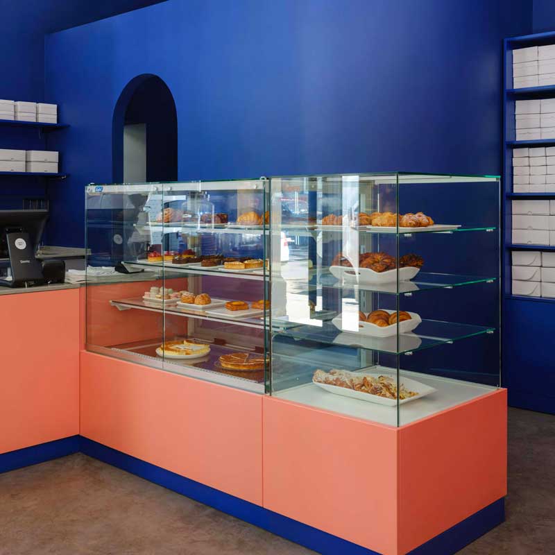
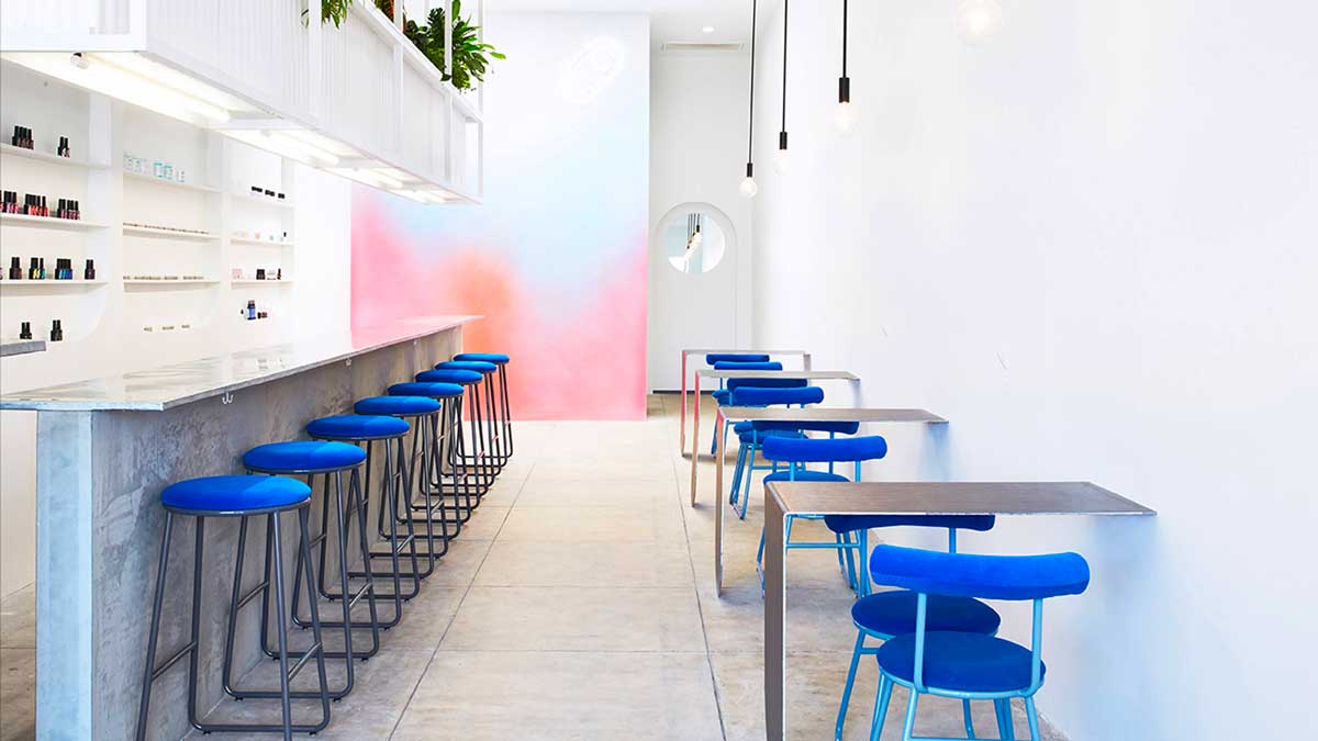
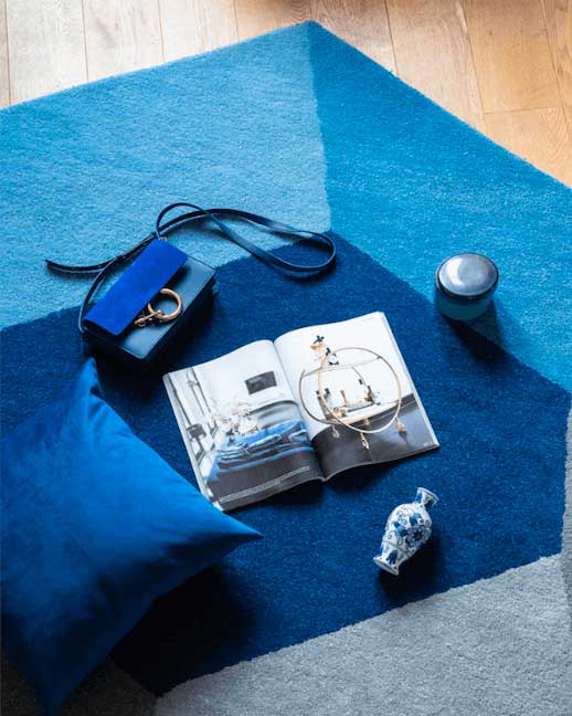
Fancy livening up your surroundings, add a splash of paint in this hue of blue or bring in through accessories wall art, cushions to a sculptural lamp can be instantly invigorating. Placed in an all-white space these can make a dramatic focal point and create a clean look with the timeless combination of blue and white. Yellow can also really make a bold blue hue pop. Or why not play around with combining with pinks, warm and cosy caramel or earthy tones. Blue bright with terracotta- practically the exact opposite. Embrace blue whether you are maximalist or a minimalist, this colour can be an instant mood – booster for your interior.
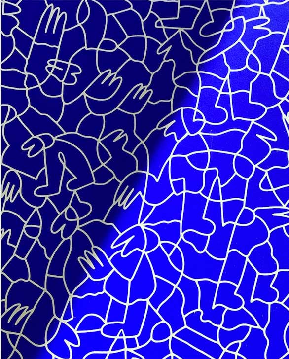
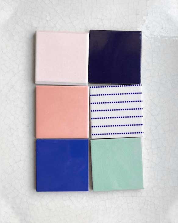
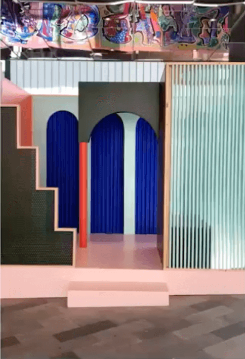
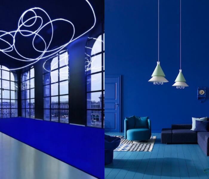
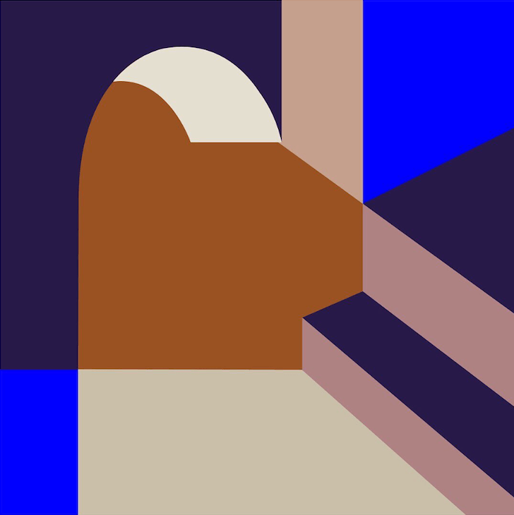
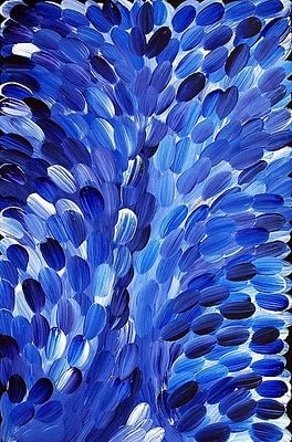
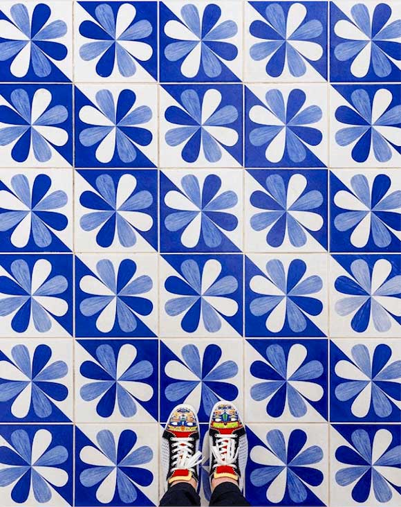
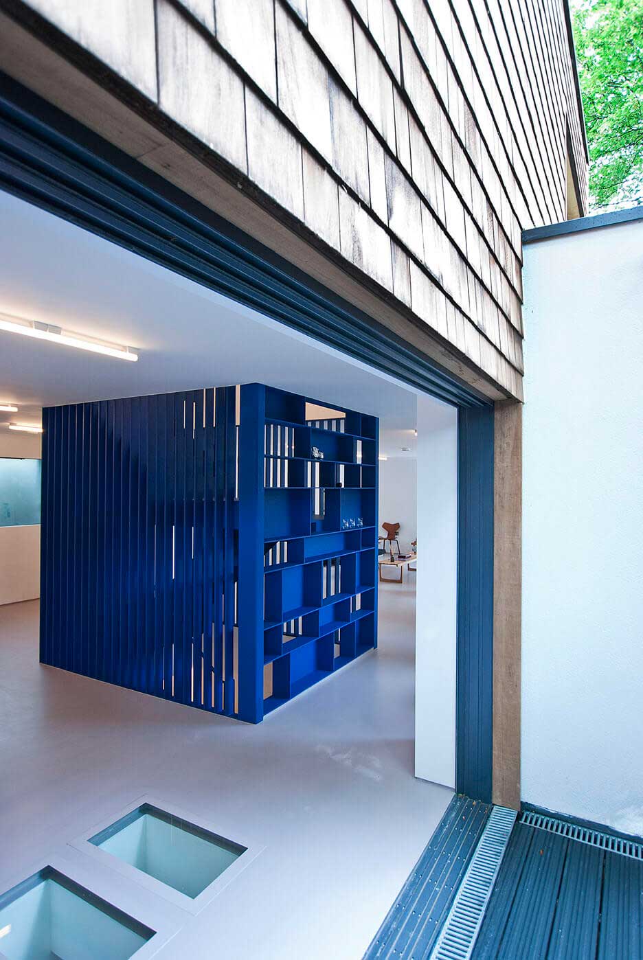
Be inspired by our Blue gallery!


![]()
@lamaisonpierrefrey, @shannonmch / @claude_cartier_decoration


![]()
Toast / House in Rua Faria Guimarães, Porto, by Fala Atelier via
@jahddesign, @casa14arquitetura, @lurca_azulejos

![]()
![]()
@2lgstudio / Under the sea @lucas_beaufort

![]()
@mademanoofficial/ @emilyforgot
![]()

![]()
via / via /@caroline_south/ via


![]()


![]()
@londondesignfair, @adrianajarosdesign, Dulux aus via Styled by Bree Leech, Photography Lisa Cohen / @pure_original_paint / @bradleyseymour, @joannalaven, design @kennedy_nolan/ @wendyslookbook
via/ from / via @joannalaven, designed by @halleroed, ph. @photographer_erik_und


![]()

Via @sayhito_, @niklas.bildstein.zaar, set design @balenciaga /Puik Design via
.
Pin the Post!
Be inspired by the past color trends: