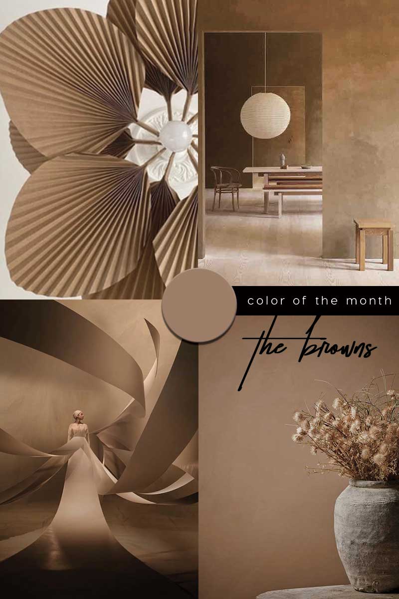
Cosy up for the cold season and be inspired by the BROWN COLOR TREND 2021 in interiors and design
The weather will be cooling down in the coming months – so let’s cosy up with a colour that is typically associated with the seasons of fall and winter.
Natural, neutral Brown.

–
BROWN COLOR TREND
IN COLOUR PSYCHOLOGY
–
Mention the colour brown and before you know it, some switch off and dismiss the colour for being dull, bland and boring; which are often words stereotypically associated with the colour brown. But believe it or not, brown is thought to create a wholesome feeling, a connection with the earth; ultimately it is “down-to-earth” and grounding.
As a down-to-earth colour brown signifies stability, structure and support.
The colour brown affects mind and body by creating feelings of wholesomeness, as well as cosy feelings of relaxation and warmth. In colour psychology, brown is honest, genuine and sincere. It is sensual, sensitive and warm, enveloping one into a sense of calmness and comfort. Brown suppresses the emotions, creating a safe haven “a sanctuary” from the everyday stresses of the outside world within which problems can be contemplated and solved. Brown represents simplicity, dependability, healing, home and health.
While a survey found that most people dislike brown, it is a colour found widely in nature and our everyday surroundings from wood, tree bark, soil to eye colour, in all its various shades. Brown is a predominant colour on the planet, along with green. While green is balancing and rejuvenating, brown is considered comforting and stabilizing – to help us deal with the stresses of modern life. Associated with feelings of organization, history and connection, the colour is wise beyond its years; brown is highly sought after for its wisdom and offers life-changing insight. In a world that appears uncertain and unfamiliar it may come as no surprise that we turn to brown – a stable and grounded down-to-earth colour that is believed to help you feel like you fit in and belong.

–
BROWN COLOR TREND
IN THE HISTORY
.
In origin for any dusky or dark shade of colour; the term brown comes from Old English brún. Words for the colour brown around the world often come from foods or beverages; in the eastern Mediterranean, the word for brown often comes from the colour coffee. In Southeast Asia, the colour name often comes from chocolate and in Japan, the word chairo means the colour of tea.
Positive associations with the colour brown evoke baking, warmth, wildlife, autumn, traditional chestnuts roasting on an open fire, a classic cup of cocoa or maybe more cosying up with a mug of hot chocolate. However, the elegance of brown shades and the soothing warm impression that we associate with chocolate, coffee and flavour of autumn we associate with now was not always the case. Brown – the colour of security, protection and material wealth.
In the ancient world, brown was the colour of poverty and low status. There are indications in literature that, in Ancient Rome, brown clothing was associated with the lower classes. Urban poor people who were called plebeians, wore brown clothing. Literally ‘the plebeians’ was “pullati” – “those dressed in brown”. In the Middle Ages brown clothes were also worn by monks of the Franciscan order. Unobtrusive colour was a sign of their humility and poverty. During that era each social class had to wear a colour that represented their status. Grey and brown shades were the colours of the poor people.

Dinesen via
–
BROWN COLOR TREND
IN DESIGN & LIFESTYLE
Observations back in 2018 lead (specialist in Lifestyle trend) Gudy Herder to predict brown shades to have a major comeback, forecasting –The Universe of Brown as colour of the year 2020. Not just one particular colour but to consider a whole brownish spectrum that belongs to Colour of The Year 2020.
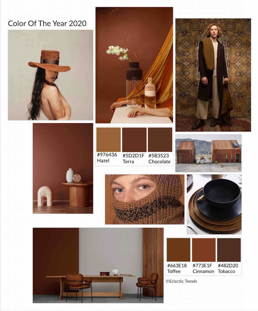


Source Eclectic Trends
Aspiration to learn source including Jotun Adventure – with warm, earthy tones remind us that there is a whole world and new colors to explore and try.

Tobacco Brown / ITALIANBARK Cool Color Trends 2021 Starting from Pantone 2020
Paint brand Dulux recently unveiled a “reassuring” earthy beige hue called Brave Ground as their Colour of the Year for 2021. Brave Ground represents the ‘natural, earthy elements found around us.’ A beigey, greyish brown.
‘A bolstering shade that connects back to nature and the simple things. A warm, earthy tone, it creates a feeling of stability, growth and potential; and provides a firm foundation for change and creativity in your home.’
Brave Ground is a warm natural neutral – ‘an enabling and grounding colour that connects us back to the simple things, and gives us a firm foundation for change.’ We have seen a shift towards beige based and warmer neutral shades previously with (a taste of caramel and a toast to champagne) and now with earthy brown.
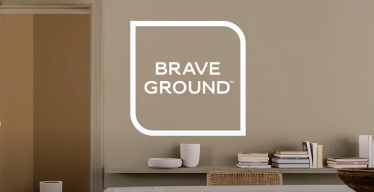


Dulux /@duinbloem /@jam_and_ginger / @hmhome /
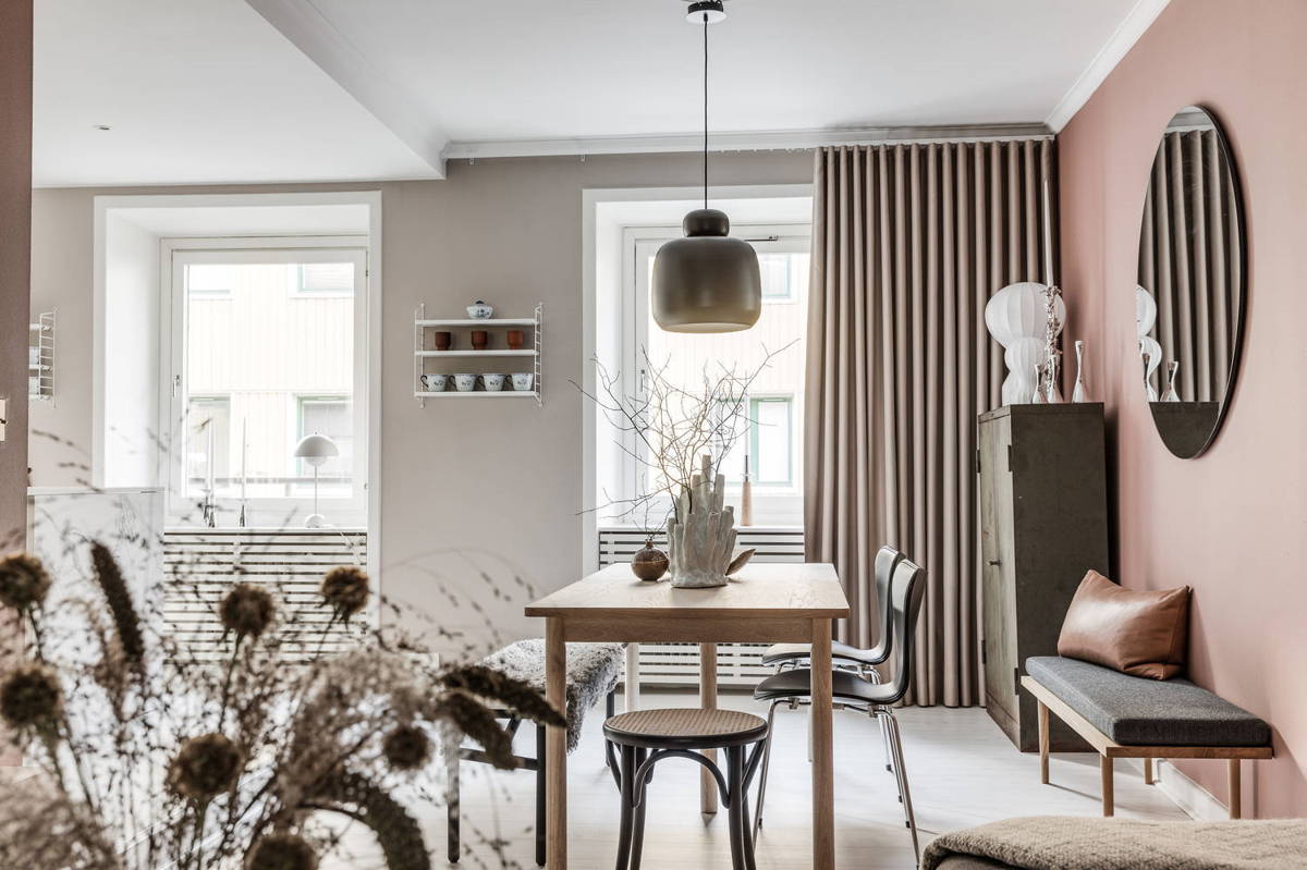
Via: Home Tour How to decorate with pink walls
–
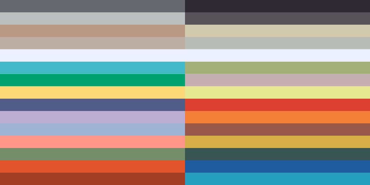
BROWNS COLOR PAINTS & CODES
FOR INTERIORS
Read the Full Article Here / Join our Trend Membership here to access the password protected area
–
–
BROWN COLOR TREND IN INTERIORS
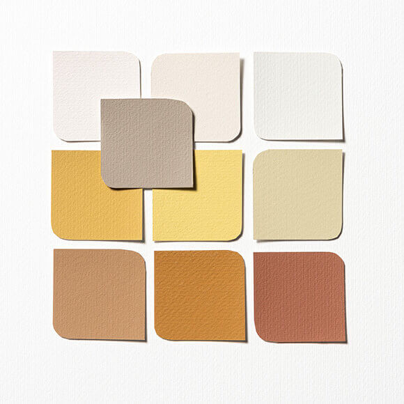
COLOR PALETTES FROM DULUX COLOR OF THE YEAR 2021

Image courtesy of Dulux
Alongside the Colour of the Year, the experts from Dulux identified four complementary colour palettes that can “sit comfortably” alongside Brave Ground, to make it easy to bring the colour into different spaces within the home or workspace. These palettes – Earth, Trust, Timeless and Expressive – will help homeowners create an environment where Brave Ground either stands strong or allows other colours to shine.
Let’s take a peek.
1/ Dulux Timeless palette


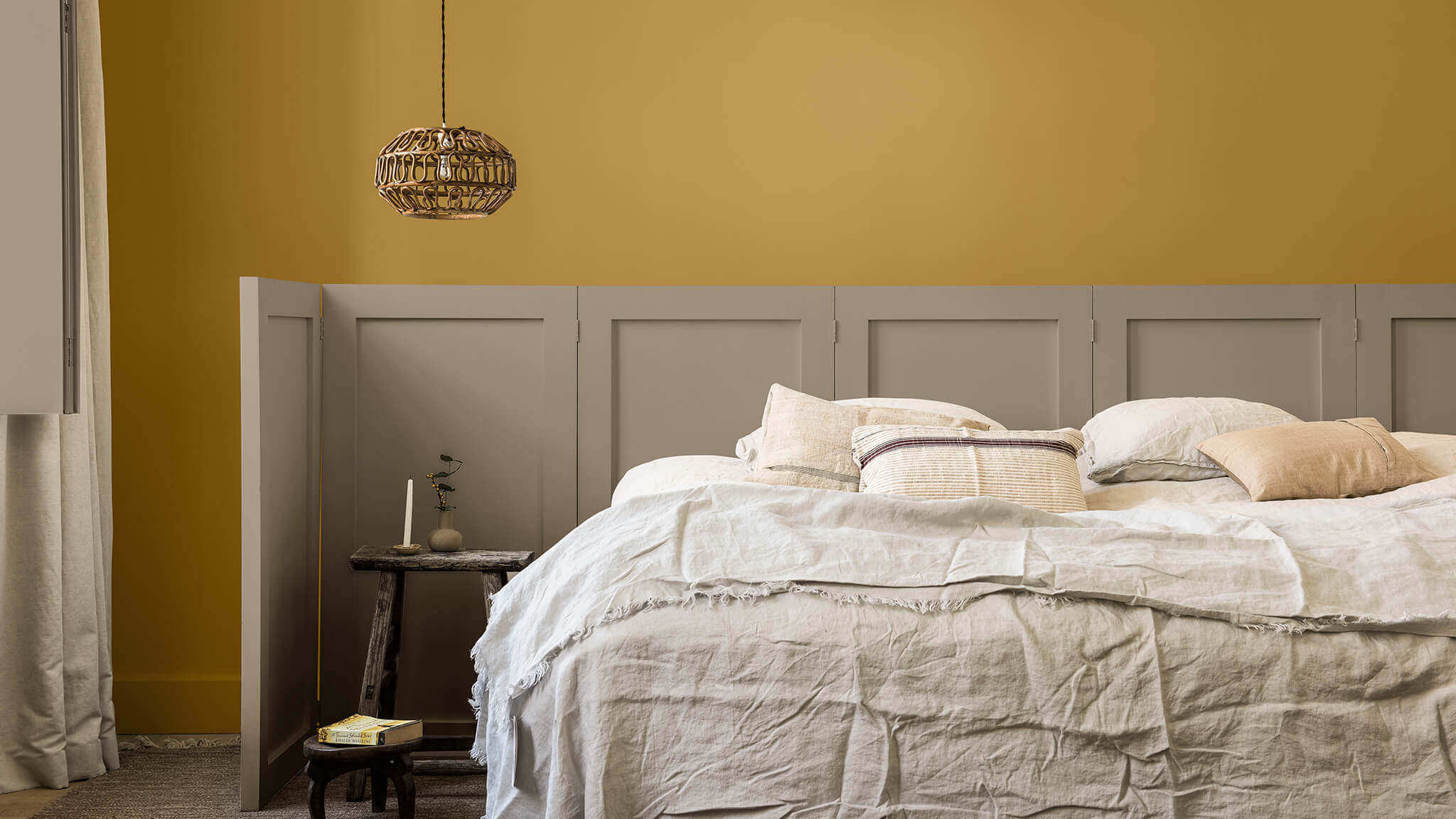

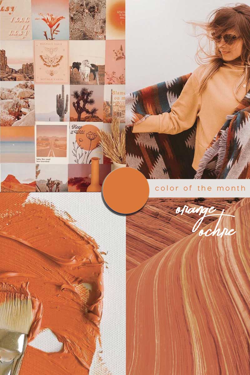
The Timeless palette is all about “recognising the value of the past and relevance for the future” says Creative Director of Dulux UK Marianne Shillingford. This colour palette includes warm shades of yellow, gold and red ochre and is balanced by natural and soft hues, such as Brave Ground.
This palette creates a firm foundation for any furnishings – traditional or modern; and works well with artisanal crafts and natural materials.
2/ Dulux Expressive palette


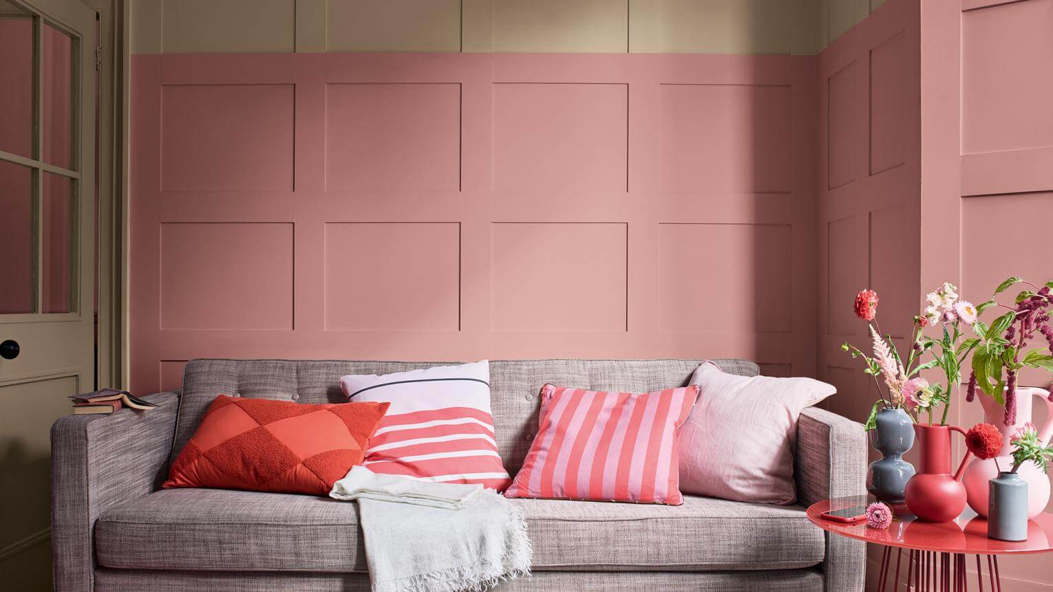
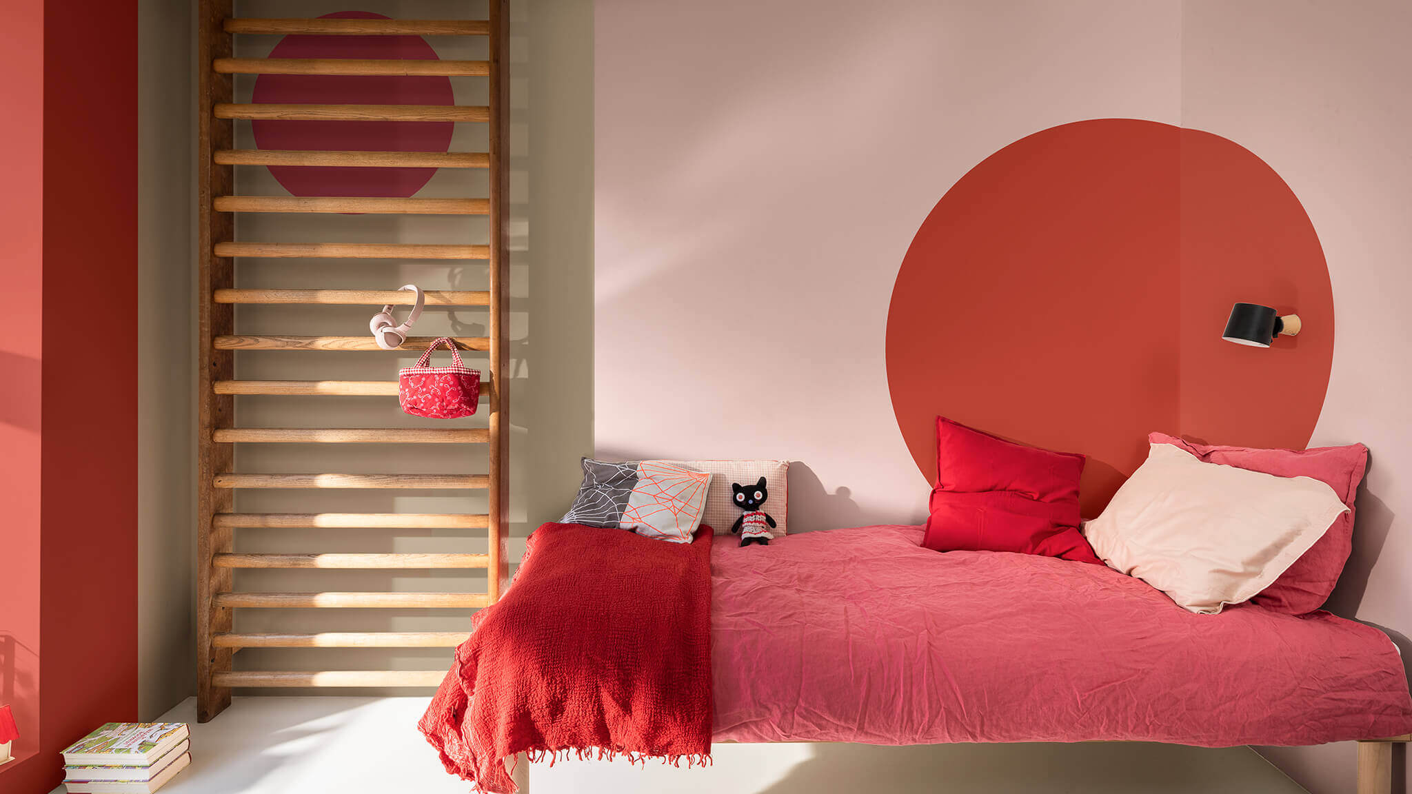
Designed to ‘let your creativity flow’ the Expressive palette using Brave Ground as a base and incorporates accents of pink and red. A scheme suitable for a space where you want to get creative such as a work-from-home spot or a bedroom; to make you feel upbeat and energised at the start of the day.
3/ Dulux Trust palette


Dulux ‘Trust’ is a go-to palette for creating a relaxing, laid-back scheme which works well for a contemporary kitchen, relaxed bedroom or a spa-like bathroom. A neutral palette with shades of soft greys and browns. Brave Ground is combined with the earthy colours of the Trust palette for a warm and welcoming feel. These tones work well with mid-century furniture and rich finishes, such as copper, marble and velvet.
4/ Dulux Earth palette


Last, the Earth palette is aimed to create a connection back to the natural world , with soft shades of blue and green. Style up with natural wood, reclaimed furniture, shapely ceramics and indoor plants.
–
BROWN COLOR TREND IN INTERIORS
BRINGING BROWN INTO INTERIORS
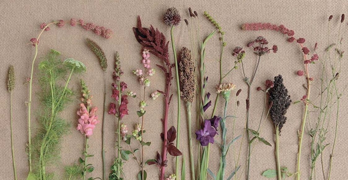
Brown is dependable yet flexible with associated meanings changing based on the colours it accompanies. Earthy browns bring warmth to a space while creating a connection to the outside world.
Read the Full Article Here / Join our Trend Membership here to access the password protected area
–
|| Looking for different color inspiration? Here we go:
- Red interiors in vermilion Chinese red color trend
- Decorating with red furniture and design
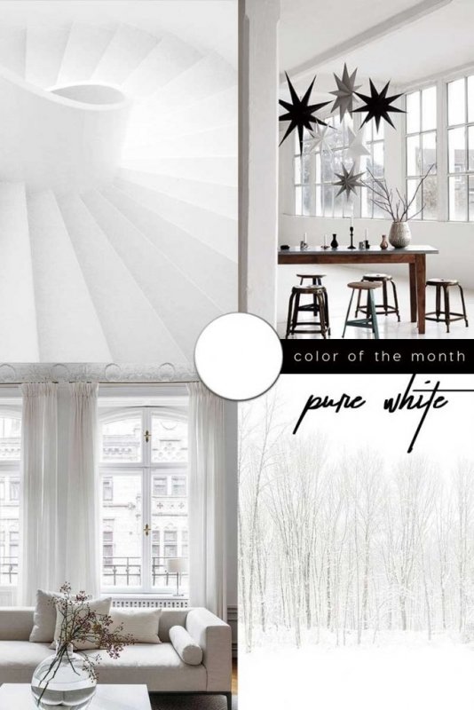
- Off whites decor trend
- Champagne white
- Dark Green Color Trend
- Dark Green furniture and home decor for a biophilic twist
- Mint Home Decor
.
Liked this post? Pin it!
.
Browse all Color Trends