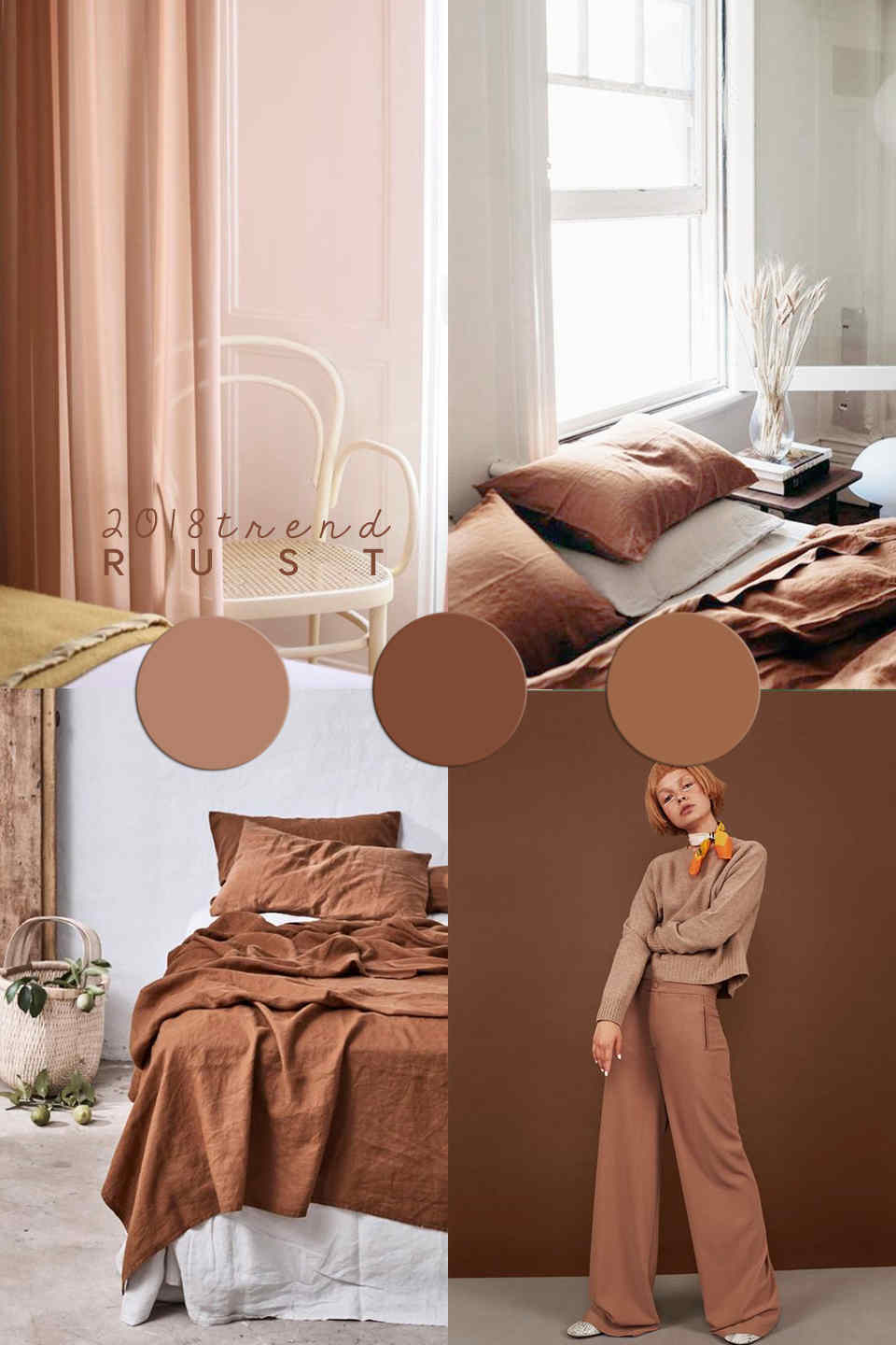
I’m talking about rust color trend.
This color has been popping up really everywhere in the last months and the trend is here to last. Rust is a warm and neutral shade, which can add a very cozy vibe to the coldest interiors.
If you are not sure about which color rust is,
as the name of course says it is a combo between red-orange-brown, very similar to the iron oxide. Rust actually looks like the translation of that earthy color trend we were talking about exactly two years ago.
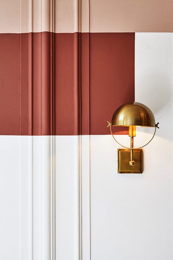
This color hue also goes perfectly well if watched with millennial pink and that’s why it soon become so popular in interiors. In addition to this, rust goes well together with all natural hues, both of greens and sands, even more with wicker and rattan. It reminds of a Seventy vibe which is very trendy too now in home decor, as it was one of the color hues very popular in that decades that has not been used so much lately.
||| Read more about the interior trends 2019 guide here
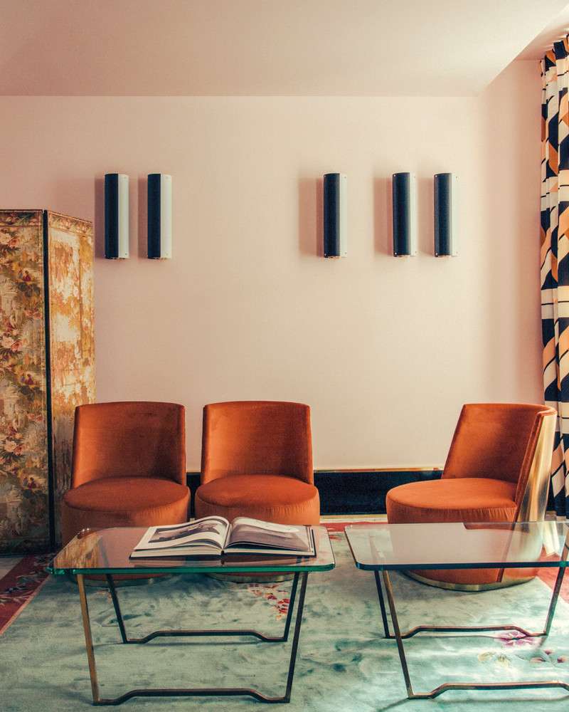
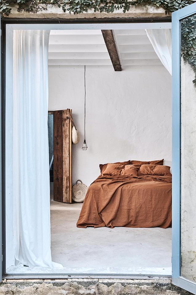
My favourite way to incorporate rust color trend in interiors for sure is in the bedroom. A warm and cozy set of linens in rust color, within a neutral bedroom setting, looks like the perfect bedroom. However, there are really several different ways to add a rust-coloured touch in interiors: enjoy the gallery and be inspired!
[ ITALIAN VERSION BELOW ]
rust color trend / interiors


Sources: @wearetriibe via; Pop&Scott; Alvhem via; DIMORESTUDIO; Inside Out via; @_designtales_ via
Cover: cereal magazine. + via


[ ITALIAN ]
Mi riferisco alla tonalità di colore ruggine.
Un colore che è spuntato praticamente ovunque nel mondo del decor e una tendenza che sembra durare. Questo perché il color ruggine è una tonalità molto calda, allo stesso tempo neutra, che può aggiungere un tocco di calore anche agli interni più freddi.
Se non siete sicuri di che tonalità si tratti,
ma non credo, visto che il nome parla chiaro!- si tratta di una combinazione di rosso-arancio-marrone. In pratica, la traduzione di quel trend verso le tonalità della terra di cui vi parlavo esattamente due anni fa.
Il bello di questa tonalità è che, in coppia con il millennial pink, crea un effetto cromatico davvero molto gradevole. Inoltre, il color ruggine si abbina alla perfezione con tutte le tonalità naturali, del verde e dei colori neutri, come ad esempio quelli della paglia e del sabbia. Un colore che rievoca quelle atmosfere anni Settanta così popolari oggi, infatti era uno dei colori più utilizzati proprio in quel decennio e caduto in disuso poi.
||| Qui trovate la guida tendenze negli interni per il 2019
La modalità che preferisco per aggiungere una nota in ruggine negli interni è di sicuro nella decorazione della camera da letto. Un set di lenzuola in questo colore, ad esempio, in un contesto di tonalità neutre, può fare la differenza. Vi lascio con una gallery di ispirazioni sul tema.
Pin it!
–
More about Color Trends in Interiors:
- This is the new White
- The new neutrals are Pastels
- The World’s favourite color
- Pink interior trend
- The colors from Milan Design Week to last in 2018