2020 Update / PANTONE 2020 is Classic Blue 19-4052.
Classic Blue is a timeless hue, elegant in its simplicity. This color is the response to our research for peace and tranquility for the next decade.
We predicted this in our color boards: jump below to see the color trends for 2020 starting from Pantone 2019

[symple_divider style=”dashed” margin_top=”20″ margin_bottom=”20″]
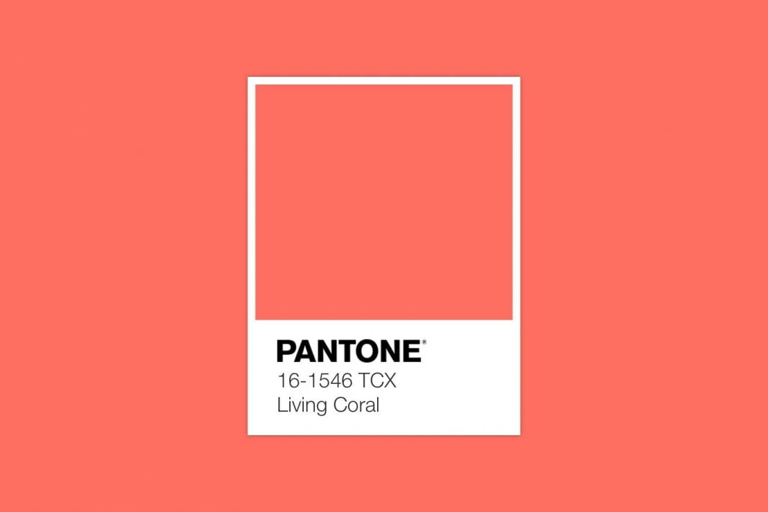
PANTONE 2019 is Living Coral 16-1546.
Living Coral is a warm, vibrant yet mellow color between orange and pink. This hue is associated with optimism, conviviality and joy. It was chosen by Pantone Color Institute as Color of the Year 2019 to represent also a reaction against digital world, towards authenticity and experiences that enable connection and intimacy. It also represents {of course} corals and more generally talking oceans. Consequently, it is a way to make us reflect about the “devastating” effect the society on the environment.
Personally, I really like Living Coral colour hue because it is not as bold as fluo, not as soft as pastels, and it also has a vintage allure. I just realized that seven years ago I choose to paint my bedroom in my parents’ home in coral red. At that time it was absolutely out of fashion 😉
[ ITALIAN ]
Il PANTONE 2019 è Living Coral 16-1546.
Living Coral è un colore caldo, vivace ma allo stesso tempo soft, a metà tra arancio e rosa. Si tratta di una tonalità associata all’ottimismo, alla convivialità e alla gioia, scelta da Pantone Color Institute come Colore dell’Anno 2019 in reazione al mondo digitale verso una realtà più autentica, essendo un colore che rimanda a concetti di convivialità e connessione con gli altri. Rappresenta anche {naturalmente} il corallo e più in generale gli oceani, ed è quindi un modo per riflettere sull’effetto “devastante” della società sull’ambiente.
Personalmente, mi piace molto questa tonalità di corallo Living Coral, che non è acceso come il fluo, non è soft come i colori pastello ed ha anche un’allure vintage. Mi sono anche ricordata che sette anni fa ho scelto di dipingere la mia camera da letto nella casa dei miei genitori proprio in rosso corallo…e a quel tempo era assolutamente fuori moda 😉


via Shutterstock: 1 | 2 | 3 | 4
.
About Coral color and Living Coral in interiors
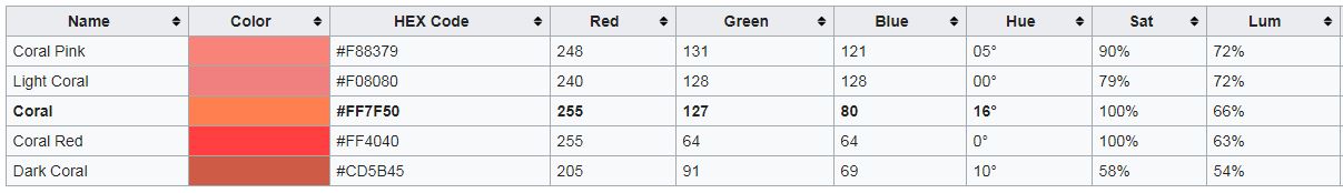
Did you know that there are many different hues of coral? This chart from Wikipedia shows which are these different variations of coral, depending on how much orange or pink you find inside it. PANTONE 16-1546 Living Coral actually is softer than coral, then easier to use in interiors too.
Pantone suggest to use Living Coral in interiors as a bold statement in settings and décor, such as pop-up installations and interactive spaces. The color is linked to tactility and human connection so it’s perfect in shag rugs, cozy blankets and lush upholsteries to create a warm feeling in the home. Used as an accent on walls or furniture, living coral also adds a dramatic pop of color to any room setting.
–
Lo sapevate che ci sono molte tonalità diverse di corallo? Questo grafico da Wikipedia riporta le diverse varianti di corallo, a seconda di quanto arancione o rosa ci siano. PANTONE 16-1546 Living Coral in realtà è più tenue rispetto al corallo, quindi più facile da usare anche negli interni.
Pantone consiglia di utilizzare Living Coral negli interni come colore principale per installazioni pop-up e spazi interattivi. Essendo però un colore legato alla tattilità e alla connessione umana, è perfetto anche per essere integrato negli interni residenziali, ad esempio con tappeti shag, coperte soft e nei rivestimenti, per creare un’atmosfera accogliente e allo stesso tempo per aggiungere un tocco di colore originale.

Color Trends for 2020 starting from Pantone 2019 Living Coral
While in almost all magazines and websites we are all reading about Pantone 2019 (yes, that’s a lot of marketing behind this!), let’s try to be more original here at ITALIANBARK. To do this, we are exploring more color trends for interiors besides Pantone2019, by starting from it.
One easy way for doing this is exploring how to match the Pantone 2019 and which are its complimentary colors. I am quite sure that, among these colors, there are many other interesting hues we are going to see a lot in 2019 and maybe as a top color trend in 2020 too. We already saw some of the following in the blog this year, so you will find the link to the dedicated post, while we are exploring more the others in 2019.
|| Looking for more inspo on 2019 interior trends? Have a look at :
- The most popular colors in the world in 2019
- Color of the Year 2019 according to ColorFutures
- Top Decorating Trends for 2019 from Paris
- Interior Trends 2019: the new Downloadable Guide is Online
Le tendenze colore per il 2020 da Pantone 2019 Living Coral
In quasi tutte le riviste e siti web di settore ci sono già moltissimi articoli dedicati a Pantone 2019 (sì, c’è anche molto marketing dietro al “colore dell’anno”!), proviamo ad essere un po’ più originali qui su ITALIANBARK, esplorando le tendenze di colore per interni al di là di Pantone2019, ma partendo proprio dal living coral.
Un modo semplice per farlo è cercare gli abbinamenti colore più efficaci e le tonalità complementari a Pantone 2019. Sono abbastanza sicura che, tra questi colori, ci siano molte tonalità interessanti che vedremo di sicuro nel 2019 e probabilmente anche come tendenza colore nel 2020. Alcuni di questi colori sono già stati approfonditi nel blog, quindi troverai il link al post dedicato, mentre rivedremo gli altri nel 2019.
[symple_divider style=”dashed” margin_top=”20″ margin_bottom=”20″]

[symple_divider style=”dashed” margin_top=”20″ margin_bottom=”20″]
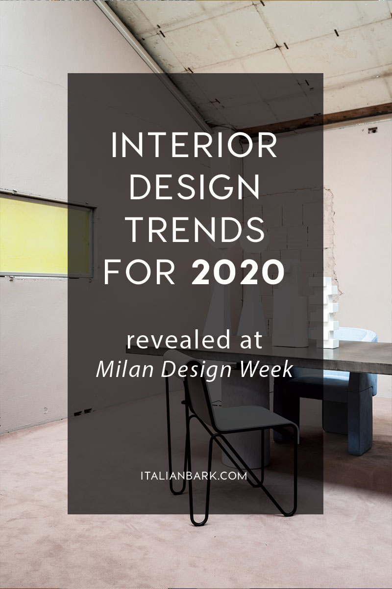
Interior Color Trends for 2020
starting from Pantone 2019 Living Coral
[symple_divider style=”dashed” margin_top=”20″ margin_bottom=”20″]
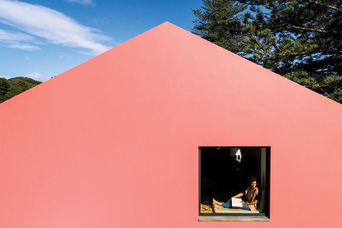
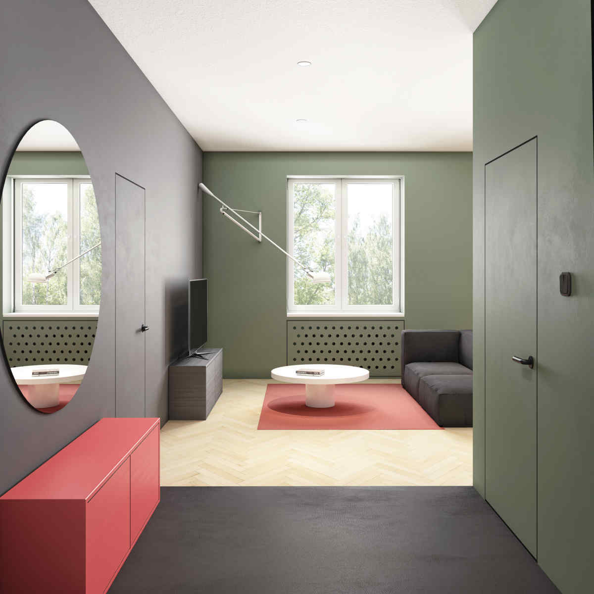
#1 | Coral + seafoam& celadon green
[symple_divider style=”dashed” margin_top=”20″ margin_bottom=”20″]
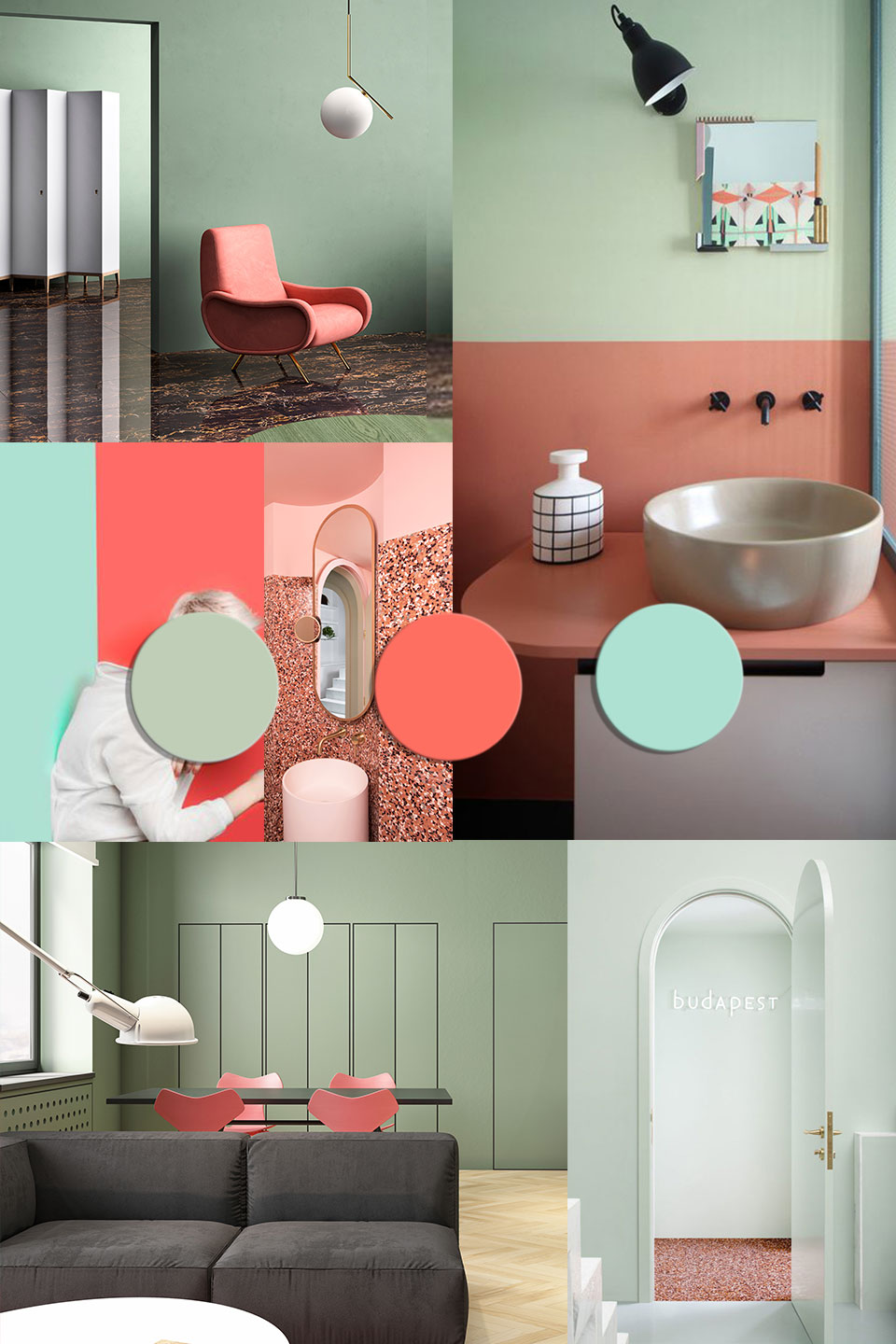
Collage ©ITALIANBARK | Sources :
1 | terzoPiano
2 | Budapest Café via
3 | Artem Tafy via
4 | Marcante Testa


[symple_divider style=”dashed” margin_top=”20″ margin_bottom=”20″]
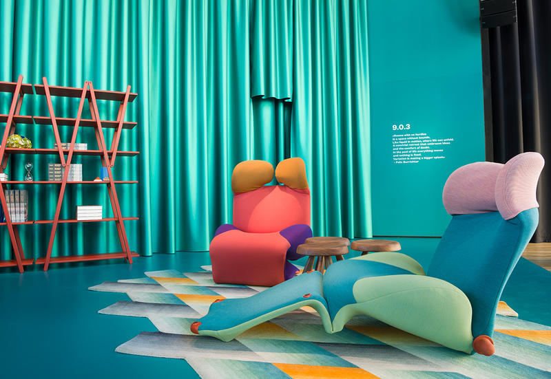
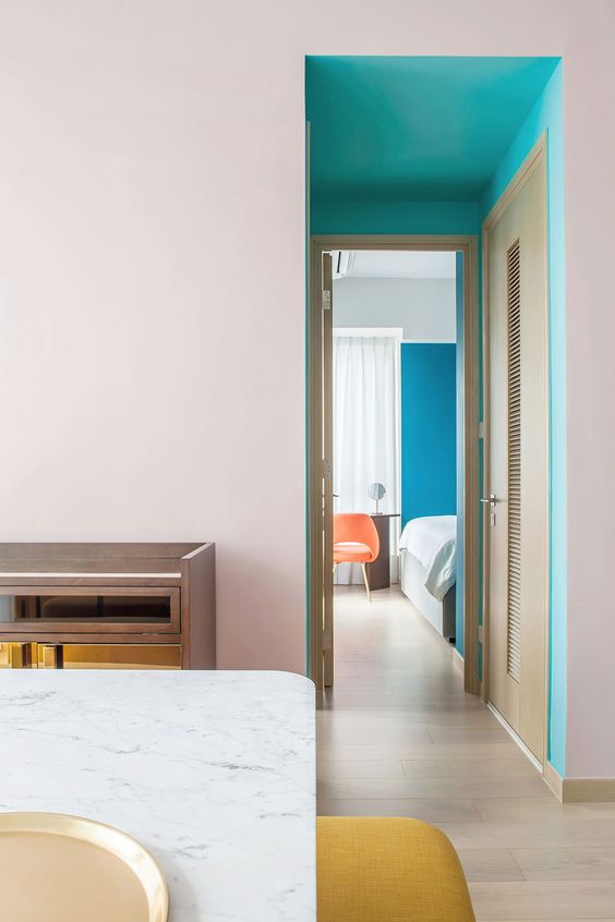
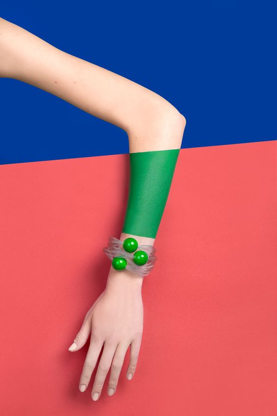
#2 | Coral + turquoise
[symple_divider style=”dashed” margin_top=”20″ margin_bottom=”20″]

Collage ©ITALIANBARK | Sources :
1 | Creative collage in Living Coral color di Efetova Anna
2 | Cassina
3 | Mosaic del Sur
4 | Reutov design via
5 | fresh watermelon slices by baibaz


[symple_divider style=”dashed” margin_top=”20″ margin_bottom=”20″]
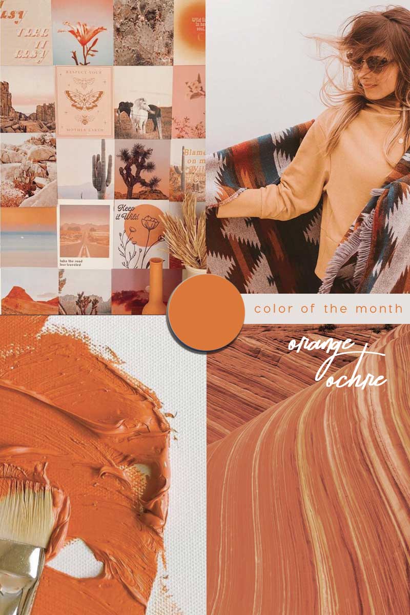
#3 | Coral + peach& cantaloupe
[symple_divider style=”dashed” margin_top=”20″ margin_bottom=”20″]

Collage ©ITALIANBARK | Sources :
1 | via
2 | cschoonover
3 | Missguided
4 | MarxIto
5 | Tribe Studio via
6 | Breadway Bakery via
|| Read more about cantaloupe orange color trend in this post


[symple_divider style=”dashed” margin_top=”20″ margin_bottom=”20″]
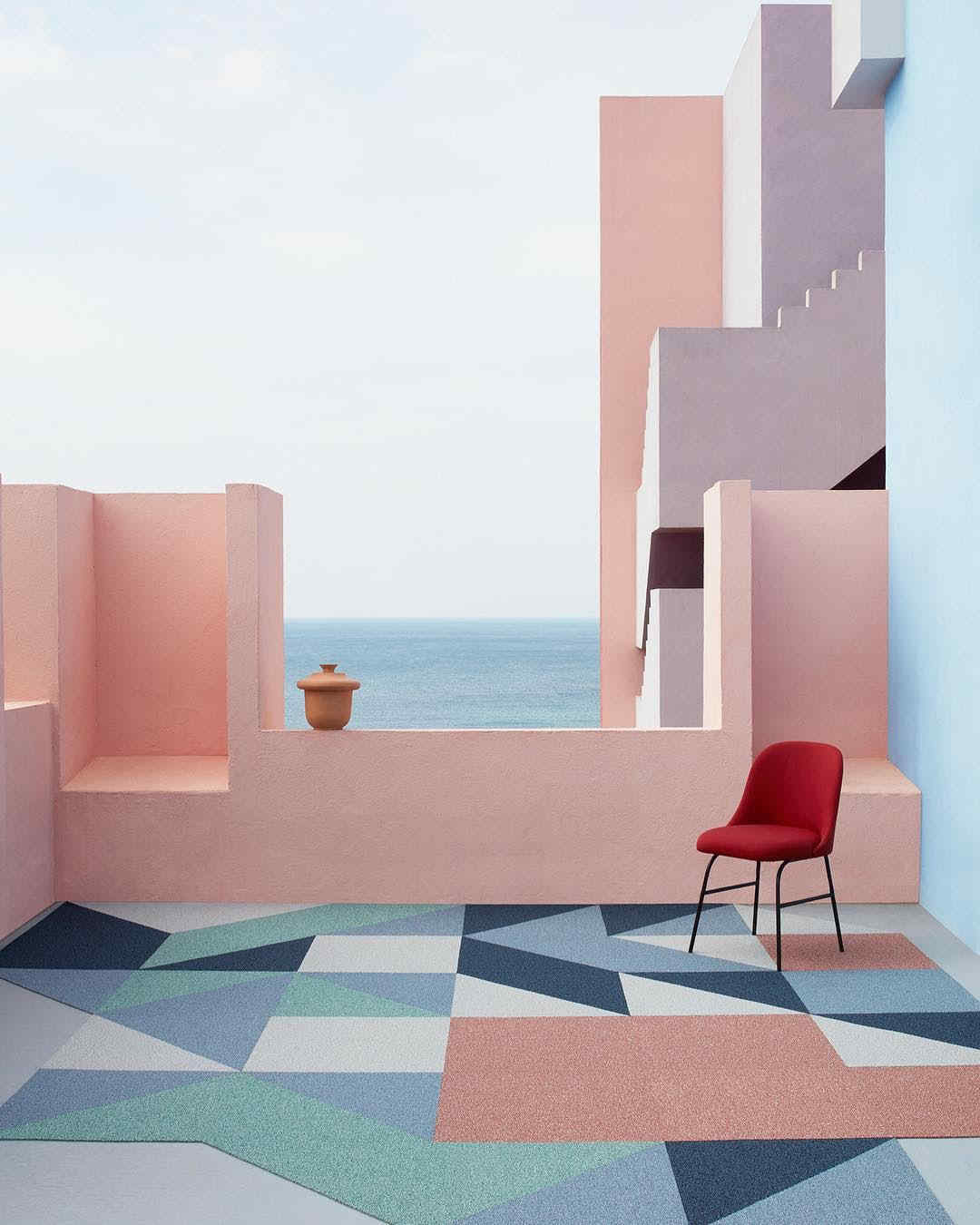
#4 | Coral + Klein blue
[symple_divider style=”dashed” margin_top=”20″ margin_bottom=”20″]
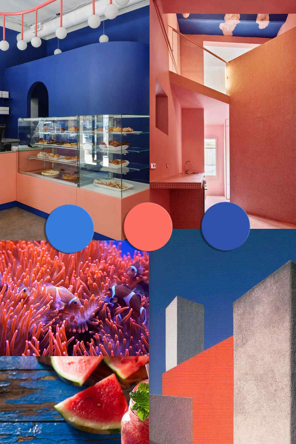
Collage ©ITALIANBARK | Sources :
1 | Breadway Bakery via
2 | Casa Horta by Guillermo Santomà via
3 | Clown fishes swimming near the coral by Fabio Alcini
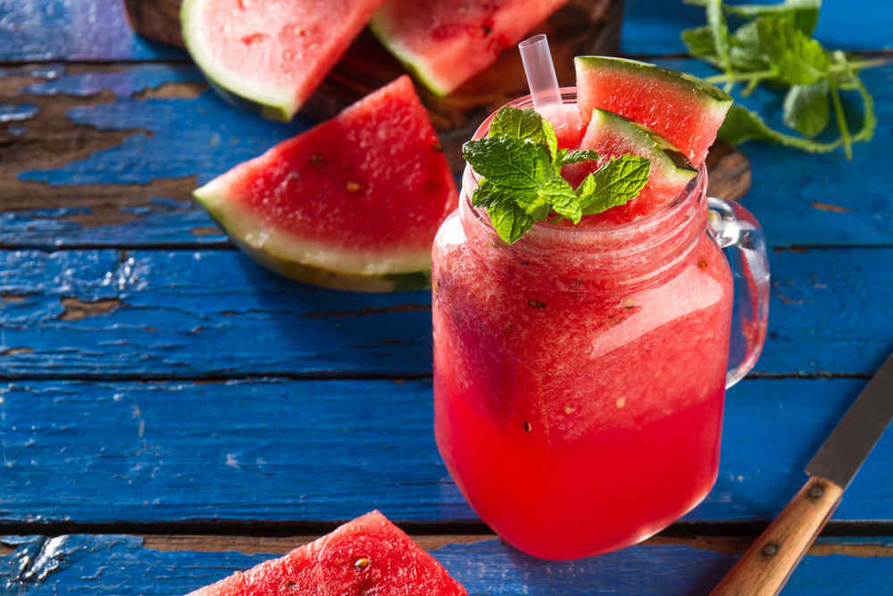
4 | Watermelon drink smoothie on blue table by Valeria Aksakova
5 | Luis Barragan house in Mexico City via
+ | Angela Woods


[symple_divider style=”dashed” margin_top=”20″ margin_bottom=”20″]
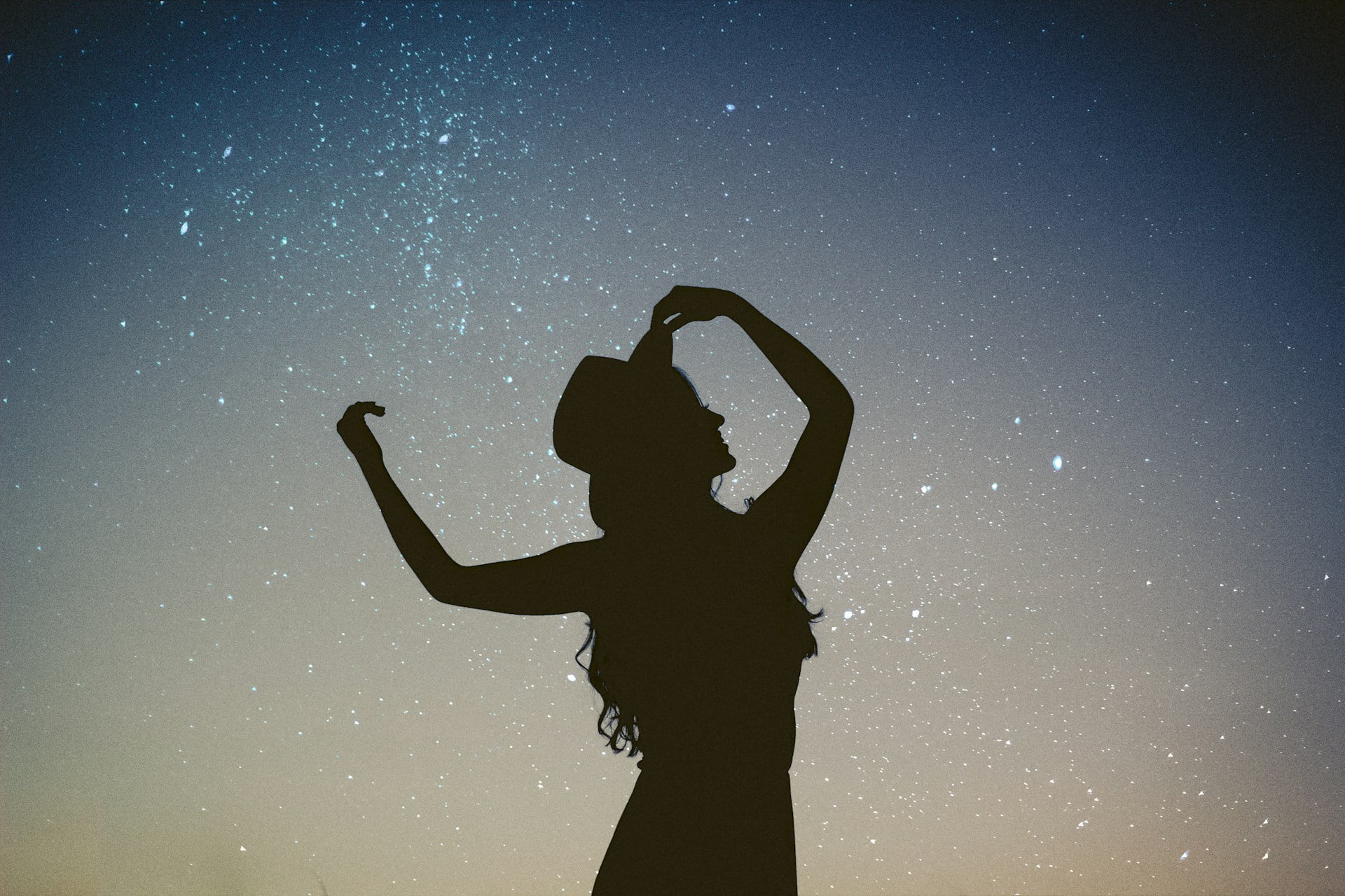
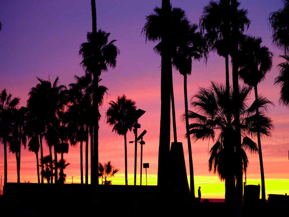
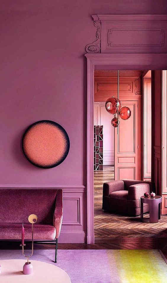
#5 | Coral + lilac &ultraviolet
[symple_divider style=”dashed” margin_top=”20″ margin_bottom=”20″]

Collage ©ITALIANBARK | Sources :
1 | Sunset at Venice beach, California by chonka
2 | Monica Reyes
3 | Muralla Roja via
4 | via
5 | Frank Benson via


[symple_divider style=”dashed” margin_top=”20″ margin_bottom=”20″]
#6 | Coral + dark teal
[symple_divider style=”dashed” margin_top=”20″ margin_bottom=”20″]
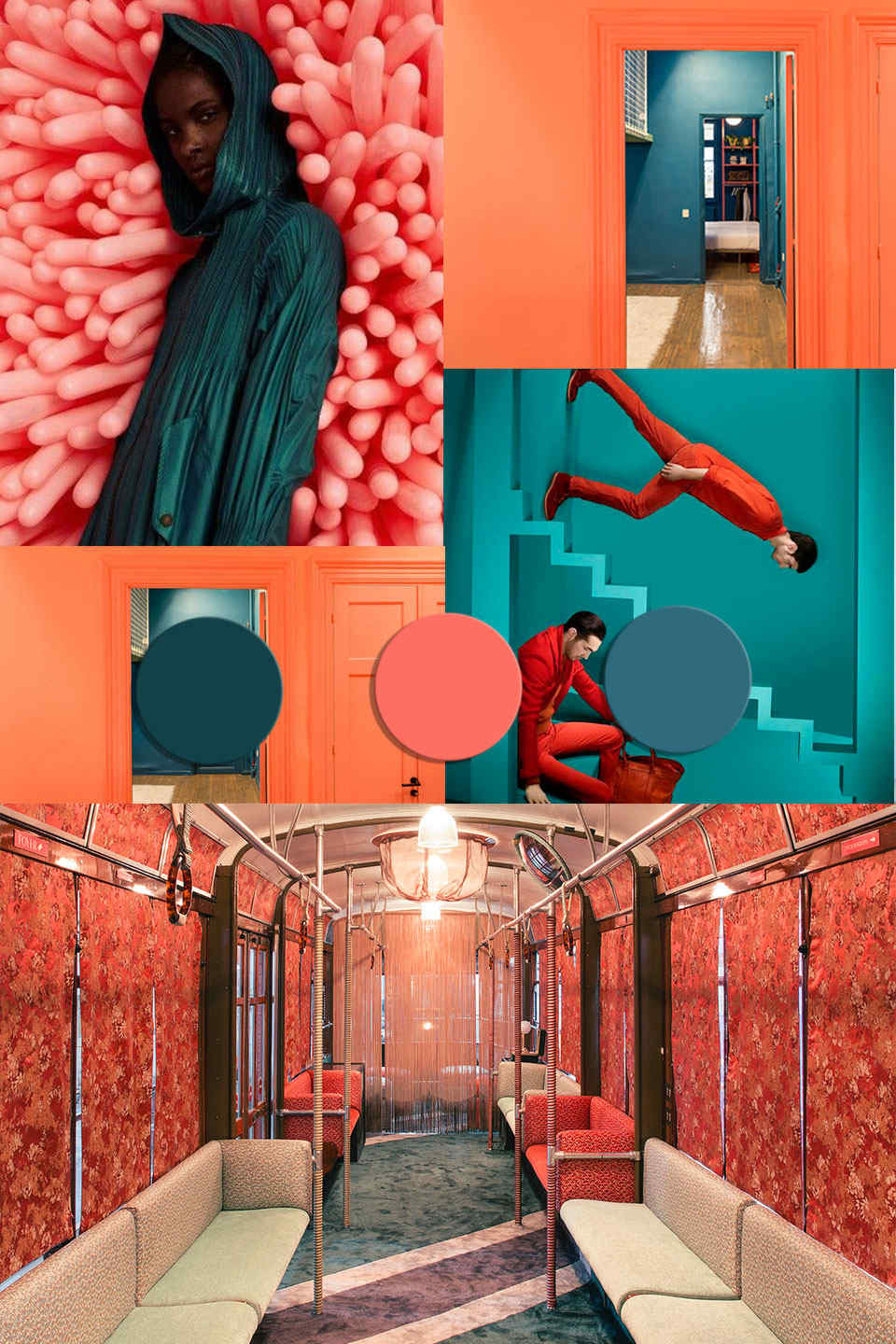
Collage ©ITALIANBARK | Sources :
1 | Travys Owen
2 | via
3 | Tram Corallo by Cristina Celestino
4 | Waterfront Nikis Apartment by Stamatios Giannikis via
|| By inspired by the dark teal color trend in this post


[symple_divider style=”dashed” margin_top=”20″ margin_bottom=”20″]
[symple_divider style=”dashed” margin_top=”20″ margin_bottom=”20″]
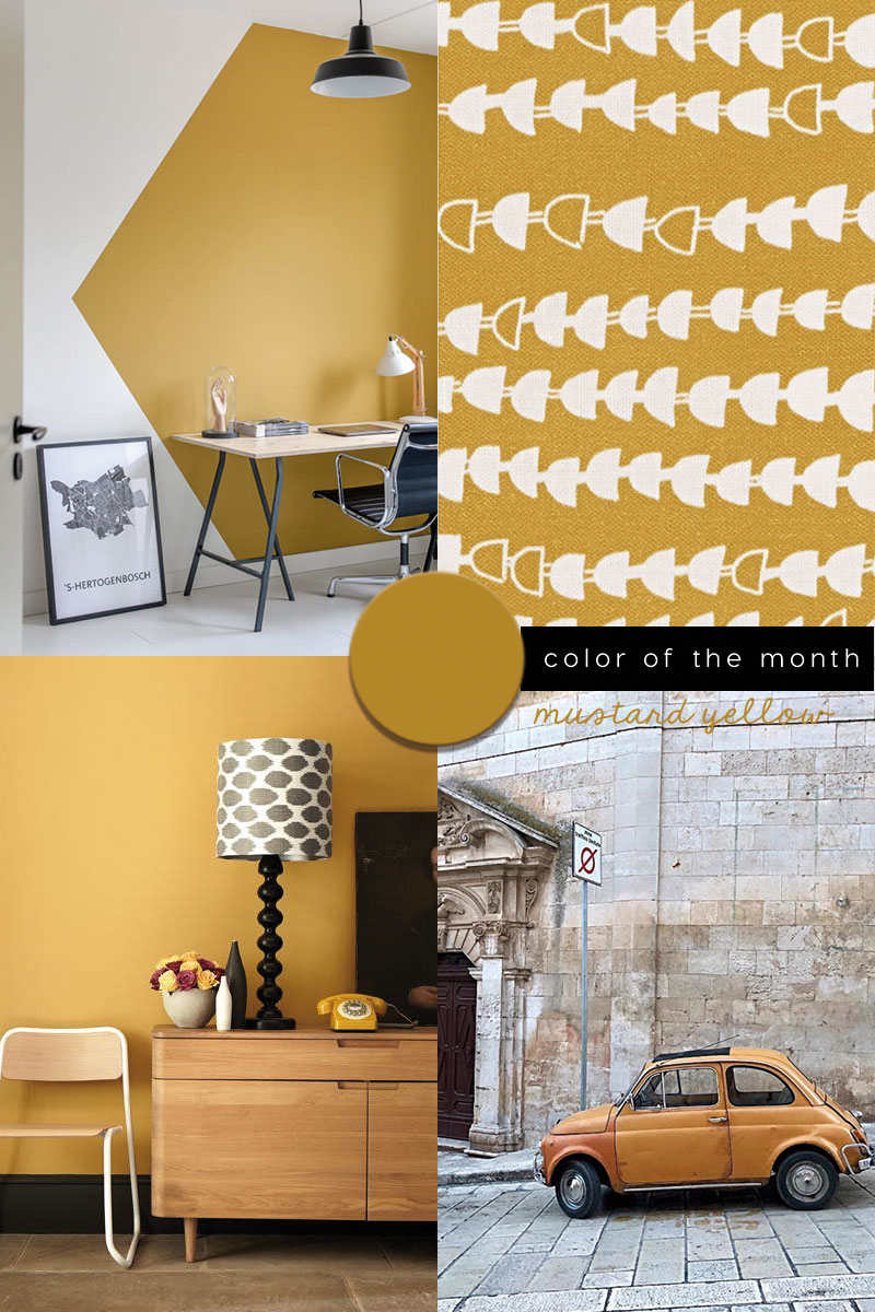
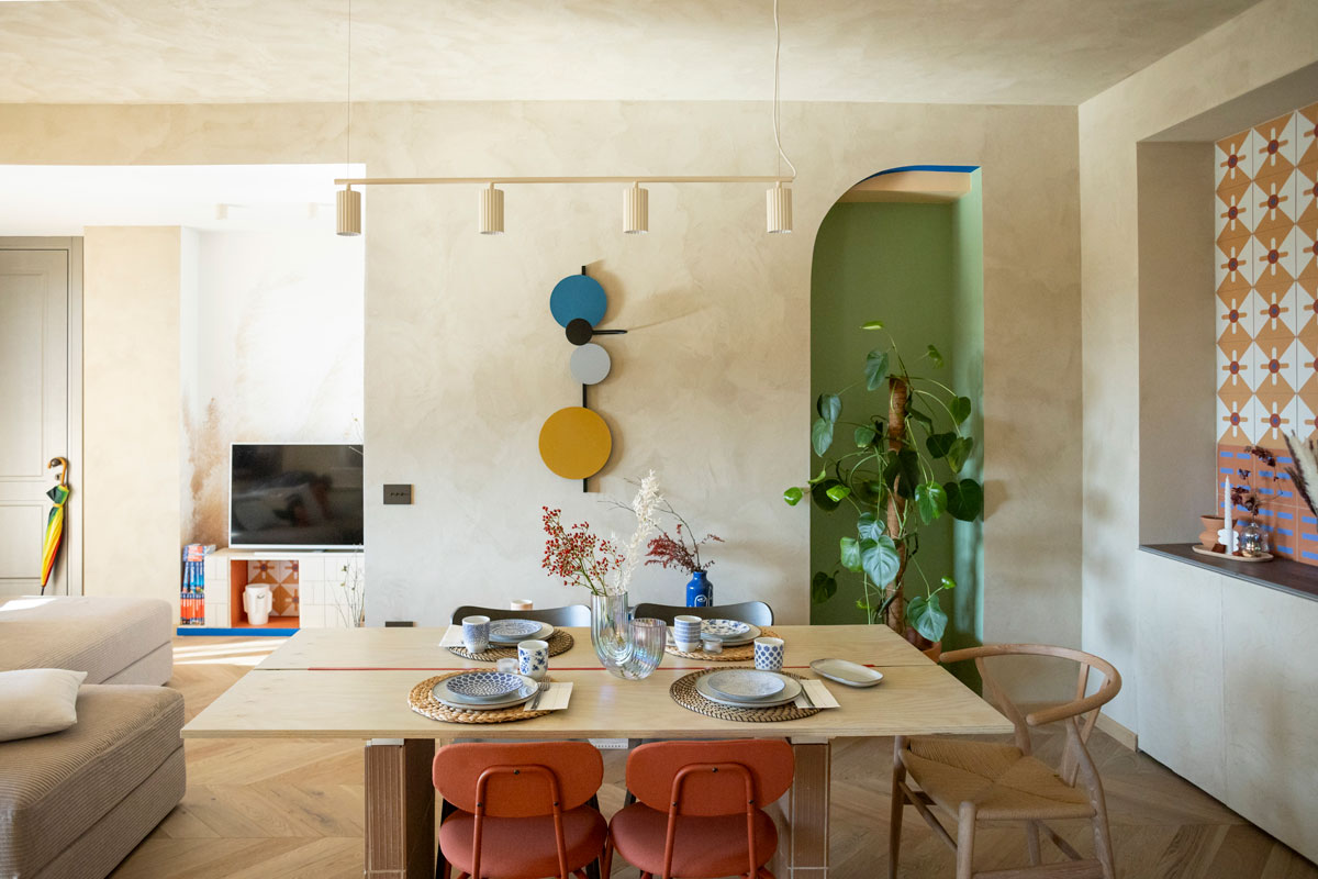
#7 | Coral + mustard &gold
[symple_divider style=”dashed” margin_top=”20″ margin_bottom=”20″]
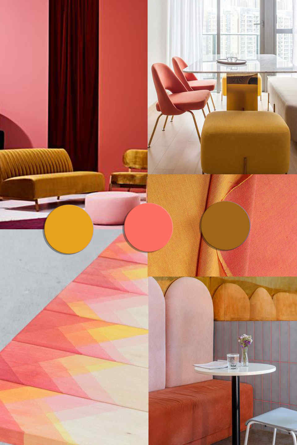
Collage ©ITALIANBARK | Sources :
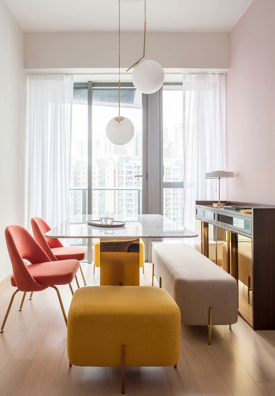
1 | Harro Home via
2 | Lim + Lu
3 | Raw Edges
4 | Jaypore
5 | Breadway Bakery via
|| By inspired by the mustard yellow color trend in this post


[symple_divider style=”dashed” margin_top=”20″ margin_bottom=”20″]
#8 | Coral + baby blue
[symple_divider style=”dashed” margin_top=”20″ margin_bottom=”20″]
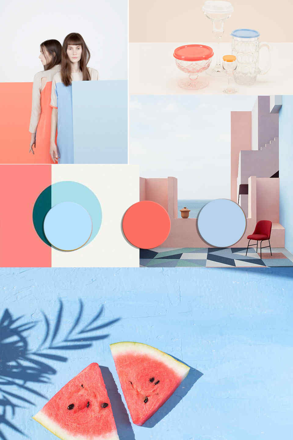
Collage ©ITALIANBARK | Sources :
1 | WGSN
2 | Klunderbie
3 | Watermelon slice Isolated light blue background by Anastasia Turshina


[symple_divider style=”dashed” margin_top=”20″ margin_bottom=”20″]
If you have loved this post and would like to use our research, we kindly ask you to quote this article with link.
.
Liked this post? Pin it!
Follow ITALIANBARK on Pinterest here

.
Be inspired by the latest color trends:
Follow ITALIANBARK on Instagram here